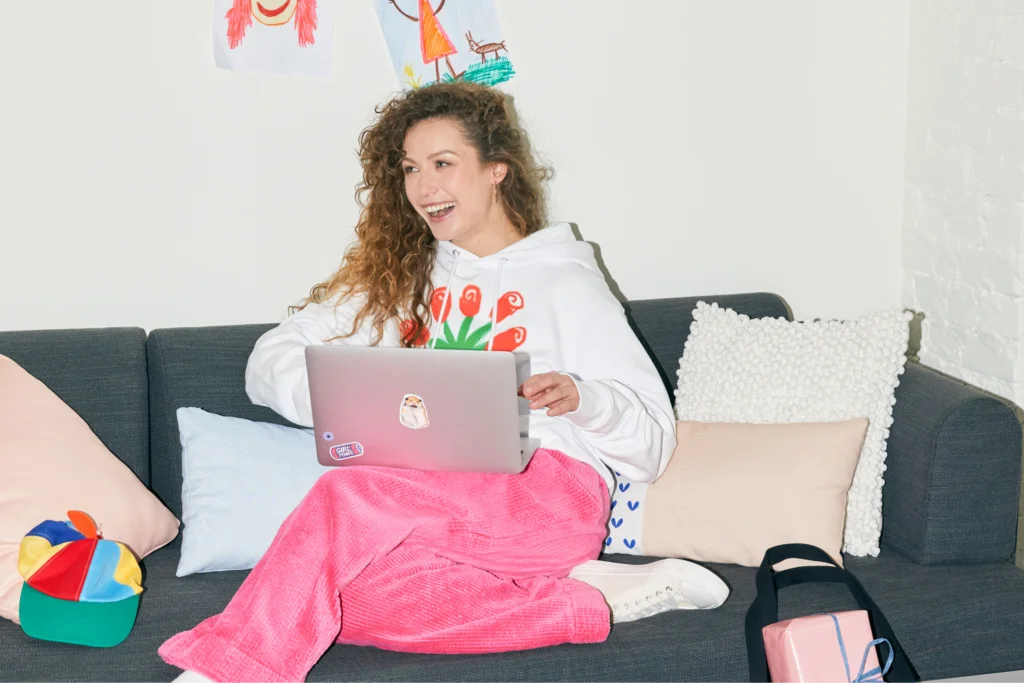
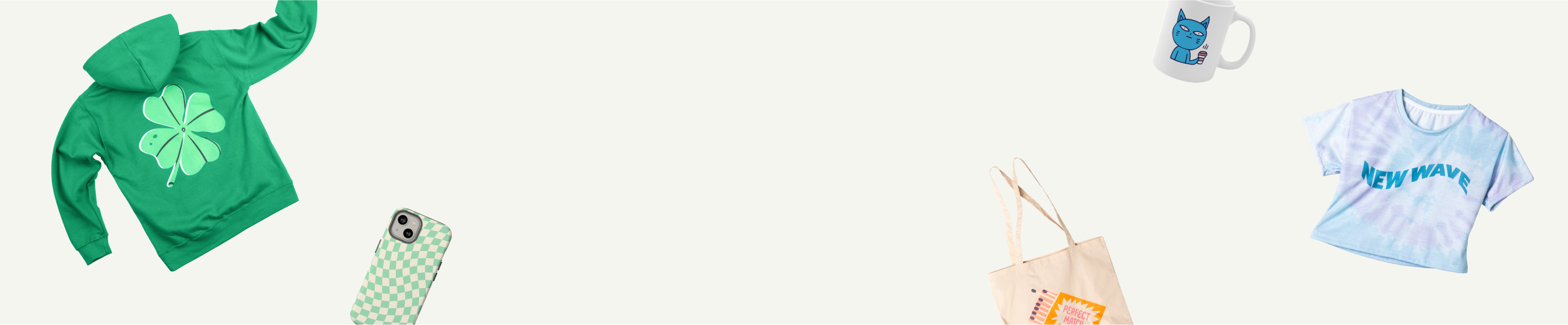


Create what’s trending. Sell what’s hot
Colors don’t just decorate – they communicate, captivate, and sell. In fact, 93% of shoppers prioritize visual appeal when deciding what to buy. For print-on-demand (POD) success, mastering the color trends of 2025 can set your designs apart.
From earthy tones to brighter shades, this year’s trending color palettes blend natural hues with modern sophistication. Let’s explore the colors shaping the year and learn how to incorporate them into your branding and products.
Key takeaways
- Earthy shades lead the way. Colors like Mocha Mousse and Elderton are perfect for brand elevation and interiors.
- Bright accents shine. Playful shades like Sunset Coral and vibrant orange inject energy and optimism into modern designs.
- Sophistication meets boldness. Trendy colors for 2025 balance timeless refinement with a contemporary edge, making them ideal for everything from logos to apparel.
- Design for connection. This year’s palette reflects emotional appeal and sustainability, helping designs resonate across generations and platforms.
Pantone Color of the Year 2025: Mocha Mousse

Pantone, the global authority on color trends, is known for capturing the spirit of the times. Each year, its creative directors select a shade that embodies the global mood, shaping design, branding, and interior trends.
For 2025, that color is Mocha Mousse – a rich, earthy shade that embodies comfort and class.
With brown undertones evoking the warmth of chocolate and coffee, Mocha Mousse is a versatile paint color that works across color palettes.
For POD merchants, this trendy color is a must-have – perfect for cozy apparel, stylish logos, or custom wall art. Mocha Mousse represents indulgence, harmony, and a deep connection to the natural world, making it a standout choice for products in 2025.
New York Fashion Week color trends 2025

Spring/Summer 2025 at New York Fashion Week introduces a color palette that feels like a love letter to nature and individuality.
These shades are versatile and packed with emotional depth, offering POD merchants a playground of opportunities when starting a clothing brand or selling various personalized goods.
Here are the standout colors redefining the season and how you can incorporate them into your products:
- Bran: Imagine the warm, delicious embrace of freshly baked bread – this cozy brown tone exudes comfort and stability. Use it as a foundation for minimalist designs or to add balance to bold palettes.
- Chocolate Brown: Rich and indulgent, this shade recalls the velvet luxury of dark chocolate. It’s perfect for bringing elegance to interiors, packaging, or logos that want to project authority and trustworthiness.
- Crocus: A vibrant purple with a hint of sweetness, it’s like the first bloom of spring. This playful hue can add whimsical pops to accessories or summer-inspired custom clothing designs for a youthful vibe.
- Orangeade: A vibrant, joy-infused orange. This warm coral shade blends passion with serenity. Pair it with earthy colors for tropical designs, or use it as a playful accent in branding.
- Lime Cream: A zesty green with creamy undertones, this soothing shade feels like a fresh lime spritz on a summer day. Add it to vibrant patterns or eco-inspired products to signal freshness and energy.
- Déjà Vu Blue: Deep and mysterious, like the twilight sky, this blue radiates calm and authority. Use it for backgrounds or statement prints that demand attention while remaining classy.
- Misted Marigold: This warm, golden orange invokes the glow of a setting sun. It’s ideal for seasonal designs, especially summer-to-fall transitions, or to add a vintage charm to your POD creations.
- White Grape: A blend of yellow and green with a natural softness, White Grape exudes subtle sophistication. Perfect for floral motifs, home goods, or products aimed at sustainability-conscious consumers.
- Rum Raisin: A deep, dark brown that feels luxurious, like a classic leather armchair. Use this neutral shade in branding, interiors, or vintage-inspired apparel to add depth.
These trending color schemes are more than just shades – they evoke certain moods. Combine these calming blues and greens with dark hues, earthy notes, and subtle pops of color in your POD designs to craft timeless products that resonate across industries.
Benjamin Moore Color of the Year 2025: Cinnamon Slate

Benjamin Moore, renowned in the interior and paint industry, sets the tone with its annual Color of the Year. Each selection thoughtfully responds to societal moods, offering design inspiration for any space.
For 2025, Cinnamon Slate takes center stage with deep, plum hues. Its rich, grounding tone with understatedelegance is perfect for both contemporary and timeless interiors.
Additional colors from the 2025 palette:

- Sea Salt: The perfect off-white shade. Pair with greens and blues for soothing designs reminiscent of coastal mornings or spa-inspired home accents like personalized candles or bath mats.
- Leather Saddle Brown: This deep, rich brown exudes heritage and warmth. It’s ideal for rustic or vintage-inspired designs, especially home furnishings like ottomans or coasters.
- Chowning’s Tan: A muted beige that transitions beautifully across spaces, great for neutral home decor or minimalist design themes.
- Tissue Pink: Soft and romantic, like the blush of a rose petal. Perfect for creating delicate patterns on bedding or pairing with darker tones for balance.
- Stained Glass: A bold blue-green that feels like a fresh, artistic statement. Use it as an accent in graphic prints or statement pieces like framed art.
- Ashwood Moss: A dark, forest-inspired green with a hint of mystery. Ideal for elegant home decor, such as rugs or accent pillows that make a striking yet grounded statement.
- Rosepine: A tranquil green reminiscent of misty mornings. It’s a luxurious shade for high-contrast, dramatic designs or nature-inspired wall art.
- Paris Rain: A muted, atmospheric gray-green that feels calming and sophisticated. It’s excellent for soft textiles or modern prints for living spaces.
- Glacier White: A classic, creamy white that brings a sense of light and space to any design. Use it to offset bolder colors or as the backdrop for patterns and typography.
The Color Trends 2025 palette emphasizes seamless transitions, cozy undertones, and timeless appeal – adaptable across wall art, custom furniture prints, or seasonal collections.
Future Dusk by WGSN and Coloro

WGSN and Coloro are leading authorities in global design and color forecasting.
Designers and brands highly anticipate their annual Color of the Year report for insights into emerging consumer preferences across industries. These include fashion, interiors, and product design – all important for your POD inspiration.
For 2025, Future Dusk – a moody and captivating hue of blue and purple – takes center stage. This dark tone invokes mystery, escapism, and transformation, capturing the essence of change and blending reality with fantasy with its celestial appeal.
WGSN and Coloro’s latest color trends:

- Transcendent Pink: A muted, barely-there pink to represent grounding and versatility. Ideal for interiors seeking balance, this hue gives spaces a feeling of calm and stability.
- Aquatic Awe: A transformative turquoise inspired by bioluminescent sea life and digital ecosystems. Perfect for bold accents in decor or designs that bridge nature and technology.
- Sunset Coral: Think of a sunset’s blush over a calm ocean. This hue promotes the importance of escapism and slowing down. Use it in uplifting wall art, throw pillows, or statement decor.
- Ray Flower: A radiant yellow symbolizing optimism and sustainability. Honeyed neutrals add pops of warmth to eco-conscious designs like print-on-demand rugs or textiles.
Sherwin-Williams Color Capsule 2025

Sherwin-Williams is a global authority in paint color and a trusted resource for designers worldwide, offering versatile options for any style or space for the year ahead.
The 2025 palette balances nature-inspired hues with fresh, uplifting tones – ideal for designing prints, wall decals, or product logos that reflect the latest color trends.
- Grounded: A refined, earthy brown offering stability and warmth, perfect for creating timeless backdrops or enhancing eco-inspired product designs.
- Sunbleached: A light neutral that bridges warm and cool tones, adding depth to wall art or modern product aesthetics.
- Chartreuse: A vibrant yellow-green that radiates energy, making it perfect for designs to stand out in logos or home decor items.
- Bosc Pear: A golden shade with earthy undertones, ideal for embracing organic themes or adding a sophisticated twist to product designs.
- White Snow: This crisp neutral offers a light, spacious feel, making it a popular choice for minimalist designs and clean product layouts.
- Rain Cloud: A stormy gray-blue that’s excellent for creating a moody yet classic aesthetic in both wall decor and fabric designs.
- Clove: A near-black brown with rich depth, perfect for luxurious accents or dark, dramatic backgrounds.
- Malabar: A sandy beige that creates serene, inviting tones, ideal for layering with light neutrals or warm orange and yellow accents in product design.
- Mauve Finery: A sophisticated, subdued light purple that adds a touch of botanical elegance to walls, prints, or accent details.
Check our eCommerce Calendar for upcoming seasonal and unique events. Get noticed with the right color palette and hop on the latest trends for important dates like Earth Day.
Rumors by Behr

Behr is a trusted leader in the paint industry, celebrated by designers and homeowners for its innovative palettes and versatile paint colors. When it comes to defining trends, Behr’s colors are a sign of what’s ahead in design.
Rumors is a luxurious burgundy ruby, exuding warmth and sophistication. It sets a dramatic, opulent tone that’s impossible to ignore, perfect to incorporate in the coming year.
- Great for logos. Add a touch of bold elegance with this rich red that commands attention and establishes a strong brand identity.
- A home decor must. Rumors is ideal for statement pieces like throw pillows, wall art, or rugs, adding depth to any space.
- Seasonal bliss. This burgundy hue works seamlessly for fall and holiday themes, invoking coziness and festivity.
- Fashion fusion. Amp up your apparel designs with this deep red that pairs beautifully with neutral tones.
Use Rumors to craft a style that’s daring, luxurious, and irresistibly on-trend.
Purple Basil by Glidden

Glidden, a trusted name in paint products, champions creativity with its trend-driven palettes that inspire designers and DIYers alike.
Its 2025 Color of the Year, Purple Basil, is a deep, warm purple embodying self-expression and the rise of maximalism in design and fashion.
This epic shade is a game-changer. It’s perfect for striking wall art, chic apparel, or luxe branding, pairing seamlessly with colors like Stained Glass blue and Gray Heron green.
Glidden’s full palette for 2025 invites innovation, encouraging a daring approach to color to create unlimited possibilities.
Elderton by Graham & Brown

A renowned name in paint interiors and wall designs, Graham & Brown has named Elderton as its 2025 Color of the Year, embracing nature’s ageless elegance.
Inspired by the Elder Tree, this neutral-toned brown exudes timeless charm and old-school class, making it a favorite among designers.
- Wall transformations. Use Elderton in your wall art projects and pair it with 2025 colorways like Taupe, Whirl, Firework, or Tattoo for a balanced result.
- Packaging finesse. Ideal for product packaging that radiates luxury, pairing beautifully with cream or soft gold accents.
- Textile emphasis. Bring this color into throw blankets, personalized tote bags, or table runners for a refined look.
- Artful pairings. Combine Elderton with muted yellows or deep greens for a palette that’s effortlessly chic and modern.
- Nature-inspired designs. Perfect for eco-friendly collections, Elderton signals the shift toward mindful, earth-conscious designs, pairing seamlessly with natural textures and organic patterns.
Encore by Valspar

Valspar is a long-trusted name in the paint world, delivering inspiring color trends that redefine home and lifestyle design.
Encore, its 2025 color of the year, is a rich ultramarine blue with an inviting charm. More than just a paint color – it’s an opportunity to refresh your world with confidence and creativity.
- Apparel highlights. Use Encore as the hero color for hoodies, leggings, or tote bags. Pair it with Lavender Escape or Sprig of Sage for calming designs, or contrast with vibrant orange for attention-grabbing visuals.
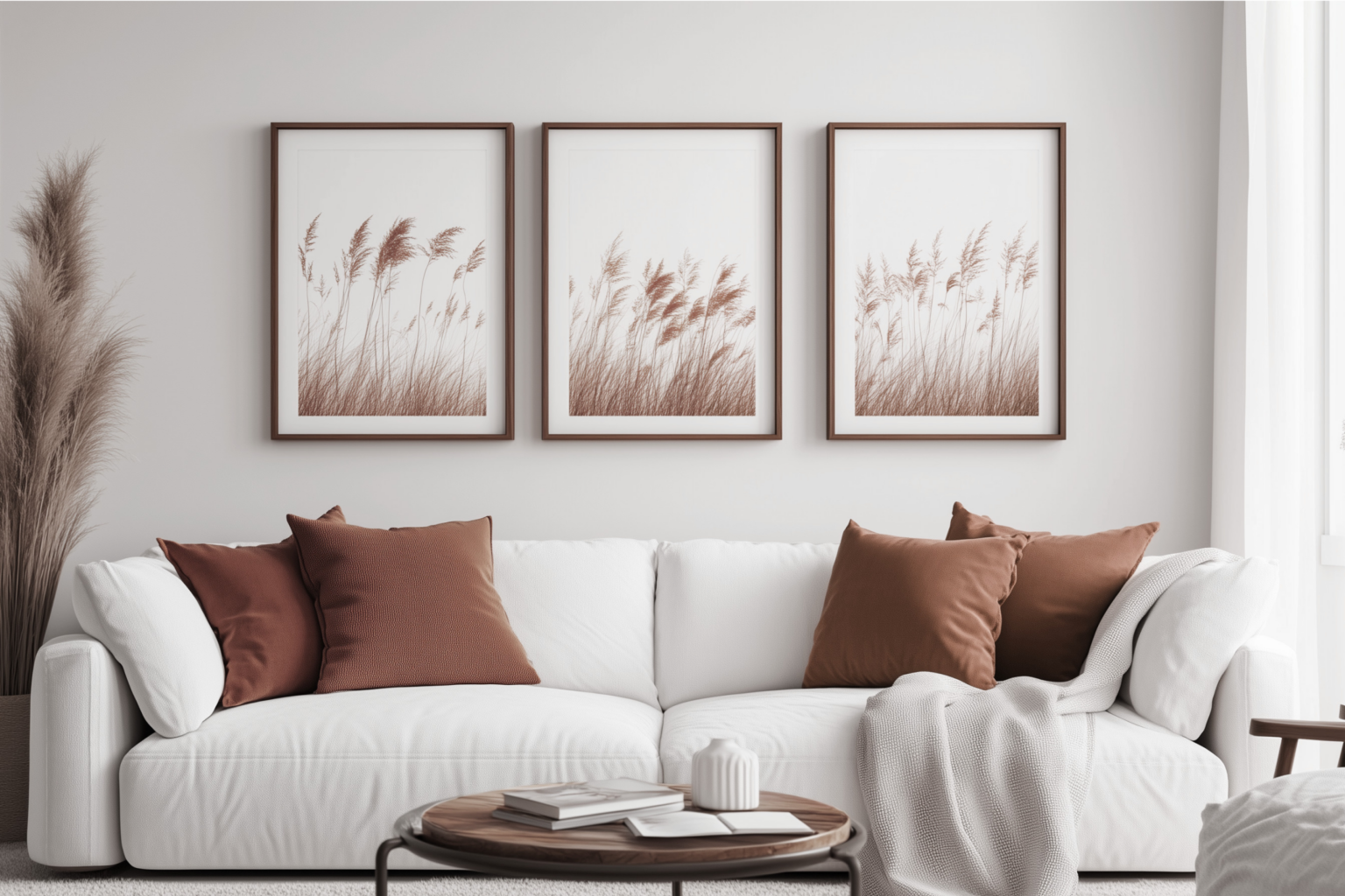
- Wall art that wows. Bring serene energy to life with abstract prints or nature-inspired illustrations on canvases, posters, or framed designs.
- Stationery staples. Design notebooks, planners, or journals with Encore as the base, accented with soft lavender or metallic gold for an upscale touch.
- Tech accessories. Think print-on-demand phone cases, laptop sleeves, or mouse pads. Feature ultramarine backdrops with intricate linework or celestial motifs.
With a touch of violet, this stunning shade captures both modern sleekness and familiar comfort, making it a versatile favorite for modern living.
Turn color trends into products and earn

Easily create and sell custom-printed products, from clothing to home decor, branded with your unique designs and inspired by 2025 color trends.
- Sign up. Create a free Printify account to access our Catalog of over 1,000 high-demand products.
- Design your items. Use our beginner-friendly Product Creator to add your designs to a product or create a new design from scratch.
- Decide where to sell. Printify easily integrates with many popular eCommerce platforms and marketplaces, streamlining order listing and order management.
- Focus on what’s important. Turn your attention to marketing and making sales while Printify does the rest.
Color trends 2025: FAQ
For 2025, Mocha Mousse by Pantone leads the way. Its earthy elegance resonates across design and branding, blending comfort and elegance. Shades like Benjamin Moore’s Cinnamon Slate and WGSN’s Future Dusk also capture the essence of this year’s trends.
Gen Z gravitates toward bold yet soothing tones, such as Heathered Plum and muted yellows. They also embrace earthy, eco-conscious colors like sage green and ultramarine shades such as Valspar’s Encore.
The 2025 color trend balances rich, grounding hues like Mocha Mousse, Elderton, and Rumors with vibrant tones like Sunset Coral and Crocus. This mix of earthy and brighter palettes reflects a shift toward sustainable, optimistic, and timeless styles.
Trending colors for 2025: Summary
2025 is shaping up to be a vibrant year in design, with color trends that mix timelessness with a fresh, playful energy.
Warm tones like Mocha Mousse and accents like Sunset Coral reign supreme. This year’s palette offers endless possibilities for creating compelling designs that resonate with the sustainable values of modern audiences.
Whether you’re reimagining logos, refreshing your product lineup, or styling your POD collections, the 2025 colors exude versatility and charm. Start designing and let these trending hues bring your creations to life!