

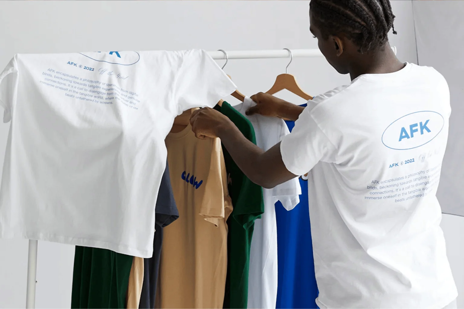
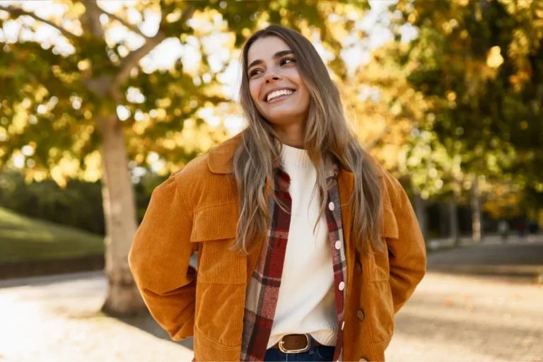
Picking the right t-shirt colors can determine whether a design gets ignored or added to the cart. To help you maximize profits, we looked at our top-performing t-shirts and current color trends to see which shades actually drive sales.
Here are the most popular t-shirt colors that keep orders coming in.
What color t-shirts sell the most? 5 Evergreen picks

1. Solid black
Customers keep coming back to black tees because they’re easy to wear and style. Black works with almost any design and fits into everyday outfits without much thought.
Best for: Brand merch, streetwear, event tees
Design and printing tips:
- Bright colors and bold statement designs pop on black t-shirts. Think red, white, or yellow ink for striking contrast.
- When using direct-to-garment (DTG) printing, remove black elements from your artwork. The printer skips ink wherever the design and fabric share the same tone.
Try it on:Gildan 64000
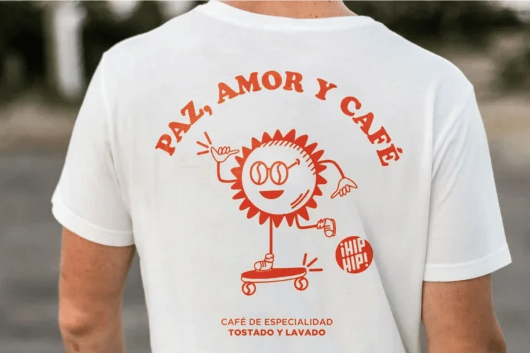
2. Crisp white
The classic white tee follows just behind black in print-on-demand (POD) sales. It’s an excellent blank canvas for vibrant graphics.
Best for: Casual everyday wear, corporate uniforms, custom gifts
Design and printing tips:
- DTG t-shirt printing skips white ink on white fabric, so remove any white elements from your custom t-shirt design and use the garment itself as the lightest tone.
- Embroidery works well for minimalist logos on white t-shirts because thread colors show clearly.
Try it on: Bella + Canvas 3001
3. Navy blue
The navy blue t-shirt outlasts most color trends because it sits in a rare middle ground – dark enough for sophisticated branding, yet familiar enough for casual wear across various age groups and skin tones.
Best for: Corporate merch or school apparel
Design and printing tip: This versatile color works with both cool and warm ink color combinations. White and light blue keep it professional, while mustard yellow or burnt orange push it toward a bolder, stylish look.
Try it on: Gildan 5000
4. Pepper
Pepper sits between black and charcoal gray. It looks softer than solid black, giving t-shirt designs a more relaxed, worn-in feel.
Best for: Vintage fashion trends and streetwear brands
Design and printing tip: Pepper’s worn, faded character makes it a natural canvas for retro-style graphics, vintage typography, and washed-out artwork.
Try it on: Comfort Colors® 1717
5. Ivory
This classic t-shirt color runs warmer than white and lighter than soft cream. It’s neutral enough to suit various styles, from bohemian designs to minimalist wellness brands.
Best for: Nature-themed prints and everyday basics
Design and printing tip: When using DTG, incorporate rich and intense shades in your artwork so the printed design doesn’t appear washed out against the light base.
Try it on: Comfort Colors® 3023CL
2026 t-shirt color trends: Earthy and nature-inspired palettes

6. Transformative Teal
Teal sits between deep green and cool blue, and this hue is having a moment. Pinterest Trends shows growing interest in this bold shade since the start of the year.
Best for: Sustainability-focused labels and coastal lifestyle shops
Design and printing tip: Yellow and orange tones often clash with the fabric’s cool blue undertones, so stick to lighter, neutral contrasting colors.
Try it on: Bella+Canvas 6004
7. Sand
This trending color is easy to wear every day, yet polished enough to make any t-shirt design look intentional.
Best for: Vacation-ready styles and laid-back outdoor vibes
Design and printing tip: Avoid pastel graphics. Lighter shades tend to disappear against the warm neutral background.
Try it on: Gildan 5000

8. Pistachio
As Harper’s Bazaar notes, pistachio is one of 2026 ’s standout color trends. Lighter than olive green, deeper than mint, and more vibrant than sage, this shade feels fresh without trying too hard.
Best for: Spring and summer product releases
Design and printing tip: Handwritten and organic-style fonts feel at home on pistachio, as the light, airy tone gives off a soft, relaxed look.
9. Amber Haze
Amber Haze is a radiant color that looks richer and more golden than mustard yellow, making it easier to wear on a wider range of skin tones.
Best for: Fall fashion drops
Design and printing tip: This t-shirt color already stands out, so use darker shades to make simple designs clear without clashing with the shirt.
10. Espresso
As search interest in espresso brown keeps rising, this trending t-shirt color is moving from coffee shop aesthetic into mainstream apparel.
Best for: Fall-winter drops and minimalist branding style
Design and printing tip: The rich yet neutral tone does most of the visual work, so a simple, bold design is all you need to make an impact. Minimalist logos and clean typographic designs work well on this dark background.
High-energy and bold colors for 2026

11. Butter yellow
Softer than bright yellow and more wearable than citrus, butter yellow ranks among the most popular colors to cycle every spring and summer.
Best for: Warm weather drops, playful lifestyle brands, trendy apparel stores
Design and printing tip: Navy blue and deep green ink work well on this warm yellow base, giving designs a slightly retro look.
12. Persimmon
One of Pinterest’s 2026 colors of the year, this bright shade brings bold energy to any trendy t-shirt lineup without being too over-the-top.
Best for: Streetwear and festival tees
Design and printing tip: Persimmon is a strong color, so simple t-shirt designs work best. Use bold shapes, large text, or a single monogram to let the color stand out.
13. Poppy red
WhoWhatWear crowns poppy red as a trending color for the year. It looks brighter than burgundy and stronger than tomato red, making it bold enough to carry a full seasonal collection on its own.
Best for: Holidays like Christmas and Lunar New Year
Design and printing tip: A red t-shirt already makes a bold statement, so white ink is your strongest ally. It balances the rich and intense shade while keeping logos, slogans, and graphic designs fully legible.
14. Festival Fuchsia
As one of the year’s standout hues, this vibrant, unapologetic pink is louder than blush but more polished than neon. Easy enough for daily wear, bold enough to own the spotlight.
Best for: Party and event merch
Design and printing tip: Cropped and fitted shirt styles sell well in fuchsia. Buyers who reach for this color are usually dressing for an event or a night out.
15. Cobalt blue
Richer than royal blue and more saturated than navy, cobalt is a cool color that’s been dominating fashion runways.
Best for: Maximalist, fashion-forward brands
Design and printing tip: White or orange ink stands out the most on cobalt. Use contrasting designs like a city skyline silhouette across the chest or headline-style typography.
Muted tones and neutral t-shirt colors
16. Cloud Dancer
As Pantone’s 2026 Color of the Year, Cloud Dancer is a lofty, billowy white with warm undertones.
Best for: Clean aesthetic drops and premium basic tees
Design and printing tip: The t-shirt color psychology behind it is straightforward – in a noisy visual world, a clean, quiet base tone signals calm and intentionality. Pair it with muted ink colors like sage, dusty rose, or warm taupe to carry that feeling through the design.
17. Charcoal gray
Charcoal gray is consistently sought after year after year with no signs of fading.
Best for: Everyday basics and smart casual outfits
Design and printing tip: Charcoal gives colorful and detailed designs more contrast than pure black, keeping smaller elements crisp.
Try it on: Shaka Wear SHMHSS
18. Athletic Heather
Athletic Heather is one of the best t-shirt colors for sellers who want to create a relaxed, sporty look that customers can wear all day – from their morning coffee run to an afternoon gym session.
Best for: Fitness and activewear brands
Design and printing tip: Because Athletic Heather is often made of a cotton-polyester blend, DTG prints appear slightly softer than on 100%cotton. Bold, high-contrast designs hold up best and stay legible across the textured surface.
Try it on: Bella+Canvas 3511
19. Muted clay
Sitting between blush and terracotta, this trendy color suits any occasion that calls for pink without being loud.
Best for: Valentine’s Day drops or bridal merch
Design and printing tip: Avoid bright white or icy blue, as they can clash with the warm shirt color. Use off-white or cream instead for a softer, more natural look.
20. Burnished Lilac
Pantone describes Burnished Lilac as a tinged, smoky lavender. It’s not bright or flashy, giving it a more subtle, vintage feel.
Best for: Premium basics, baby showers, garden events
Design and printing tip: Keep your design simple. A small chest logo, delicate script, or single botanical element suits the quiet luxury vibe of this color far better than an oversized graphic.
How to choose t-shirt colors for your design
Does your t-shirt color suit your typography style?
Even the most common shirt colors, like black, white, or navy, need the right ink to make text readable.
How to match text color with your t-shirt:
- High contrast makes text easy to read. Avoid pairing too-similar colors together if you want to maintain high visibility.
- Test how different fonts for t-shirts look in your chosen shade. Larger text can survive on lower-contrast combinations, but small or thin lettering needs a significant color difference to stay legible.
- If you can’t read the design within three seconds at a normal distance, adjust the font size, color, or t-shirt color.
Does your ink color match your fabric composition?
Ink color combinations behave differently depending on the fabric composition and decoration method, which directly affect print sharpness, color accuracy, and durability.
For example:
- 100% cotton works best with DTG printing, absorbing ink well for clean details, smooth gradients, and solid color payoff – especially on light-colored shirts.
- Cotton-poly blends produce slightly softer results with water-based printing methods like DTG, while DTF printing offers more consistent color vibrancy across blends.
- Polyester shines with sublimation printing, producing vibrant, sharp results that won’t peel or fade.
How to adjust your ink color combinations:
- Avoid small details or thin lines on blended fabrics.
- Tweak your design complexity to match the fabric and print method.
- Choose lighter shirts when printing on blended fabrics to keep colors visible.
Does the color palette hold up in mockups and in real life?
Mockups help you see how a design might look, but colors often appear different on real fabric. Lighting, texture, and how the ink sets can all change the final result.
Order a physical sample before going live. It’s the best way to confirm that the shirt color, print quality, and overall look all work the way you intended.
Which popular t-shirt colors work best for your brand?
The best t-shirt colors for your brand depend on your niche, target customers, and how your designs show up on fabric. Here’s a simple guide.
- Streetwear brands: Black and charcoal gray create a bold, high-contrast base. These shades make graphics stand out quickly, helping designs grab attention in social feeds.
- Corporate and team merch: Navy blue and white keep logos clean and readable. Plus, navy hides stains better than lighter shades.
- Lifestyle brands: Customers love white, ivory, and sand for everyday outfits. These colors layer well with other pieces, driving repeat purchases over time.
- Outdoor and eco brands: Pistachio and olive green connect directly to nature-focused branding, helping products feel more authentic to eco-conscious buyers.
- Youth-focused brands: Bright colors like light blue, mustard yellow, or neon green attract attention quickly and perform well for trendy designs.
- Wellness brands: Muted tones like soft cream, sage, and dusty pastels create a calm, minimal look that fits self-care and premium positioning.
When to update your color offerings
To keep your catalog aligned with demand, check sales every 90 days. Remove slow sellers and replace them with seasonal t-shirt colors to reflect current color trends. Test new shades in small batches, then restock the ones that sell out quickly.
FAQ
Ready to pick your winning t-shirt colors?
The most popular t-shirt colors perform best when they align with your design, brand identity, and customers’ preferences.
Core shades like black, white, and navy drive steady sales – customers use them for everyday wear and pair them easily with existing outfits. Meanwhile, trending colors help new seasonal collections stand out.
Want to start a t-shirt business? Sign up to Printify for free, choose a customizable t-shirt from our Catalog, and launch your first design in minutes.


