

Ever wonder why some t-shirt designs instantly stand out while others fall flat? Intense-contrast pairings like white ink on a black t-shirt ensure legibility, while analogous schemes offer a subtle, premium feel.
This guide breaks down the technical reasons why specific shirt colors work with certain inks, covering color theory and printing physics. We’ll also cover the 15 best t-shirt and ink color combinations to help your custom apparel designs pop.
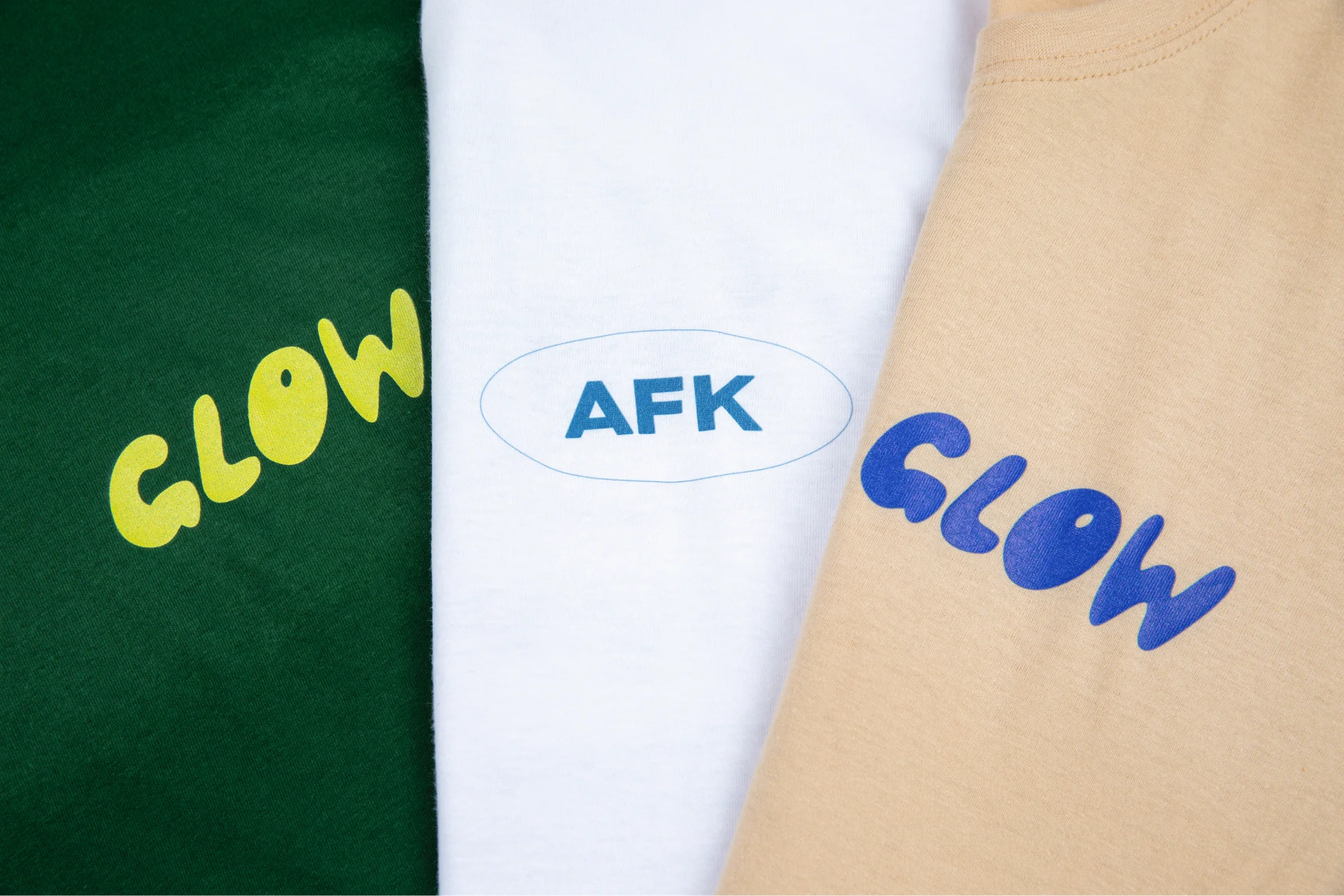
T-shirt and ink color combination cheatsheet
Use this table to identify high-contrast combinations that guarantee your t-shirt design remains readable from a distance.
Shirt colorBest ink color (contrast)Best ink color (subtle)BlackWhite, bright yellow, neon greenCharcoal, dark redWhiteBlack ink, navy blue, forest greenPastel pink, sky blueNavy blueWhite ink, gold, bright orangeLight blue, silverRedWhite, black, yellowMaroon (tone-on-tone)Heather greyBlack, navy, royal blueWhite (vintage look)GreenWhite, cream ink, orangeForest green, dark grayYellowBlack, navy blue, redWhite, light orange
Using the color wheel for t-shirt design color combinations

The color wheel consists of three primary colors (blue, red, and yellow), three secondary colors (orange, purple, and green), and six tertiary colors.
Strategic ink color combos rely on the geometric relationship between these shades to create visual interest.
- Complementary colors: These sit opposite each other on the wheel, such as blue-orange pairings. They provide the highest visual tension, making a t-shirt design pop against its background.
- Analogous colors: These utilize different shades located next to each other. For example, using light blue ink on a royal blue shirt creates a harmonious, sophisticated look.
- Triadic color schemes: This method uses three colors evenly spaced on the wheel. It produces colorful designs that remain balanced rather than chaotic.
High-contrast shirt and ink combination choices improve legibility. In custom apparel, understanding how light ink interacts with darker shades prevents muddy prints and ensures the final product matches the digital mockup.
Quick tip
Always design in CMYK mode. While RGB displays vibrant colors on screens, screen printing and digital transfers use cyan, magenta, yellow, and black. Converting early prevents dull results when the physical t-shirt arrives.
15 Popular t-shirt and ink color combinations for 2026
1. Black shirt and yellow ink

A black t-shirt paired with yellow ink provides one of the highest levels of contrast. This combination mimics safety signage, naturally drawing attention. It works exceptionally well for team uniforms or bold, minimalist designs where the text must be readable from far away.
Merchants often use this for gym apparel or bold streetwear because the yellow maintains its vibrancy against the dark fabric without requiring a heavy underbase.
2. Black shirt and white ink

The white ink on black t-shirt combo is the industry gold standard. It offers a striking contrast that suits any niche, from intricate designs with thin lines to bold typography.
Because white ink is neutral, it fits most brand identities. For the best results, use proper layering and curing techniques to achieve full opacity on dark garments, and apply low-bleed inks when printing on polyester to prevent dye migration.
3. Navy shirt and white ink

A navy blue t-shirt with white ink gives off a professional, collegiate aesthetic that feels more premium than standard black. Consider it for corporate merchandise and casual wear.
The white ink provides a crisp, clean finish that stands out sharply against the deep blue. This pairing is particularly effective for nautical themes and sleek branding.void overly bright tones that might be too overwhelming – unless that’s what your customers want.
4. Navy shirt and yellow ink

Combining a navy blue shirt with yellow ink utilizes near-complementary colors to convey vibrant energy. This color combo is synonymous with functional athletic wear and sports fan gear.
The warmth of the yellow cuts through the coolness of the navy blue, ensuring that logos and player numbers are immediately identifiable.
5. Red shirt and white ink
A red t-shirt with white ink is a classic high-energy pairing, popular for restaurant merch or promotional events. The white ink provides the necessary contrast to balance the intensity of the red fabric.
To maintain the pop, ensure the printing process includes a thick underbase so the red dye of the garment doesn’t turn the white ink pink.
6. Blue shirt and orange ink

This pairing is a direct application of color theory using complementary colors. A blue shirt with bright orange ink creates a visual effect that makes the t-shirt design jump off the fabric. This combination is popular in tech branding and modern streetwear.
The orange ink provides a warmth that light colored inks often lack. Merchants use this pairing to createa distinct, high-impact energy that looks curated.
7. Blue shirt and gold ink
Using a royal blue shirt with gold designs signals luxury. This is a frequent choice for membership clubs, anniversary editions, and high-end team uniforms.
The gold ink adds a level of dimension that standard bright colors cannot achieve, while the deep blue enhances the shimmer, making those custom shirts stand out at events.
For the best result, use a high-pigment gold or a metallic finish. This ensures the design reflects light, creating a premium feel that justifies a higher retail price.
8. Olive shirt and gold ink

Olive green serves as a neutral base for earth tones. When paired with gold, it creates a rugged, outdoor aesthetic that’s trending for lifestyle brands focusing on camping, hiking, or vintage styles.
- The gold provides enough light ink contrast to be readable without the harshness of pure white.
- The muted green fabric complements the warmth of the gold ink, resulting in a cohesive garment that looks better as it ages.
This pairing feels organic and grounded, making it perfect for brands that prioritize a natural or heritage-inspired look.
9. Maroon shirt and white ink

Maroon provides a rich, dark backdrop that makes white ink look exceptionally crisp. This shirt color combination is often used for university apparel and autumn-themed collections, providing an elevated lifestyle feel.
The white ensures that even intricate designs remain visible against the deep red fabric. Because maroon is a heavily saturated color, a high-quality underbase is essential. This prevents the dark red fibers from tinting the white ink, keeping your t-shirt colors sharp.
10. Green shirt and gray ink
For a subtle, low-contrast look, pair a forest or olive green shirt with gray ink. This is a tonal design choice that works well for large, illustrative t-shirt designs where the art should blend into the garment.
It’s a staple for streetwear brands that prioritize texture and mood over raw contrast. The gray ink offers a sophisticated, understated finish that looks intentional, expensive, and refined.
11. Green shirt and white ink

This is one of the best t-shirt color combinationsfor eco-friendly branding and athletic merchandise.
Whether using a mint green or a deep forest shade, the white tone provides a fresh, organic feel that resonates with health and wellness audiences.ntion to details. Whether you’re aiming for vintage athletic styles or modern streetwear, this combo delivers.
12. Orange shirt and black ink
This is the ultimate high-visibility ink combination. Black ink on a bright orange shirt is impossible to miss, making it a functional choice for workwear and event staff.The black absorbs light while the orange reflects it, creating a striking contrast for text-heavy designs.
Beyond safety gear, this pairing is popular for high-impact streetwear and seasonal merchandise, especially Halloween.
13. Mustard shirt and red ink
Mustard yellow with red ink creates a vintage 1970s aesthetic that’s increasingly popular in indie retro shops. These earth tones work together because they share warm base pigments, resulting in a garment that feels worn-in and nostalgic.

It’s a perfect choice for vinyl record store merch or heritage brands that want to avoid modern, clinical color palettes. The red ink provides enough contrast to be readable while maintaining the warm, analog feel of the mustard fabric.
14. Mustard shirt and navy blue ink
Pairing mustard with navy blue ink offers a sophisticated twist on the classic primary color palette. The deep navy blue grounds the brightness of the mustard, creating a balanced, academic look.
This is an excellent choice for custom apparel that needs to look smart and curated rather than just promotional. Merchants often use this combination for boutique labels or coffee shop merchandise.
15. Heather gray shirt and black ink
A heather grey shirt with black ink is the most versatile color combo in the print-on-demand industry. Thetextured heather grey fabric hides wear and sweat, while the black ink provides a timeless finish. It’s a safe bet for any merchant starting their first t-shirt line.
Because of the blended fabric, the black ink often sits on the surface, appearing darker and more consistent. This pairing works for everything from corporate logos toartistic illustrations, making it a must-have for any apparel store.
Why your t-shirt colors look different in print
Digital mockups can be misleading because they don’t account for the physical printing method. The way fabric fibers interact with pigment affects the final ink color combos.
Ink absorption
On 100% cotton, ink penetrates the fibers deeply, resulting in a matte finish. However, on poly-blends (like heather grey), the ink sits on top of the synthetic fibers. This makes bright colors appear more vibrant on blends, while pure cotton offers a softer feel.
The underbase factor
When printing light ink on dark shirts, printers must first apply a flash layer of white that acts as a primer. Without a proper underbase, royal blue ink on a black shirt would disappear or become muddy.
The quality of this base layer determines how much your t-shirt colors pop.
Printing methods
Choosing your t-shirt color combinations is only one part of the process. You need to make sure your design and combo fit the printing method for the best results.
- DTG (direct-to-garment): Works like an inkjet printer. It excels at intricate details and gradients on cottonfabrics, but results can vary across different shirt colors and poly fabrics. Small dark text and minimalist designs on darker colors might not be fully readable.
- DTF (direct-to-film): Involves printing designs on a film and heat-pressing it. This creates a flexible plastic-like layer that produces extremely vibrant shades, like white ink and neon green, regardless of the base fabric.
- Sublimation: Actually dyes the fibers so that designs become part of the garment itself. This works best on light-colored t-shirts made of 100% polyester. It produces the most durable designs, but cannot print white. If you have a white part in your design, it will appear transparent, showing the color of the t-shirt.
Quick tip
Read our guide on the best digital printing techniques to find the best match for your shirt color combinations.
Common color-matching t-shirt mistakes
Even seasoned professionals can ruin a t-shirt design by ignoring how fabric and light interact. Whether you’re building a brand or making team uniforms, avoid these four technical errors to ensure your tees look professional and remain readable.
Light ink on light shirts
Printing white on a light blue tee or cream on a white t-shirt results in poor legibility. From a distance, the design disappears into the fabric. To fix this, always maintain at least a 40% difference in value (darkness vs lightness) between the shirt and the ink.
Dark ink on dark shirt colors
Using navy blue ink on a black t-shirt results in colors bleeding together. Unless you’re intentionally going for a stealth look that’s only visible under bright lighting, designs will not be legible.
If you want a subtle look, use dark gray ink on black instead, as the slight value shift looks more intentional.
Overcomplicating with too many ink colors
Every additional ink color increases the risk of misalignment and raises production costs in traditional screen printing. Meanwhile, although base costs are fixed with Print on Demand (POD), intricate designs with 12 different colors can look muddy once printed on the garment.
If you’re a beginner still testing out designs, limit your palette to three or fourhigh-impact colors for the best results.
Ignoring the vibration effect
Combining high-saturation bright colors like a red t-shirt with neon green ink causes a visual vibration that is physically uncomfortable to look at. This happens when two colors have the same chroma or intensity.
To fix this, darken one color or lighten the other to achieve a more balanced palette.
Picked your colors? Create a t-shirt with Printify
Ready to turn these t-shirt and ink color combinations into a thriving business? Printify makes it easy to start selling.
Transform your t-shirt design ideas into physical products using the Product Creator. Browse our Catalog of 100+ shirt colors, styles, and materials, then apply artwork to see how different analogous colors or neutral tones interact with the fabric.
Once ready, place an order or list your colorful designs online through our eCommerce integrations. After a customer pays, we’ll print, package, and ship your t-shirt creations directly to them – no hassle on your end.
T-shirt ink and color combinations: FAQ
To summarize
Understanding t-shirt and ink color combinations is crucial for achieving stunning results on your custom apparel.
By utilizing contrast, incorporating color theory, and understanding how different printing methods handle light ink, you can make your own t-shirts that look as good in person as they do on screen.
Start your journey today by choosing a t-shirt from Printify’s Catalog and launching your first design.


