

Shirts with writing on them consistently dominate print-on-demand sales because they require no illustration skills, can be produced in any color, and can be scaled across dozens of products.
In this article, you’ll learn how to create a text design for clothes – from planning a message, choosing fonts, and arranging layouts to preparing files and launching via Printify. The tips apply whether you use Photoshop, Illustrator, Canva, Figma, or built-in tools.
Key takeaways
- Strong text designs for t-shirts start with a clear message, audience, and niche. Think "teacher shirts for back-to-school 2026." The same principles apply to hoodies, sweatshirts, and kids' apparel.
- Font pairing, hierarchy (which words stand out), and alignment are the three fastest ways to make simple text look professional on clothing.
- You can test quotes and slogans digitally using print-on-demand tools like Printify before investing in inventory, reducing risk to zero.
- Your print method – DTG, heat transfer paper, DTF, or embroidery – directly affects how thin lines, small text, and colors render on fabric.
- A step-by-step workflow from idea to mockup to sample order helps entrepreneurs quickly launch profitable shirt designs online.
What makes a great text design for clothes?
A great text design earns its place on a shirt through three things: readability, personality, and a smart match between the words and the wearer. Whether you're building a t-shirt for a business, brand, team, or personal occasion, the same elements matter.
Key ingredients to focus on:
- Font choice – bold, playful, elegant, or handwritten. Pick a style that represents what you want the shirt to feel like at first glance.
- Contrast – dark letters on light fabric, or light letters on dark. Weak contrast kills readability.
- Layout and spacing – give the letters room to breathe. Cramped text loses impact fast.
- Personality – add icons, illustrations, or small elements around the text to make it feel unique.
- Placement – center chest, sleeve, back panel, or pocket. Where the text sits changes the whole vibe.
- Print method – DTG, DTF, embroidery, or ink transfers each render text differently. Match the technique to the design.
Ready to make one yourself? Let's look at six steps to help you create a text design.
Step 1: Define your message, audience, and apparel type

Before you open any design tool, write down your concept in one sentence. Here is how to get it right:
- Define the message. Summarize the purpose: "funny dog lover t-shirts for Etsy customers in the US and UK in 2026." This guides tone, word choice, and style.
- Know your audience. Different niches respond to different energy. Fitness fans want bold, condensed letters ("LIFT HEAVY"). Bachelorette parties lean toward script and fun flourishes. Teachers prefer punchy, relatable words. Let the person's identity drive your inspiration.
- Pick the apparel type early. A classic unisex tee, a women's fitted shirt, an oversized streetwear piece, a hoodie, or a kids shirt each have different printable areas and silhouettes that affect text size and placement.
- Consider the occasion. Event shirts (family reunions, summer 2026 weddings), corporate merch for a company team, or evergreen quotes for an online store each require different longevity and design concepts, and choosing a theme helps shape the wording and overall direction for event, cause, or aesthetic-based apparel.
- Match text length to the product. Short, punchy slogans of one to three words work best with large bold fonts. Longer phrases or block text can add life to a design, but need strong hierarchy and spacing to avoid a cramped look.
Step 2: Choose fonts and pair them effectively
T-shirt font choice is the fastest way to transform a basic shirt design into something that looks premium. Here are the main categories in simple terms:
Category | Example | Best for |
|---|---|---|
Sans Serif | Montserrat, Oswald | Clean, modern designs. Sans-serif fonts lack tails on letter ends, giving a streamlined look. |
Serif | Playfair Display | Elegance, heritage, vintage themes. |
Script / Handwriting | Brush script styles | Personal, emotional, feminine tone. |
Display / Decorative | Retro, bubble, stencil fonts | Impact and novelty-use sparingly. |
When pairing, use one dominant font for impact words and a simpler font for supporting text.
- Combining serif and sans-serif fonts creates visual contrast in designs.
- Pairing script fonts with sans-serif fonts delivers a softer contrast that suits feminine or wedding t-shirts.
- For sports or gym shirts, try a bold sans alongside a condensed sans.
Limit yourself to two or three fonts per design to keep things clean.
How to make important words stand out
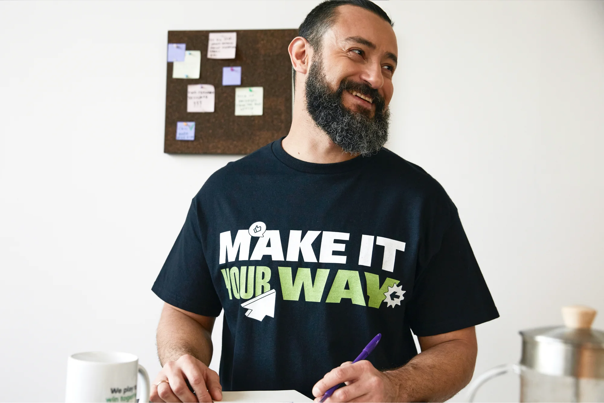
Hierarchy is what separates interesting designs from forgettable ones. Decide which one to three words represent your primary message, then make it the largest element in the design to enhance visual hierarchy. Use larger fonts to make important words stand out, for example, DAD at triple the size of the surrounding tagline.
Specific tricks that work:
- Size shift. Stack words like GOOD / VIBES / ONLY and increase the size of VIBES so it commands attention.
- Weight change. Set one word in bold and the rest in regular weight.
- Style switch. Write one emotional word in a script font while keeping the rest in a modern sans serif.
- Color contrast. Render one word in a different color (red among white, for example) so it pops. Ensure the design still prints cleanly on cotton fabric.
Acknowledging and utilizing negative space in typography can also form hidden shapes or symbols, adding a cool layer of detail that rewards a closer look.
Common font mistakes to avoid on t-shirts
- Overused novelty fonts and too many font styles at once make a design look amateur. Simplicity wins.
- Extremely thin scripts vanish after printing. Successful designs avoid excessively thin lines and overly detailed effects.
- Low-contrast combinations like dark gray text on black t-shirts are nearly invisible unless the subtle effect is deliberate.
- Text too small on chest prints is a common wrong move, especially on textured fabrics like heather blends.
Testing designs for readability from six feet away is essential in apparel printing. Zoom to 100% on screen or print on paper at actual size before finalizing.
Step 3: Plan your layout, alignment, and spacing

Great shirt design is as much about layout and composition as it is about the words themselves. A well-structured layout can personalize even a simple phrase into something people want to wear.
Common text placements on apparel include chest, sleeves, and back. Strategies for text placement include large center text or pocket-sized text on the left chest. Here are popular layouts to consider:
- Centered stacked text – the classic slogan tee. Align design elements for better visual balance by snapping to center guides.
- Badge or circular text – adds a vintage or official feel.
- Left-aligned lines – looks more modern and editorial.
- Mixed text with small icons – adds visual interest without overwhelming the message.
Break long phrases across lines so the message reads naturally and fills the printable area. Leave breathing room around text – white space prevents prints from feeling cramped, especially on small sizes like XS t-shirts. Use rulers and grid snapping in your design tools to keep everything balanced.
Quick tip
Read our design placement guide for inspiration and explore all the proper ways to personalize a cool outfit.
Filling empty space with simple graphics
Minimal additions keep costs down and readability high. Add small icons, lines, or shapes that support the text without turning the design into a graphic-heavy piece:
- Hearts for love quotes, dumbbells for gym shirts, paw prints for pet designs, or simple stars for kids' apparel.
- Bold shapes and lines, such as geometric patterns, create a modern look when paired with clean sans-serif fonts.
- Keep icon styles consistent with the fonts – hand-drawn elements for script, clean icons for modern type.
You can't go wrong with tiny additions, they are usually safest for print-on-demand pricing and readability across sizes.
Step 4: Choose colors that print well on fabric

Colors look different on fabric than on a backlit screen. Start with basic contrast rules: contrast is essential, light text is required on dark garments, and vice versa. High-contrast color combinations improve text readability on clothing, and using vibrant high-contrast colors enhances text visibility across garment types.
- Your design must consider the garment color. MAMA in white on dusty rose feels soft, while the same word in black on sport gray reads bolder.
- Limiting the color palette to 1-3 colors often yields better designs that are versatile and cost-efficient.
- Trending now: Vintage off-white ink on washed black tees and pastel text on cream shirts remain popular in 2026.
- High-contrast colors ensure text stands out against garment colors. Always preview mockups in multiple shirt colors (black, white, sand, navy) before listing.
Color considerations for different print methods
- DTG (direct-to-garment) and DTF (direct-to-film) handle full-color gradients and photo-quality detail well, making them ideal for complex color work.
- Screen printing is best for vibrant and long-lasting clothing designs with solid, limited palettes. Fine detail under about one point or text smaller than eight to ten points can become inconsistent.
- Heat transfer paper allows printing images onto fabric with bright solid colors, but the texture can feel heavier on large text blocks.
- Sublimation doesn't like white. It will end up transparent, so add text in a different shade during your design process.
- Embroidery adds texture and a premium feel to text designs, worth considering for small chest logos or brand marks.
Avoid extremely low-opacity text and subtle gradients that may not translate on cotton t-shirts.
Step 5: Prepare print-ready files before you add text

Even beautiful text designs can print poorly if the export settings are wrong. Here is what to get right:
- Resolution: 300 DPI at actual print size. A 12 × 16-inch chest print at 300 DPI equals 3600 × 4800 pixels.
- File format: Transparent PNG for DTG and DTF workflows. Utilizing vector formats (AI, EPS, PDF) ensures high-quality printing without losing detail, especially for screen print and vinyl.
- Convert text to outlines in Illustrator or similar vector tools so missing fonts never cause rendering issues across devices.
- Organize layers clearly-main text, accent text, icons-so you can adapt the design for hoodies, kids shirts, back prints, or sleeve placement.
- Quick preview test: Print the design on standard paper at 100% scale with a home printer. If you can read every word from a few steps back, the file is ready.
Step 6: Use Printify to launch and scale your text designs

Print on Demand removes inventory risk entirely. You only pay when a customer places an order, letting you test multiple text designs with no upfront stock. Here is a simple workflow:
- Sign up for free and browse our Catalog for clothing.
- Click Start designing to launch the free Product Creator.
- Upload photos, personalize patterns, and add text directly on the tool with our multi-language and emoji-friendly Text Editor.
- Preview mockups and click Save.
- Place an order or connect Printify to your online business (we integrate with big players like Etsy, TikTok Shop, Shopify, and more).
Once you link a store and publish your designs online, we take care of the rest. When a customer buys from you, the order automatically goes to the Print Provider, who prints, packs, and ships it to their doorstep.
Printify offers the largest Catalog in Print on Demand with t-shirts, dresses, hoodies, kids' apparel, and more, with various fits and colors.
Choose Print Providers by region (US, EU, UK) to drop shipping times and increase margins. A/B test different versions of the same text design. Swap a font, change a color, write an alternate slogan – all without extra risk thanks to the no-inventory model.
Tips for testing and improving your text designs over time

The best-selling shirt designs rarely come from the first attempt. Treat each launch as a board for gathering data:
- Survey real customers or social media followers on which text layouts, quotes, or colorways they prefer.
- Use store analytics-click-through, add-to-cart, conversion-to search for patterns in which text designs resonate.
- Rotate seasonal designs (Valentine's Day, graduation, Halloween, Christmas 2026) while keeping evergreen best-sellers live via Printify.
- Update old designs with new fonts, improved spacing, or fresher color palettes as trends evolve. Of course, templates and posters you created for social promotion should be refreshed to match.
- Order physical samples periodically to check print quality, color fidelity, and readability of smaller text on actual fabric.