

While most people think of placing hoodie logos on the center chest or left chest, those aren’t your only options – and they’re not always the best ones.
Sleeve prints, back logos, neck labels, and even seam-to-seam patterns can completely change how a hoodie looks. The right logo placement affects visibility, wearability, and how people perceive your brand.
In this hoodie logo placement guide, we’ll break down the most effective placements and how to choose the right logo size for your design goals.
Key takeaways
- Proper logo placement improves brand recognition and makes hoodies more appealing to buy.
- Popular hoodie logo placements include the center chest, left chest, back, sleeves, neck label, and full-coverage repeated patterns.
- Strong hoodie designs balance impact and wearability. The best placements support the brand’s message and positioning without overwhelming the garment.
- To find the right hoodie logo placement and size, consider how the hoodie fits and who it’s for.
- Color contrast, fabric texture, printing method, hoodie style, and overall branding all influence how clearly a logo appears when printed.
- Check the print area, garment size, and maximum print size before publishing, especially when adapting one design across adult, youth, fitted, and oversized hoodie styles.
Why hoodie logo placements matter
One of the most common hoodie design mistakes new print-on-demand sellers make is underestimating logo placements. A design that works on one hoodie style falls flat on another, so it��s essential to think beyond the artwork itself and focus on where that design lives.
Whether you’re starting your own clothing brand or designing corporate apparel, a smart logo placement strategy can:
- Increase brand awareness. With proper placement, your hoodie logo stays visible from a distance, supports brand recognition, and helps your designs stand out in everyday wear.
- Shape brand perception. A large, center chest logo can signal confidence and boldness, especially when paired with eye-catching graphics. Smaller, more discreet placements lean subtle and sophisticated.
- Make a simple garment more desirable. Thoughtful logo placement improves visual balance and makes the hoodie more appealing to wear. When a hoodie looks good, it’s easier to sell and more likely to become a repeat purchase.
What’s the standard hoodie logo placement? Guide for beginners
Not all hoodies are created equal. Instead of a single standard, most brands rely on a set of popular logo placements that balance visibility and style.
Use this section as a quick logo placement guide for the most common front, back, sleeve, neck, and all-over options.
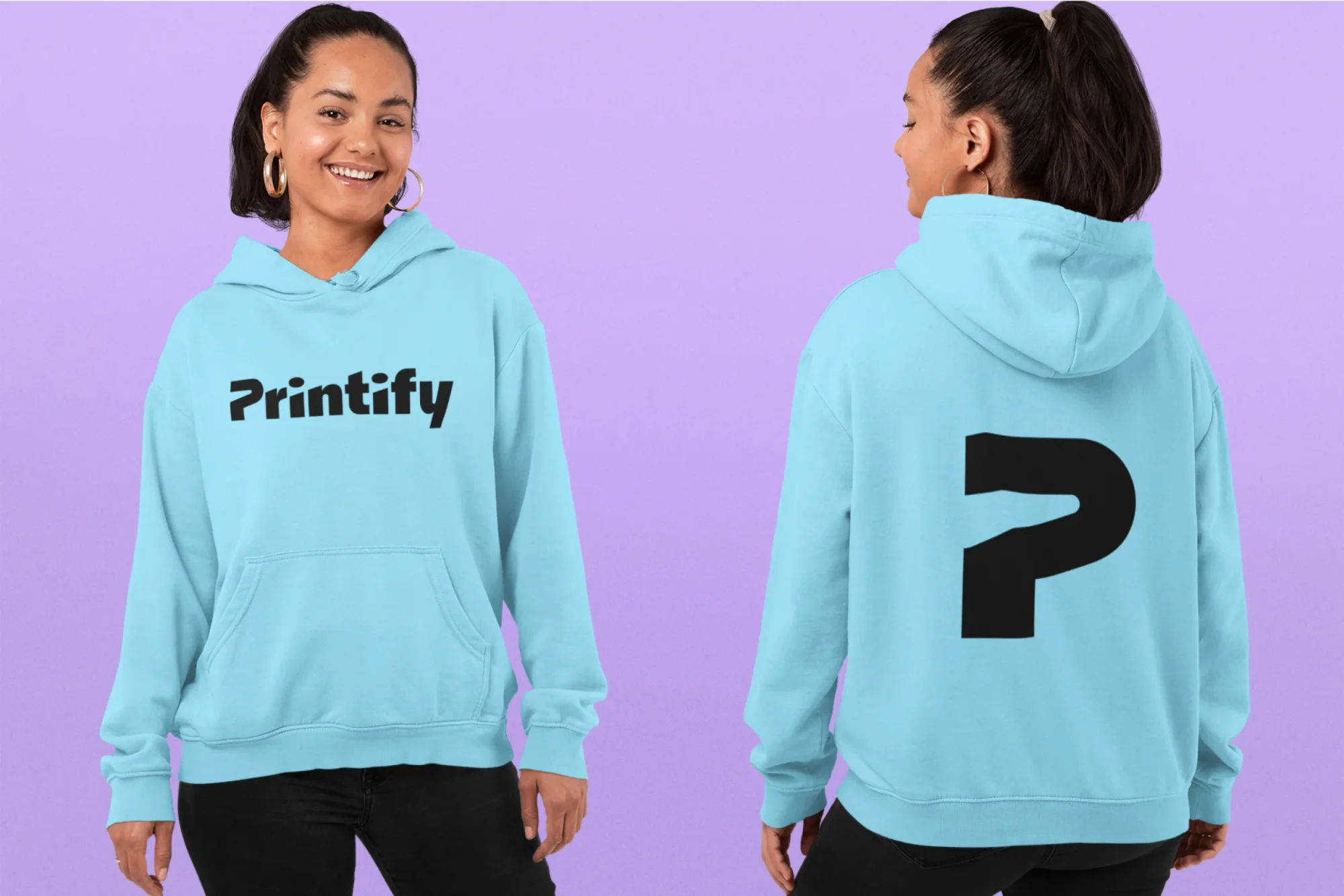
Center chest placement

Positioned across the middle of the chest, this print placement creates a clean, symmetrical look that’s easy to spot. The logo sits front and center, making it one of the strongest options for immediate brand recognition.
You’ll often see the center chest logo placement on sports hoodies, where bold branding and clear visibility matter. The uninterrupted front panel gives the design room to stand out without competing with seams or closures.
Ideal for: Large or medium-sized logos, especially wordmark-style designs.
Why it works:
- It keeps brand visibility strong by giving the design one clear, central focal point.
- A straightforward option that works well on its own, without needing additional design elements.
- Since the center chest area wrinkles less than the lower front, the logo stays readable at all times.
- Works well for screen printing, DTG, and DTF when the design needs a larger, easier-to-read front placement.

Left-chest logo placement on hoodies and left-hest logo size

The left-chest placement is another classic choice, especially for brands that prefer subtle branding over bold statements. This print placement feels intentional without dominating the entire design.
For most hoodies, a typical left-chest logo size runs around 3-4 inches wide. Size down for fitted or women’s styles, and test the final scale on a sample hoodie before selling.
It’s especially common on premium hoodies, where clean aesthetics and versatility are more important than maximum visibility.
Ideal for: Symbols or icon-based logos that remain readable at smaller sizes.
Why it works:
- Creates a classic, understated look that suits professional custom apparel.
- A reliable option for zip-up hoodies, where the logo can sit on one side of the vertical line.
- Excellent for embroidered designs, where stitching adds a premium, textured look.
- Left-chest placement is great when you want subtle branding that still reads as put-together, not like an afterthought.
Back logo placement

Typically positioned on the upper back, just below the shoulder seam, this print placement offers a large, uninterrupted area that gives designs plenty of room to breathe and allows for bold lines.
Use the shoulder seam as a visual reference point, but don’t place the design too high. Leave enough space between the hood and upper-back artwork so the hood doesn’t cover the logo when worn down.
Because of the available space, a back logo placement works well for large logos and more complex designs. You’ll often see it in sports teams, promotional products, and streetwear styles, where visibility from behind is just as essential.
Ideal for: Large logos or detailed artwork that benefits from extra space.
Why it works:
- Plenty of room for intricate details that wouldn’t fit well on the chest.
- Draws attention in motion – adding a dynamic design to the hoodie.
- Leaves space on the front for subtle branding while letting the back do the heavy lifting.
- Good for bold graphics or large artwork that just doesn’t fit on the chest.
Sleeve print logo placement

This logo placement fits right into current hoodie branding trends, especially in streetwear. Instead of competing with the front or back, it adds detail along the right and left sleeves, giving the hoodie a modern look.
Sleeves offer a narrower print location, so it’s important to consider the design placement, size, and readability. Logos can run vertically along the custom apparel sleeve, higher on the upper arm, or closer to the sleeve cuffs for a unique twist.
Ideal for: Small, icon-based or wordmark logos.
Why it works:
- Reinforces the brand’s identity without overpowering the hoodie.
- Pairs naturally with subtle left or right chest placements to create a balanced design.
- Extends branding beyond traditional front and back placements.
- Sleeve logos work well as a supporting element: think sleeve prints, vertical graphics, or secondary logos that back up the main front or back design without competing with it.
Neck label logo placement

The neck label – both inner and outer – offers a subtle yet effective way to place a logo without competing with the main design.
Outer back neck logos sit just below the hood seam and stay visible when the hoodie is worn up. Inner neck labels are inside the collar area, which aren’t visible once the hoodie is worn.
Ideal for: Subtle branding with small logos.
Why it works:
- Outer neck label – adds a stylish accent that shows when the wearer uses the hood.
- Inner neck label – creates a clean finish that pairs naturally with sizing or care information.
Zip-up hoodie logo placement

Zip-up hoodies require extra design considerations because the zipper line creates a natural break down the center of the garment.
For this reason, logo placements usually work best on one side of the chest, positioned away from the vertical line, or split symmetrically across both sides of the hoodie.
Ideal for: Small to medium-sized logos that don’t depend on a continuous, uninterrupted front surface.
Why it works:
- One-sided chest placement – keeps the logo readable whether the hoodie is zipped or unzipped and avoids distortion caused by the zipper line.
- Split design placement – creates a balanced, intentional look when the hoodie is fully zipped, as long as the alignment is precise.
- Left or right logo placement both work, since they avoid crossing the zipper and steer clear of the off-center placements that can throw off the layout.
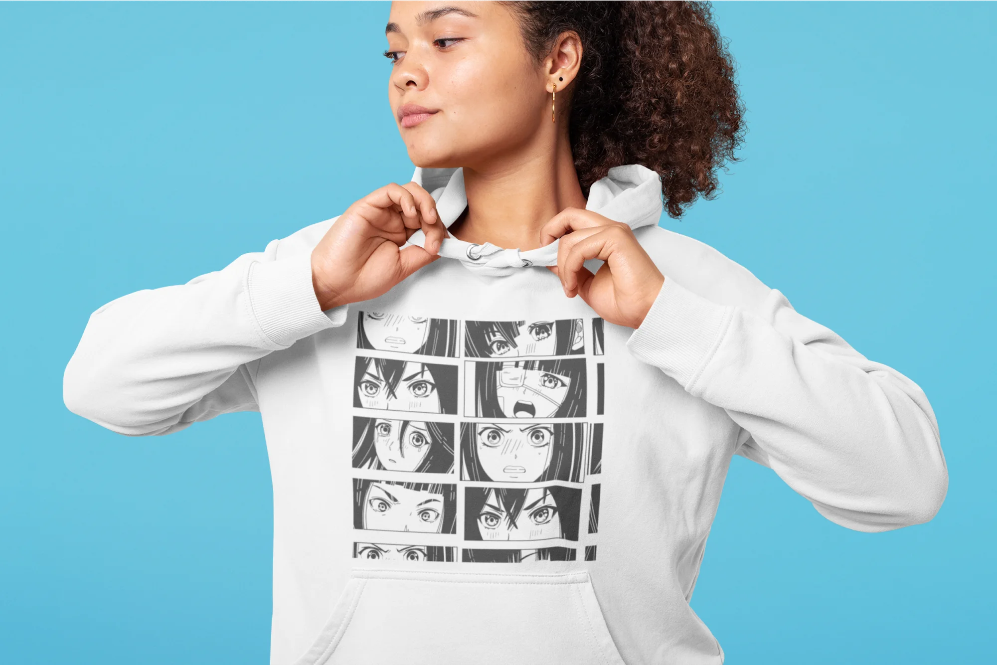
Seam-to-seam (including hood) placement

Instead of placing a single logo in one spot, this approach turns the design into a repeating pattern that runs across the entire hoodie, covering the shoulder seams.
It’s a unique hoodie logo idea that uses the all-over print technique, where artwork is applied to fabric panels before cutting and sewing the garment.
Because of this, logos need to repeat evenly and have clean seam alignments across panels to maintain a cohesive look.
Ideal for: Icon-based logos that work well as a pattern.
Why it works:
- This design placement delivers a bold, fashion-forward look that looks good from every angle.
- Excellent for limited drops and statement pieces.
- Allows creative flexibility – for example, keeping the logo pattern across the body while using solid or complementary colors on the sleeves, hood, or pocket for contrast.
Let’s talk size: Hoodie logo placement guide
The logo size requires just as much careful consideration as the placement. Too small, and the design gets lost. Too large, and it can overwhelm the hoodie and throw off the overall design.
The best size depends on the hoodie design placement, print area, garment size, and how the logo will look when the hoodie moves, folds, or stretches.
How to find the perfect hoodie logo size
The right logo size depends on how the hoodie fits and who it’s for. Consider these factors:
Hoodie style
Oversized hoodies give designs more room, so larger logos usually look balanced. Fitted or lightweight hoodies benefit more from smaller logos that don’t crowd the garment.
With zip-up hoodies, logo width matters even more, since designs can’t cross that center seam without breaking the visual flow.
For pullover hoodies, watch the pocket height before placing artwork low on the front. For dark hoodies or textured fleece, use higher contrast and simpler artwork to keep the logo visible.
Keep in mind that placement shifts slightly between sizes – a small and a 2XL hoodie will look differently since placement is done by hand. That’s exactly why checking the actual garment matters more than trusting a mockup alone.

Logo type
Wordmarks need enough space to stay readable, especially from a distance. Icon-based logos scale down more easily and still look clear at smaller sizes – making them a safer choice for subtle placements like the left chest or sleeve.
Fit and audience
When creating matching hoodies for different demographics, avoid using the same logo size for all. For example, youth hoodies usually need logos scaled down by 20%-30% to keep proportions balanced.
When in doubt, simply order a sample hoodie. Seeing the logo on a real garment beats guessing from a screen and helps you catch sizing issues before selling.
Custom apparel production method
Decoration method affects proper placement. DTG and DTF printing can handle larger print areas and detailed artwork, while embroidery works better for smaller logos, thicker fabrics, and cleaner shapes.
If we’re talking embroidery placement guides, start with left chest, sleeve, or outer neck positions: stitching stays controlled and premium-looking.
What is the best size for a logo on a hoodie?
If you want a quick rule of thumb, think in terms of logo placement first, size second.
Front and back placements generally support larger logos because they offer more surface area. Smaller placements – like the left chest, sleeves, or neck label – work best with scaled-down designs.
The goal isn’t to hit a specific measurement, but to choose a size that stays readable and maintains visual balance on the hoodie.
Once you’ve decided on placement and overall scale, use the size chart below to lock in the exact measurements.
Hoodie design size chart: Visual guidelines
Placement | Recommended size |
|---|---|
Left chest | 3-4 inches |
Center chest | 5-7 inches |
Full back | 8-12 inches |
Sleeve | 2-3 inches wide |
Neck label | 1-2 inches |
Seam-to-seam | 3-7 inches (repeated pattern) |
Hoodie logo visibility and placement tips

Consider the hoodie color and fabric
Color scheme and fabric choices directly affect logo visibility, so placement decisions should always account for how the hoodie will look once printed. To make sure your logo stands out, keep these guidelines in mind:
- High color contrast allows logos to remain visible even in smaller placements, such as the left chest, sleeve, or neck label.
- Lower contrast combinations often work better in larger placements, such as the center chest or back, where size helps maintain visibility.
- Smooth fabrics like cotton or polyester blends help logos appear sharp and defined across most placements.
- Textured fabrics, such as fleece, can soften fine details, which makes simpler logo shapes a safer choice.
- Think of it as strategic placement: chest for recognition, back for impact, sleeve for detail, and outer neck for a small branded accent.
- To visualize placement before ordering, preview the hoodie mockup from the front, back, and side. This helps you catch scale issues, hood coverage, and pocket interference.
These factors also tie directly into hoodie printing techniques. Most logos work well with direct-to-garment (DTG) or direct-to-film (DTF) printing, since both handle color gradients and fine details well on smooth fabrics.
Embroidered logos, on the other hand, perform best on thicker fabrics and smaller placements. However, the color options are more limited.
For consistent embroidery results, avoid tiny text, thin lines, and overly detailed artwork. Keep the logo simple enough for repeatable placement across sizes, especially if you plan to sell multiple hoodie styles.
Heat transfer vinyl also works for simple shapes and names, but large vinyl areas can feel heavier on a hoodie.
Want to handle screen printing yourself? It’s a legit option, but it’s messy and time-consuming to get right, which is exactly why most sellers let Printify’s Print Providers handle it, following the same screen print placement guide principles covered here. That’s the beauty of Print on Demand: you get professional results without buying equipment or holding inventory.

Position logos based on hoodie style
Different hoodie styles come with built-in design considerations. Pullover hoodies feature a kangaroo pocket, so keep that pocket height in mind from the sizing section above. Zip-up hoodies need the same zipper awareness we covered earlier: don’t let the zipper interrupt the design, or use a split layout that leans into it.
Think of your branding
If you want your brand to feel clean, reliable, or professional, choose placements that don’t dominate the hoodie – like the left chest. This makes the hoodie feel polished, understated, and easy to wear every day.
If your goal is to stand out, placements like the center chest, back, or seam-to-seam designs can make a strong impression.
Secondary placements, such as sleeves or outer neck labels, signal attention to detail, giving the hoodie a more intentional feel.
Examples of effective hoodie logo placements
These examples show how well-known brands use logo placement, size, and visibility to reinforce their brands’ message and overall style.
Nike: Known for its iconic swoosh, Nike often places its logo on the left chest. This slightly off-center position maintains a sleek look that aligns with its athletic brand image.
Avoid common placement mistakes
Even strong artwork can fail when the placement works against the garment. Use these placement tips to avoid common mistakes before you publish.
- Don’t place the logo too low on a pullover if a kangaroo pocket cuts into the front panel.
- Don’t stretch one logo size across adult, youth, fitted, and oversized hoodies without checking proportions.
- Don’t cross the zipper line unless the split design looks intentional.
- Don’t use tiny text on sleeves, textured fleece, or embroidered areas.
- Don’t rely on mockups only – order a sample when the logo size or placement controls the whole look.
Catch these before you hit publish, and your hoodie design looks intentional instead of accidental.

adidas: In adidas hoodies, logos often appear on the center chest or back, creating strong visibility that works equally well for casual wear and sports apparel.

Supreme: This streetwear brand often opts for a bold back print across the shoulder blades or sleeve logos, making a bold fashion statement and providing maximum visibility.

How to put a logo on a hoodie with Printify
Want to sell your own branded custom hoodies with minimal setup? With over 2,000 customizable products and more than 70 Print Providers worldwide, Printify makes it easy to design and start selling hoodies – no inventory required.
Here’s how to get started:
- Create a free Printify account and start browsing our Catalog. You’ll find everything from kids’, unisex, and women’s hoodies to embroidered styles and bold all-over print options.
- Upload your logo in the Product Creator, test different placements, adjust the size, and add extra design elements using our graphics library or AI image generator.
- Preview realistic mockups to see how your logo placement and size look before publishing the product.
- Order a sample hoodie to review the final result, or connect your online store and start selling right away. Printify integrates with Shopify, Etsy, Amazon, eBay, and more.
Want to print a logo on a hoodie fast? Start with one main placement – center chest, left chest, or back – then layer in sleeve or neck details once the base design works.
Frequently asked questions (FAQ)
Conclusion
With this hoodie logo placement guide, you now know how print location, size, and decoration method work together to shape how your hoodie looks, feels, and sells.
No matter which hoodie design placement you choose, the goal stays the same – keep your logo visible, balanced, and aligned with your brand’s message.
Ready to step up your hoodie game? Turn your ideas into real products with Printify. Flexible logo placements and on-demand production mean no inventory and no upfront costs, just hoodies ready to sell.