

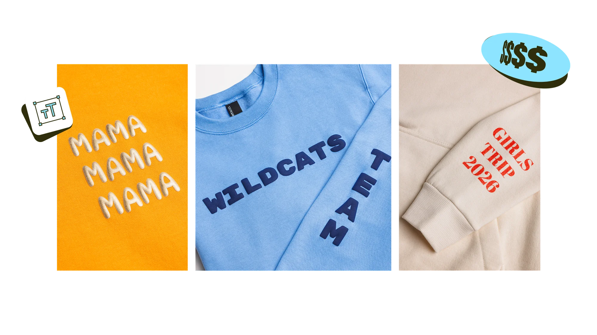
Your complete guide to Printify’s textured and metallic finishes.
If you’ve been selling print-on-demand apparel for a while, you’ll notice that flat prints are starting to blend into one another. Even with original artwork, your designs can end up buried under a wave of similar-looking listings.
Specialty prints change that. Puff, metallic, and glitter give you something different: designs customers can actually feel, not just look at.
Printify now offers puff, metallic, and glitter prints across a select range of apparel, so you can expand your store without switching print-on-demand services. This guide walks you through what each specialty print does and how to choose the best font for each production method.

Specialty printing methods explained
Specialty printing is a decoration method that goes beyond flat printed graphics. Each of the three techniques below uses a different printing technique to display logos or artwork on your apparel.

What is a puff print?
A puff print is a specialty heat-transfer decoration that achieves a raised, 3D foam-like effect on fabric.
During production, the puff ink expands when heated and rises off the garment surface. This creates a soft, spongy texture that customers can run their fingers over. Puff print transfers hold up on cotton, polyester, and blended fabrics.
Use this technique to create puff print shirts with bold slogans, statement sweatshirts, streetwear graphics, varsity lettering, and holiday product ranges where texture takes center stage.

What is a metallic print?
A metallic print is a precision-cut heat-transfer vinyl decoration that produces a sleek, high-luster finish.
The vinyl is cut to the artwork’s shape, weeded, and heat-pressed onto the garment, bonding to the fabric for lasting durability. This creates a reflective, liquid-metal finish under any light source. Printify offers up to 10 metallic shades, giving designers a large range to work with.
Metallic print is great for logos, monograms, text-based art, and anything positioned as elegant or high-end. It also suits special occasions like anniversaries or wedding day, where the premium finish makes the product feel gift-worthy.

What is a glitter print?
A glitter print is a precision-cut heat-transfer vinyl decoration that delivers a bright, sparkling finish with real surface texture.
The glitter vinyl sheet is precision-cut to the shape of your logo or artwork, weeded to remove the excess material, and heat-pressed onto the garment. The vinyl bonds to the fabric, locking the embedded glitter particles in place. Printify offers up to 19 glitter shades.
Print-on-demand glitter prints are great for collegiate-style lettering, bachelorette shirts, holiday drops, or dance and cheer teams where glitter-print t-shirts are the uniform’s whole personality.
What to keep in mind with specialty print designs
Before adding specialty-printed products to your online store, take a minute to look at the design criteria for these methods. Knowing what the Product Creator accepts up front can help you decide which finish suits each design.


Text-based artwork only
Currently, Printify’s specialty prints support text, not uploaded images. You’ll create your design or logo directly in the Product Creator using a font from the available list.
If you already have an image-based logo file, specialty prints work best as a complement to it – not a replacement. For example, you could add a tagline in metallic on the hoodie chest area, a signature phrase in puff on a t-shirt front, or a name or initial in glitter down a sleeve.
When you need to print your logo file itself, stick with direct-to-film (DTF), direct-to-garment (DTG), or embroidery instead.

One text element per placement
Each print area accepts only one text-based artwork. You can’t stack two designs as separate elements in the same space. If you want a slogan above a name, both need to be part of the same text element.

Multiple placements per product
Most apparel products offer four print areas: front, back, left sleeve, and right sleeve. Use as many or as few of these spaces as your design calls for.
A puff print t-shirt might carry a bold center graphic and a smaller logo on the sleeve, while a hoodie can have all four for a more cohesive look.
Quick tip
For products that already offer DTF printing, the specialty print’s sizes and areas are the same.

Curved text is supported
You can arc your text along a curve for logos, badges, and collegiate-style artwork. This is useful for varsity lettering, event merch, and anything with a circular or crest-based layout.

Minimum font size
Font size minimums differ by specialty print method:
Puff print: at least 88pt
Metallic and glitter prints: at least 36pt (roughly 0.5" tall or 150px at 300 DPI)
These minimums apply to font weights 400 through 800. Anything smaller risks getting flagged during quality checks. Some lines get too thin to hold up under puff expansion, too small to read in glitter, and too fine to reflect cleanly in metallic.
Chapter 3
Why font choice matters more for specialty print

With flat DTF or DTG printing, you can achieve a design on the garment that closely captures what you see on your computer screen.
Specialty prints work a bit differently. Puff ink expands during curing, which can slightly reshape your artwork. Metallic and glitter vinyl transfers hold the shape you designed, but the reflective sheen or sparkle texture changes how the design reads on the garment.
That’s why it’s important to plan your font choice around what will physically hold up, not just what looks good in the Product Creator. It’s the difference between a puff print sweatshirt that reads as premium quality and one that comes back from production looking muddy.
A note on font eligibility
The Product Creator lets you pick from a wide range of fonts, but not every one prints well on specialty methods. As a general rule, stick with bold, relatively large text that has enough space between and within the letters.
This article presents a shortlist of our top picks. If your favorite font isn’t listed, apply the same principles: heavier weight, wider letterforms, and no fine detail.
Chapter 4
Puff print fonts
Puff print is the most demanding of the three specialty methods, so its font rules set the baseline for the others. Get puff right, and your artwork will translate cleanly to metallic and glitter, too.

How puff print affects lettering
A t-shirt font can behave very differently on a puff print than it does on screen. The ink expands during curing, so strokes swell, and the type displays with a heavier, softer weight than the file you designed.
That expansion has three consequences:

Thin strokes bleed, lose their crisp edges, and turn soft or muddy.

Small ornamental features – thin crossbars, tapered ends, decorative flourishes – can vanish into space.

Condensed letterforms close up. The negative space inside letters like e, a, o, and g shrinks once the surrounding strokes expand into it.
The fonts that bring out the best in puff have bold weight, chunky letterforms, and consistent stroke width from one side of a letter to the other. If a font looks like it was drawn with a heavy marker rather than a fine pen, it's a strong candidate for puff.
Puff print specifications
If you decide to use puff print, plan your design with these specs in mind so the finished product matches your expectations closely.
Specification | Minimum or maximum | Why it matters |
|---|---|---|
Gap between elements | 0.125” (3 mm) minimum | Prevents expanding ink from merging adjacent letters into a single blob |
Solid area | 3.94” x 3.94” (10 cm x 10 cm) maximum | Anything larger puffs unevenly, cracks over time, and holds up poorly through washes |

Recommended fonts for puff print
The table below lists ten fonts that hold up under puff production.
Font | Category | Why it works for puff |
|---|---|---|
Anton | Sans-serif / display | The thick strokes stay clean when the ink puffs up |
Bebas Neue | Sans-serif | The same thickness all the way through – no thin spots to bleed |
Black Han Sans | Sans-serif | Heavy and even – fantastic for bringing puff prints to life |
Bungee | Display | Wide, blocky letters with lots of surface for the ink to puff evenly |
Rubik Mono One | Sans-serif | Every letter is the same width and weight |
DynaPuff | Display | The letters are styled like a puff-print artwork |
Abril Fatface | Display | Heavy enough that even the serif details hold up once the ink rises |
Luckiest Guy | Display | Chunky and slightly slanted with no tiny details that could get lost |
Titan One | Display | Like Anton, but a bit wider in style |
Passion One | Display | Narrow but still heavy, so letters stay open when they puff |
Softer and festive picks for puff prints
If your brand leans playful rather than bold and edgy, these three fonts still puff cleanly while keeping a friendlier feel:
- Fredoka Bold. Rounded and approachable, a strong fit for children’s apparel.
- Comfortaa Bold. Geometric and rounded with an even stroke.
- Righteous. Slightly retro with a rounded shape – fantastic for lifestyle brands and everyday wear.

Fonts to avoid for puff prints
Font | Why skip it |
|---|---|
Oswald Light, Barlow Condensed Light | Thin and narrow strokes that can bleed together and lose their shape |
Lobster, Lobster Two, Oleo Script | The stroke changes thickness within each letter |
Any Thin (100) or Extra Light (200) weight | The strokes are too thin to meet the 0.125” minimum |
Chapter 5
Metallic print fonts
Where puff print vinyl needs bold strokes, metallic needs even strokes that consistently reflect light.

How metallic print affects lettering
Any inconsistency in how the font is drawn shows up in the metallic reflection. Take a classic serif font – the vertical strokes are thick, but the horizontal strokes and the serifs are much thinner.
On screen, that contrast reads as elegant. In metallic, the thick parts catch the light differently from the thin parts, so a single letter can look patchy or unbalanced.
The fonts that work best for metallic have an even stroke from top to bottom and side to side. If a font looks at home engraved into a metal surface, it’ll usually work in metallic print.
Recommended fonts for metallic print
The table below lists ten fonts that can bring your metallic prints to life:
Premium editorial picks
If you want to showcase a more refined, designer feel – wedding day gifts, special occasion wear, small-batch drops – check out these three serifs:
- Cinzel Decorative. A more ornate version of Cinzel.
- EB Garamond Bold. Classic serif proportions with controlled thick-thin contrast.
- Spectral Bold. Refined serif that features an even stroke at heavier weights, excellent for premium positioning.
Fonts to avoid for metallic print
Font | Why skip it |
|---|---|
Lobster | Thick strokes and thin strokes sit right next to each other in every letter – the reflection breaks up unevenly |
Lobster Two | The script-style letterforms don’t reflect light consistently |
Oleo Script | The calligraphic strokes read as patchy once they catch the light |
Galada | Decorative display font with strokes that change thickness across each letter |
Playball | Flowing, script-adjacent letters with varying stroke widths |
Chapter 6
Glitter print fonts
Glitter print showcases sparkle across the entire shape of your design, so the surface area matters a ton.

How glitter print affects lettering
Instead of the design being drawn onto the fabric, the glitter vinyl sheet is cut to the shape of your letters and pressed on. Since every part of that shape is filled with sparkle, there’s no space for fine detail to breathe.
That’s the trade-off with glitter designs. While the sparkle drives sales, it also flattens the artwork into a single textured surface.
You’ll achieve the strongest glitter results with fonts that are big, bold, and simple in shape. Think signage or varsity lettering scaled to match the print’s size.
Recommended fonts for glitter print
If you plan to sell specialty glitter products, these fonts are your safest bet – heavy and wide enough that the sparkle fills every letter evenly.
Font | Category | Why it works for glitter |
|---|---|---|
Anton | Sans-serif / display | Heavy and consistent, so glitter fills every part of the letter evenly |
Graduate | Serif | Chunky slab serifs with a collegiate feel |
Black Han Sans | Sans-serif | Bold letters that read as solid blocks of sparkle |
Bungee | Display | Wide, blocky, signage-inspired shapes with plenty of space for glitter to fill |
Protest Guerrilla | Display | High-energy display font that works when the glitter itself is the center of the design |
Abril Fatface | Display | The bold serifs add elegance instead of getting lost in the sparkle |
Bebas Neue | Sans-serif | Works best for single-word or short-statement designs |
Black Ops One | Display | Military stencil look, suitable for edgy glitter artwork |
Fjalla One | Sans-serif | Bold and condensed – stays legible in glitter even at smaller sizes |
Russo One | Sans-serif | Geometric bold with no thin elements |
Collegiate and varsity picks
If your store is all about event or sports merch, these three fonts look fantastic with glitter:
- Graduate. The go-to varsity font, ideal for sweatshirt and hoodie glitter designs where the lettering is the whole story.
- Bungee. Sporty and bold, a strong pick for proud team merch or bachelorette weekends.
- Righteous. Slightly retro with a rounded shape, perfect for customers looking for fun glitter pieces.
Fonts to avoid for glitter print
Font | Why skip it |
|---|---|
Thin-serif fonts at Regular weight | The delicate serifs disappear into the glitter texture |
Condensed fonts at small sizes | The arrow letters sit too close together |
Lobster, Oleo Script, and other script-style display fonts | The stroke varies in thickness across each letter |
Chapter 7
Fonts that work across all specialty printing methods

If you want to create and order prints using all three specialty methods, the eight fonts in the table below share the same core traits: heavy weight, consistent stroke width, and no fine detail that would fail under any of the three production processes.
Design once, apply to any specialty print, and the artwork will translate cleanly.
Font | Why it works across all three |
|---|---|
Anton | Maximum stroke consistency that displays well as puff expansion, metallic, or print |
Bebas Neue | A single uniform weight – reliable for any artwork across all three finishes |
Black Han Sans | Bold with no delicate details – a safe pick for logo-style designs |
Bungee | Wide, blocky, and works well for large print sizes |
Abril Fatface | Versatile for various artwork styles – bold for puff, elegant for metallic, and simple for glitter |
Righteous | Consistent, rounded, and retro-style strokes |
Montserrat Bold | Even geometric strokes that yield great results with any specialty print |
Oswald Bold | Narrow but heavy, consistent strokes |
FAQ
Ready to design your first specialty print?
Specialty prints let you expand your product range and stand out in competitive marketplaces. The design rules across 3D puff print, metallic, and glitter come down to what translates from screen to garment: bold weight, consistent stroke, and no fine detail.
When you create specialty-printed products, the Product Creator generates mockups showing the closest representation of the finished piece. To fully see the tactile texture, metallic sheen, or glitter sparkle, we recommend ordering a sample of your first design before listing it.
Sign up with Printify for free today to kickstart your creativity and increase sales with specialty prints!