The purpose of this guide is to help you succeed in making the best print-on-demand products for your eCommerce store. Please closely review and follow these suggestions. In doing so, you and your customers will be much more likely to discover, create, and enjoy the high-quality products that make print on demand so enticing.
The following layout details how to minimize (or even eliminate) issues. Once again, following this guide is a surefire way to guarantee optimal quality.The last thing before you begin, we have a dedicated Merchant Support Team available 24/7. If you have any questions, comments, or concerns, please don’t hesitate to reach out.
Learn more about Print on Demand and starting a print-on-demand business.
5 tips for creating the perfect custom design
Let’s take a look at some precautionary steps you can take to ensure the best possible outcome for your custom design. These are five tips to consider when creating your artwork for printing purposes.
Check out our Terms of Service and Intellectual Property Policy to make sure your designs comply with our guidelines. Our Print Providers will cancel any orders containing prohibited designs.
1. Pick your products and materials carefully
The same design can appear different after printing on two different products. This largely depends on the material printed.
For example, one t-shirt style may have awesome ink absorption, resulting in a sharp-looking finish. However, that same design on another product (maybe a thick hoodie) might appear less intense (DTG prints on blended fabric will look less crisp than on a 100% cotton material).
This discrepancy can be due to the fabric used (cotton, polyester, rayon, blend, etc.), the thickness of the cloth, differences in dying technologies/processes, and other factors.
Our printing partners currently offer direct-to-garment, all-over-print or dye sublimation, heat-press transfer, and direct-to-film printing and decorating methods, which are further explained in the upcoming chapters. Your design will appear slightly different with each technology and method.
Useful articles for picking the right product, material, or printing method
- Direct-To-Garment Printing: A Quick Guide
- Guide to Polyester, Cotton, and Blended Fabrics
- What Is Sublimation Printing
An easy way to dodge this pitfall is to order a product sample before selling. This way, there will be a physical representation of that product and its design.
2. Use high-quality designs
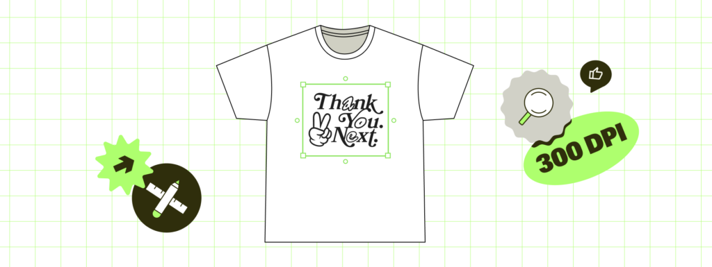
A poor, low-resolution design will almost always produce a low-quality print. Make sure designs are of a high enough resolution to avoid this problem. Also, consider your background color for different styles of products.
Please avoid small details, especially for mugs, as those tend to come out blurry in the final print. While this mainly depends on the product material surface, your artwork should be at least 5 pixels (ideally more).
The Product Creator displays print file requirements for each product once you click the Upload button in the top-left corner. It also shows the resolution of your uploaded design. The design tool has an image enhancer feature, automatically enhancing the print quality before sending it to production.
However, note that this is not a miracle tool that will make low-quality artwork appear flawless. We still encourage you to use high-resolution files since our tool will only enhance the quality slightly to be more suitable for printing.
3. Weigh the difference between digital artwork and photos
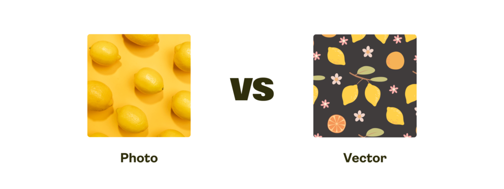
Digital artwork has the potential to look better than a photo. Graphics usually have larger solid color blocks. While photos tend to have more color gradients, mid-tones, and a wider color palette. And those need to be converted into a computer-friendly file. (Our Product Creator supports JPEG, PNG, and SVG formats).
However, we partner with the best printing companies worldwide, who use top-notch equipment to ensure crisp and sharp prints for photos and digital artwork.
4. Mind the bleed area
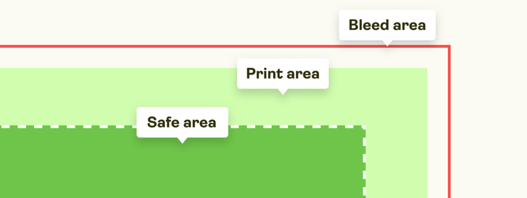
Products have multiple areas within their surface
- Safe Area. White area with a dotted line border where all the important design elements should be located.
- Print Area. The white area on the Product Creator that should be covered with your design.
- Bleed Area. The gray area surrounding the outside of the printable area. Important design elements should NOT be placed there.
! We strongly recommend covering the bleed area with your design. While this area is mostly used for inner seams and other elements not visible to the naked eye, covering it with your design will ensure full coverage and avoid unprinted areas!
Products with the bleed area have downloadable templates where you can check if your design covers the entire surface. Find instructions here.
5. Troubleshoot your text
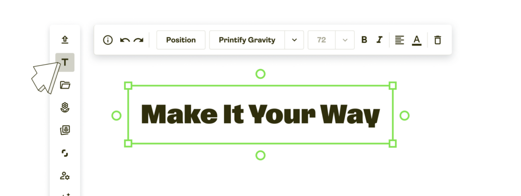
Our Product Creator allows you to add and edit text directly on the product – without uploading it as a separate file. Find the Add text button on the left side and choose among many font and color options. The text editor is multi-language and emoji-friendly.
From different fonts and colors to text size. Modify your message every way you want to create the perfect design for your custom products.
Print file sizing
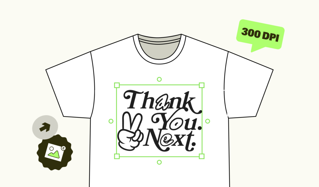
There’s nothing worse than building the perfect design than seeing an error message when trying to put that design on a product. This is what we mean by file sizing. It’s the quality of a design, its ability to be enlarged, translated, or printed without losing quality.
What to consider
The recommended print size of a product is for the entire print area. Prepare the design to fit the recommendations and scale it however you need. Random pictures from the internet can be extra problematic, so we’ve prepared a short list of things to consider when sizing your print files.
Image quality
Image quality can depend on multiple factors. First, is it a photo, scan, or digitally created file? While modern technologies can make nearly anything happen, remember to prepare the best quality images possible. Second, keep in mind lighting, positioning, and other elements that could affect the quality of your print design.
Zipper area
If you don’t want prints to be printed over a garment’s zipper, please avoid that space. The printable area starts two inches for the front and three inches for the back down from the collar (in most cases).
Product sizes
Keep in mind product sizes on the Product Creator. The design will look slightly different on S, L, or XL products. Our product creator shows the L apparel size and allows you to place the design on that size only.
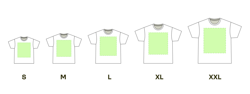
Remember that the distance between the collar and the print stays the same, no matter the size. For this reason, avoid placing the design on or near zippers, pockets, or other places where a cutoff might occur when a smaller size is ordered.
Consult our Help Center article to find out which printing partners don’t offer a scaled-down design version for their products and how to check the print area size for specific product variants.
How to choose the right size for your custom design
Take everything mentioned above into account when creating, uploading, or saving your design. Each printing company and custom product has different file requirements for reaching the best printing result. And those should be your ultimate guide for creating your design.
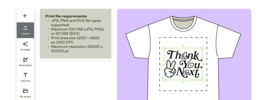
The Product Creator is your best friend for creating designs. It gives clear instructions on file requirements and allows you to customize the design in many different ways.
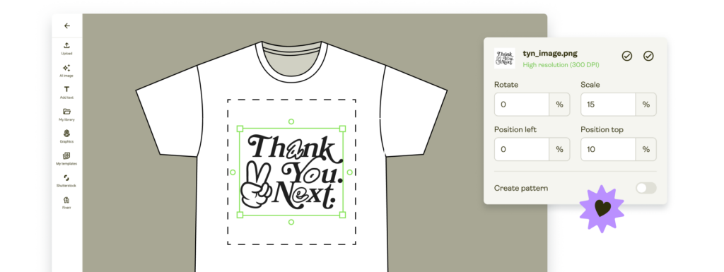
Our team keeps updating the tool and releasing new and useful features, ensuring you an easy and fast design process. From scaling possibilities and alignments to adding text and even creating patterns. Reduce time outsourcing designs and make your own artwork on the Printify platform.
How to upgrade your design
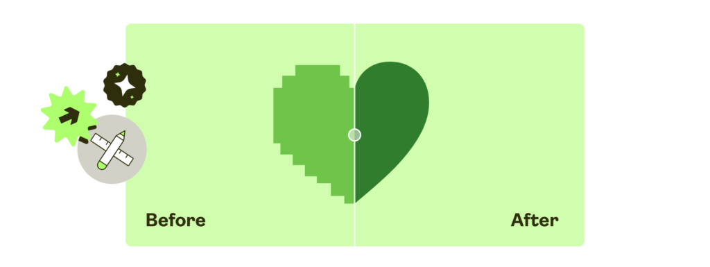
While starting with a high-resolution design is always better, various software can be used to improve things. It’s worth mentioning that these don’t have to be expensive, like Adobe Photoshop or our very own completely free Image Enhancer on the Product Creator.
Here are three solid alternatives for giving a design a boost and checking RGB vs. CMYK colors and color codes.
When a design is created via software, you won’t have a problem resizing (rescaling) it within that program. However, please make sure to export a large image file, so the design has some room to stretch or resize relative to POD products while staying consistent.
Print colors
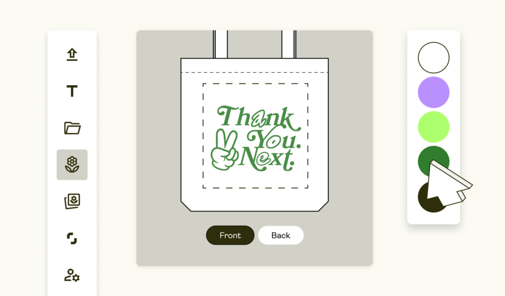
The color spectrum used for printing is less varied compared to what you’ll see on your computer screen. Avoid making brightness a key component of your design since printers won’t be able to reproduce vivid colors precisely.
Although we accept files in different color spaces, our system only works in RGB (red, green, and blue). Please note that we will convert any CMYK (cyan, magenta, yellow, and black) files you upload to RGB.
RGB vs. CMYK
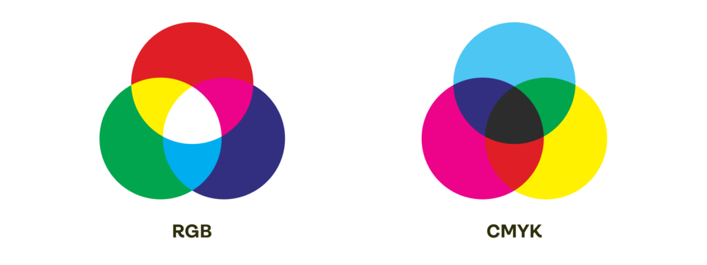
People, computers, and printers view colors differently. The human eye is capable of seeing so called ‘visible light’ – the range of the electromagnetic spectrum between infrared and ultraviolet, that is basically equivalent to the colors of the rainbow.
Computers, on the other hand, are programmed to distinguish different tints and colors of specific red, green, and blue compositions.
And, last but not least, printers operate in yet another coding scheme: cyan, magenta, yellow, and black (CMYK).
If these three perspectives don’t line up correctly, an end product’s print colors will look different from that same item on a computer screen. Learn how to get the best print color to match your vision with the final product as much as possible.
RGB to CMYK
When someone makes or uploads a design with different print colors, the image is saved in computer software as RGB. However, before the design is printed, that RGB format must be converted into CMYK.
This is because, instead of a screen projecting various print colors, the tints we perceive on a garment are only the reflected wavelengths of visible light.
Print colors and what affects them
Our print providers convert the design files to the appropriate color space and profile, depending on their process. Please be aware that physical printing limitations cannot produce the full range of RGB spectrum.
Each printing company uses different software for converting files. Not only that, but their printers, color profiles, settings, and processes also differ. Color inconsistencies are sometimes a problem, especially for DTG printing. So your prints can vary depending on many different factors.
- Printer errors
- Print provider’s workflow
- Garment color and material
- Your monitor settings, and more.
To achieve brighter print colors for your products, consult our guide on RGB vs CMYK.
Here is an example of a common issue in how a computer will display your design and how the garment will look once printed when it comes to color consistency in printing and publishing across the web.
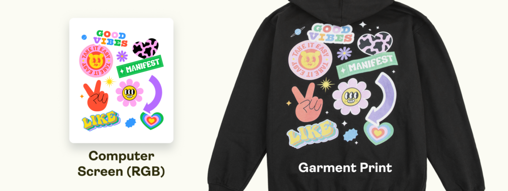
Our Product Creator displays product previews in RGB by default. That means that regardless of the colorspace you use, your design will be converted to RGB once you upload it.
Print Providers usually print in CMYK, but you can check how the product will look after printing with the Product Creator. Preview your creation in both color profiles, check for differences, and fine-tune your designs if necessary.
That way, the final results will be much closer to the mockup without significant color shifts.
These steps are essential for those who prefer using exotic or unique print colors, as they may not perfectly match what you see on a screen.
AOP color limitations
The conversion is not the only aspect affecting your final print. Each print provider uses different equipment for different printing methods, resulting in slight discrepancies in the color, especially for all-over-print (AOP) products.
For example, many of the blank items used – such as tees, leggings, hoods, etc. – are white by default and are then printed on with your colors and designs. As the garment itself is white, putting a pitch-black color or design on top may sometimes translate to a gray/charcoal gray tone. Any intense and dark or bright colors might not come out as vibrant as you’d like.
Why? This is due to the bright ink being unable to fully penetrate white fabric, therefore bringing down the tone’s opaqueness. In short, the white fabric still shows through and makes for a more translucent tone.
Shades of blue
Printing blue and purple tones can be extra tricky since the two are very close within the color spectrum. Both navy blue and dark purple colors are known to shift.
Different shades of blue that are similar to purple tones can be printed as purple shades – and vice versa, due to color conversion. If you’re worried about the final print regarding your blue shades, try adjusting the colors accordingly on your software.
You need to change the color settings to evade undesired shades of blue or purple. To avoid purple, use a small percentage of magenta and a heavy percentage of cyan (the difference should be 30-40%). To avoid blue, reduce the percentage of cyan and increase the one for magenta.
While this affects shades of blue the most, the same principle applies to yellow-orange and other close-color inconsistencies. Keep the color-mixing process in mind when designing, and remember that the physical color output might differ slightly.
These are general guidelines since there are many different factors (listed above) that can affect the final print.
Transparency and gradients
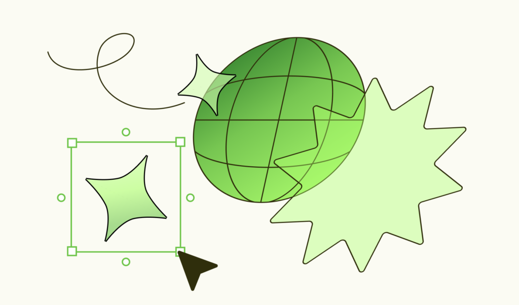
A gradient is a gradual shift from one heavy color to another. Please avoid gradients going all the way to transparency in your designs when designing DTG products.
Transparent areas will fill in with white under the base to ensure that colors appear as bright and vivid as possible. If there is a gradient in a DTG design, try using a white background to see how it turns out before publishing for customer purchase.
For more information on gradients and fine-tuning this process, please see this help article.
However, gradients can work well with products using sublimation printing techniques.
Custom brushes and textures
These are typically problematic, particularly with DTG printers and gradients. Dots spread more on garments than on the high-quality paper used in art prints. It’s a different canvas absorbing the ink. So, it makes sense that there would be some variance.
DTG specifics
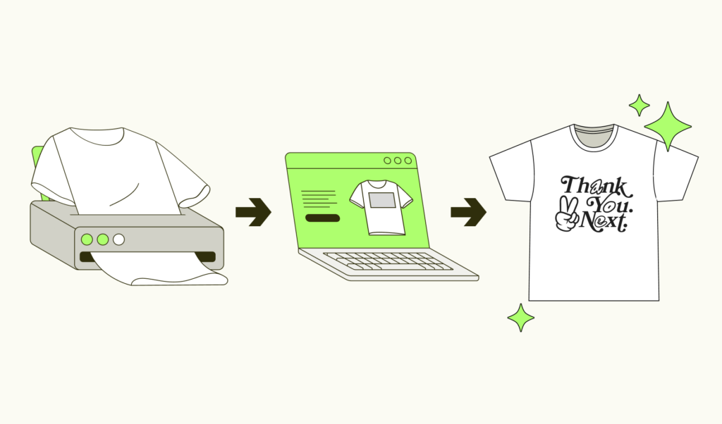
Direct To Garment printing is not the old-school, iron-on transfer that fades rapidly with time.
DTG printing reminds the document printing. A high-resolution digital image is transferred directly onto a shirt.
DTG colors are comparable to those in a CMYK color range used by conventional document printers. This is an excellent method for printing in small quantities.The small elements will also be printed in a higher quality and the images will look sharper compared to the screen printing method.
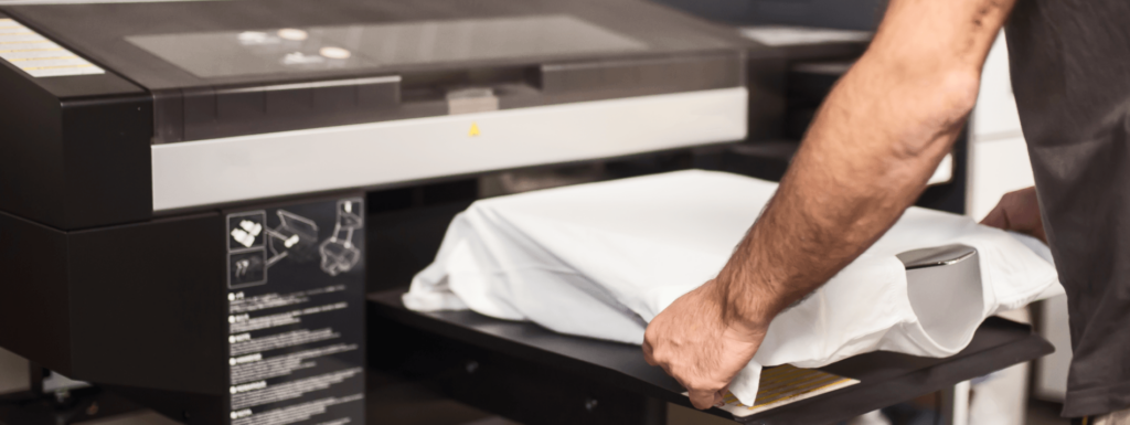
Material absorption
The color of a material plays a role in how designs appear on final products. Using the example of an identical design printed on two different products (one thin and one thick), the thinner material will absorb the ink a bit better. So, the thicker variation will have a more prominent layer of paint – this helps the design stand out.
Zero setup
DTG printing is a quick and easy way to print products, compared to other traditional printing methods. This is particularly beneficial for small orders that can be processed and shipped quickly.
Looks great
DTG prints look as good or even better than other printing processes, such as screen printing. This means you get high-quality products at low prices.
Detailed images
One of the main reasons DTG has been chosen by so many designers and creatives, and has somewhat revolutionized the printing and merchandise industries, is the ability to produce very detailed graphics. Follow our guidelines on file size and colors, and create with ease.
What is underbase
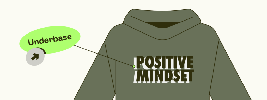
Except for white clothing, all DTG fabrics have a white underbase applied to them. Your design is printed on this underbase, making the colors vivid and detailed. At the same time, the underbase makes color gradation complex. While a gradient might look beautiful on a white garment, it won’t look great on a black one.
DTF specifics
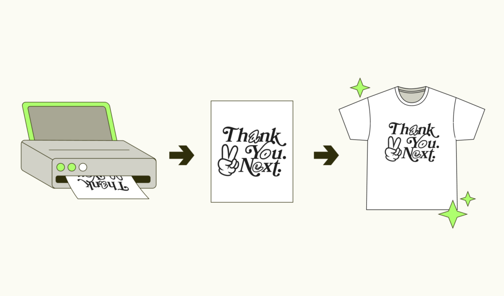
DTF stands for direct-to-film printing and is a highly used printing method in the print-on-demand industry. With a bit of heat, patience, and precision, you can have your designs pressed into the fabric in a unique and long-lasting way.
What is DTF printing and how it works
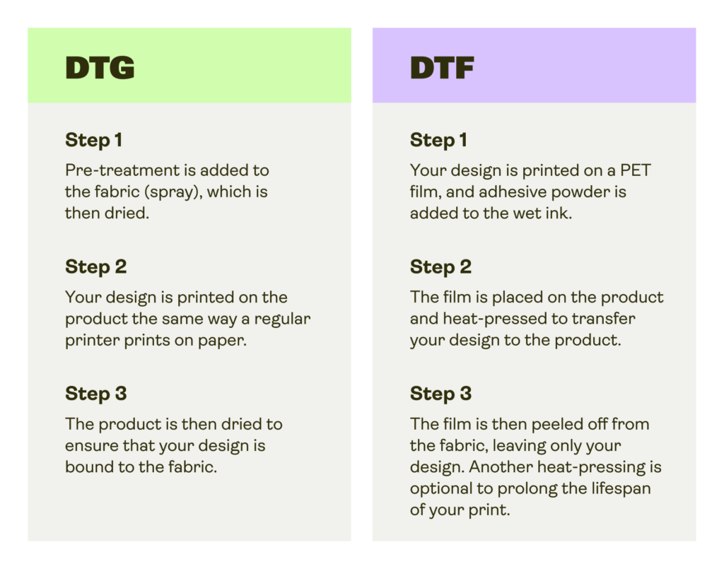
DTF is a heat-press mechanism that transfers your designs onto the product using film and powder. Here’s how it works.
Step 1
Printing
Your design is printed on a special PET (Polyethylene Terephthalate) film.
Step 2
Powdering
The design is then evenly coated with an adhesive hot-melt powder while the ink is wet.
Step 3
Melting the powder
The film is then put into a heating press or oven to melt the powder into your design.
Step 4
Transferring
The film is placed on the product surface and heat-pressed to transfer the design onto the product. After this step, the film is fully attached to the fabric.
Step 5
Cold-peeling
Once the film and fabric have cooled down, the film is slowly peeled off, leaving the design firmly printed on the product.
Step 6
Post-pressing (optional)
The product can be heat-pressed one last time for a couple of seconds to ensure long-lasting effects against daily wear and tear.
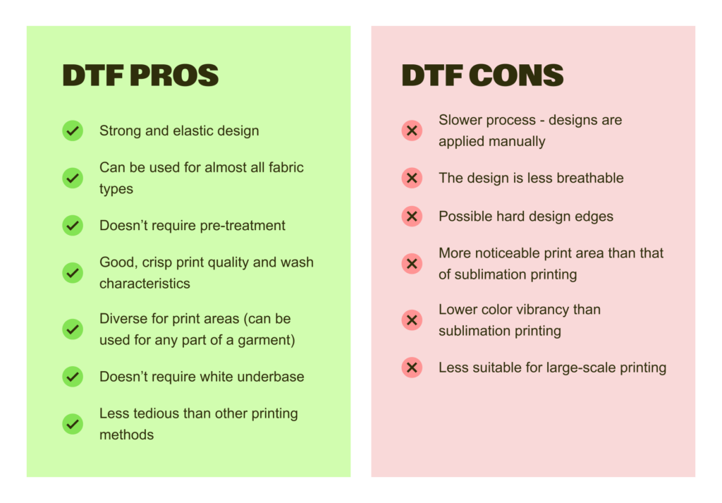
DTF pros and cons
DTF vs. DTG
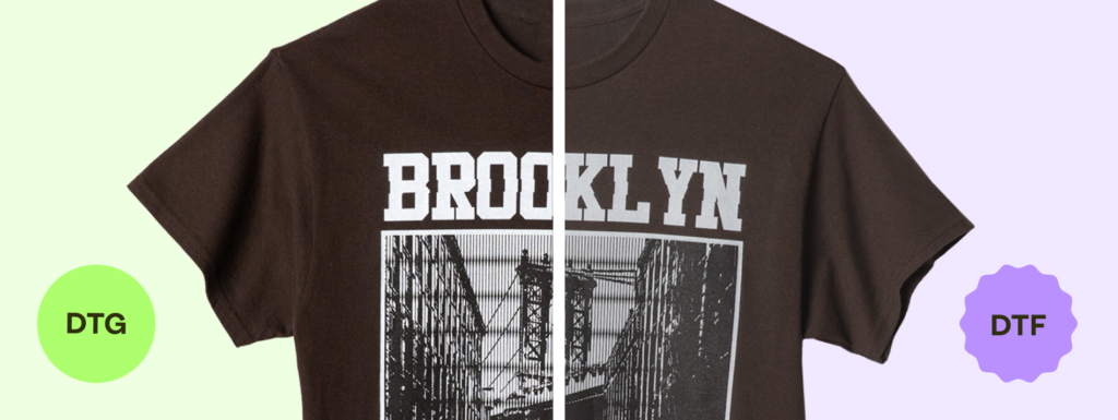
While the print comes out similar, the whole process differs between these two printing methods. And some significant distinctions can be spotted in the final product.
Main differences between DTG and DTF
- DTF ensures crisp text and line designs without issues
- DTG prints are one with the fabric – smooth and blended
- DTF is less integrated with the fabric – may appear shiny and plastic
- DTG ensures better smoke or flame effects for prints
- DTF has better intensity since colors don’t mix with the fabric
- DTG uses 75% more ink than DTF
When to choose DTF over other printing methods
The direct-to-film printing method is ideal for anyone looking to utilize textile personalization to the fullest. While other printing methods limit your fabric choices, DTF provides freedom and lifts all restrictions, allowing you to print your designs on almost every fabric.
With no requirements for pre-treatment, the DTF method allows you to print merchandise economically, reducing overall printing costs and leaving you more room for profit.
Sublimation specifics
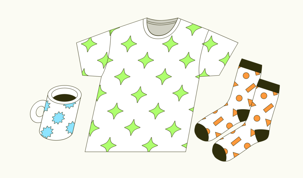
In sublimation, the ink moves from a solid to a gas state without ever being liquid. It’s a good printing method for polyester and hard-coated products. The ink is heated along with a transfer paper that allows it to become gas and spread throughout the fibers of the garment. The image itself will only deteriorate as the substrate does, making it a durable choice.
When to choose sublimation
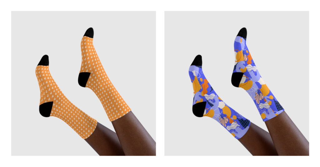
Sublimation requires a polymer-based surface, so the process has its limitations and is best for polyester performance apparel or other hard-surfaced products. You can tell which products are sublimated in the catalog by looking for ones that say “All Over Print” or “AOP”.
AOP and cut & sew limitations
Sublimation products are created, then have designs printed on them. Cut & sew products are the opposite: they’re printed, then stitched together. For this reason, an all-over-print design will seldom repeat perfectly – particularly along seams.
However, mockups are only digital representations, while the real design can slightly shift during the fulfillment process and cause a misaligned print.
Remember, that for some products (especially drinkware – mugs, tumblers, travel mugs) the seam line may still be visible even with a full-bleed design. For that, we strongly recommend avoiding wrap-around designs and artwork with important design elements placed near the edges (like repeating patterns, text messages, or large details).
If you’d like to explore the specifics of cut & sew capabilities, here’s a great guide. Or, see here for more AOP product limitations.
Don’t forget to utilize our Product Creator to its fullest extent when designing AOP products. To significantly reduce your time spent on AOP products, we’ve added a pattern creation tool, allowing you to design patterns from a single element. Forget outsourcing other programs or experts. Create your custom patterns directly on the Product Creator.
Sublimation vs DTG: Which printing method is best for your business?
When comparing direct-to-garment (DTG) with sublimation, both printing methods offer unique benefits that cater to different product and design needs.
Understanding the differences between these printing techniques will help you make the best choice for your business. We’ll break down the key factors that separate DTG from sublimation, from print quality to costs.
Sublimation vs DTG printing: Quick comparison
Both DTG printing and sublimation printing are popular for custom apparel and promotional products.Each printing process delivers vibrant results, but these garment printers suit different fabrics and design complexities. Here’s a summary:
| Feature | Sublimation printing | DTG printing |
|---|---|---|
| Print quality | Stunning designs on light fabrics, vibrant colors | Highly detailed, vibrant on dark materials |
| Durability | Extremely durable, with no fading or cracking | Durable with proper care and pre-treatment |
| Design placement | Full coverage on synthetic fabrics like polyester | Limited printing area based on garment |
| Product focus | Ideal for 100% synthetic textiles | Best for cotton and natural fibers |
| Sustainability | Less waste, no water needed | Requires water and pre-treatment chemicals |
| Cost | More cost-effective for large batches | Higher setup costs, ink can be expensive |
We’ll go into more detail about each category, comparing direct-to-garment printing vs sublimation to see which technique comes out on top depending on your business needs.
Explore DTG, sublimation, and screen printing in depth on our blog.
Quality
DTG printing uses inkjet printer technology to apply ink directly to the garment. This process is suitable for detailed artwork and creating colorful designs on cotton tees and other natural fabrics.
Since DTG uses a white ink base to print an image directly on dark garments, it can produce vivid and clear results.
Sublimation printing turns sublimation ink into a gas that bonds with the material’s fibers. The final product is a stunning design with vibrant colors that won’t fade or crack over time.
However, sublimation performs best on synthetics and light-colored surfaces.
Is sublimation better quality than DTG? It depends.
DTG takes the lead in printing on cotton and natural fabrics and producing intricate designs on dark garments. Sublimation is best for light polyestergarments where color vibrancy is essential.
Durability
When comparing the durability of DTG vs sublimation, both methods hold up well under different conditions. Does DTG printing last? Yes, especially when a garment is pre-treated properly.
However, DTG prints may fade over time, especially after repeated washes or exposure to harsh conditions.
In contrast, the sublimation printing method makes sure the ink bonds directly into the fabric, making the printed image part of the material itself.
Sublimation prints are incredibly durable, resistant to fading, cracking, and peeling, and can last through many wash cycles without losing vibrancy. This makes sublimation particularly ideal for sportswear and other frequent-use garments.
Sublimation dominates for overall durability, as the design becomes part of the fabric and resists wear and tear better than DTG.
Design placement and complexity
With DTG printing, you’re limited by the printing area of the garment printer. DTG printers typically focus on smaller sections, usually the front or back of a t-shirt.
However, the design can be as intricate as you like, even on dark textiles.
Sublimation printing technology produces full-coverage designs that wrap around the entire garment, giving you much more freedom for design placement.
The sublimation process excels for large, complex designs and all-over prints, but DTG is a better choice for smaller, detailed prints on specific areas.
Product options
When comparing dye sublimation vs DTG in terms of product variety, the material plays a crucial role.
DTG works best when printing directly on natural fibers and blends. This makes it ideal for cotton t-shirts, hoodies, and other natural fabric apparel.
In contrast, sublimation printing works on synthetic textiles like polyester. This includes t-shirts, sportswear, and home decor items like mugs and phone cases, provided they are coated with a polyester-like material.
DTG shines for cotton fabric apparel, while sublimation is better for polyester and synthetics requiring full print coverage.
Sustainability
The DTG printing technology typically requires more resources, such as water and chemicals for pre-treatment to facilitate ink adhesion.
This process creates some waste and requires careful management to minimize environmental impact.
A sublimation printer, however, uses less water and creates less waste since no pre-treatment is necessary. There’s minimal environmental impact during printing beyond the ink and sublimation transfer paper.
Sublimation is more eco-friendly due to minimal water and chemical usage compared to DTG. However, its reliance on synthetic garments affects sustainability.
Costs
DTG printing tends to have higher setup costs. DTG printer ink cartridges can be expensive, especially when using white ink for dark fabrics. Additionally, most garments require pre-treatment, which adds to the overall cost.
Sublimation is generally more affordable, especially for bulk orders. It makes the sublimation printing process cost-effective for businesses looking to produce in higher volumes.
Sublimation is more cost-effective for large-scale production, while DTG may be more suitable for smaller orders with high design complexity.
What to consider when choosing between DTG and dye sublimation
When choosing between sublimation printing vs DTG, there are a few key factors to consider:
- Design placement: If you want to cover the entire garment, sublimation is the best option. The DTG printing technique is ideal for smaller, defined design areas.
- Type of fabric: DTG printers are best for natural fibers like cotton shirts and blends, while sublimation is perfect for synthetics.
- Color vibrancy: Sublimation produces brighter and more vibrant colors, especially for synthetic textiles, while DTG can better handle dark textiles and intricate designs.
If you’re wondering whether sublimation is better than DTG printing, both have their strengths depending on your product needs, design preferences, and production scale.
Whether you prioritize durability, cost, or fabric options, these two printing methods offer flexibility for a wide range of products.
Is DTG better than heat transfer?
Heat press transfer uses special paper for a wider variety of fabrics, including synthetics, but it may result in a heavier feel and less durability over time. DTG is better for detail and quality when using natural fabrics like cotton t-shirts.
Export and file formats
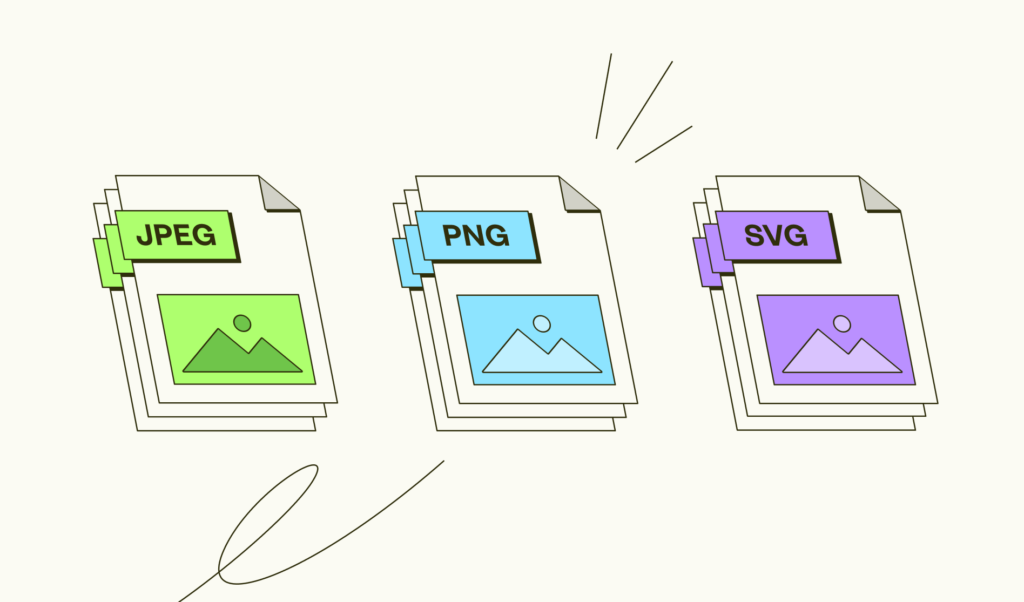
JPEG files are accepted in both RGB and CMYK color spaces; however, we will convert designs to RGB and remove the profile for all internal activities. PNG format, however, can only be in RGB.
- The export settings for PNG (for designs with transparent backgrounds) should have no interlacing, and the compression isn’t important.
- Export settings for JPEG (for designs without transparency) images should be of 60-80% quality.
Vector images
Our merchants often create vector artwork using CorelDRAW or Adobe Illustrator. The vector method makes it simple to scale the shapes while maintaining their original clarity and quality.
The product creator is SVG image-friendly
Ensure your products have better quality and less friction in the creation process with SVG formats.
SVG images mean:
- Easy SVG uploads without additional workarounds
- No extra resolution requirements as vectors stay the same after resizing
- Better quality images with higher resolution
SVG format limitations
- SVG size is limited to 20mb
- You shouldn’t use the SVG format for photographs and raster images.
- While some software like Figma allows raster elements to be exported as SVG, we advise you not to. If most of your content is raster – upload it to Printify as JPEG/PNG.
- SVG can contain up to 20mb of extra raster images.
- Text layers within SVG are not supported.
- If your design contains text layers, the text needs to be converted to paths before uploading to Printify using popular design software like Adobe Illustrator, Affinity Designer, or Inkscape.
- SVG is limited to 20,000 individual path elements.
- Other vector image formats need to be converted.
- If you use EPS images or other vector formats – those images will have to be converted to SVG format using your preferred design software before uploading to Printify.
How to do that?

Intellectual property and copyright in design

Designing responsibly means understanding intellectual property.
Navigating the rules of intellectual property laws as a print-on-demand merchant is just as important as creating eye-catching designs. Missteps can lead to legal disputes and blocked products, but with the right knowledge, these issues can be avoided.
While we’re not legal advisors, these insights on copyright in graphic design will help you identify risks and discover commonly observed pitfalls to protect your creative efforts.
What is intellectual property?
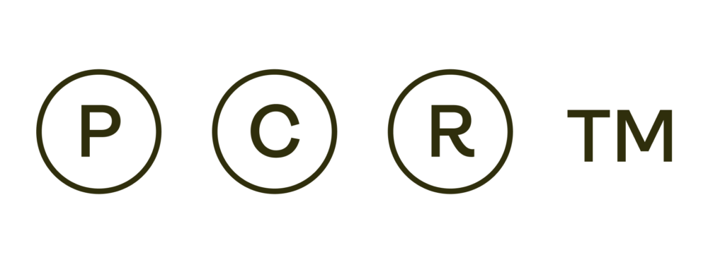
Intellectual property (IP) refers to creative works – designs, inventions, or brandelements – that are legally protected.
There are four main types of intellectual property.
Patents
Patents safeguard new inventions or processes, granting exclusive rights to manufacture, use, or sell them for a specific period. While not often associated with graphic design, patents can apply to innovative tools or workflow methods.
Copyrights
Copyright protects original works, such as digital art, photographs, and illustrations. Many print-on-demand designers unknowingly risk copyright infringement by using certain images or quotes in their designs. This can lead to product removals under our IP policy.
Trademarks
Trademarks protect brand identifiers like logos, slogans, or distinctive symbols and legitimize them under state, federal, or international law. Using trademarked elements, such as a well-known logo or tagline, can result in design infringement claims.
Trade secrets
Trade secrets include confidential practices or proprietary methods that give creators a competitive edge. While it’s unlikely to affect your print-on-demand business, protecting your own techniques and workflows prevents your originality from being compromised.
What is intellectual property infringement?
Intellectual property infringement happens when protected works – such as designs, logos, or text – are used without authorization. Legal disputes can arise even if designers unknowingly incorporate copyrighted or trademarked elements.
Using unlicensed content, like images or quotes outside the public domain, or repurposing brand logos can get your products flagged. To avoid copyright infringement, follow guidelines and consult additional resources from your local government.
What designs are considered IP infringement?
Design infringement examples often incorporate copyrighted images, trademarked logos, or other protected material that may result in legal penalties or product removal.
Below are some examples of graphic design copyright infringement.
Using copyrighted material without a license
Incorporating images, artwork, or other copyrighted elements into your designs without getting the proper license violates copyright laws. Creators retain exclusive rights to their work, and unlicensed use can lead to takedowns or lawsuits.
Replicating logos or icons from other brands
Using recognizable brand symbols in your designs, like logos or mascots, violates trademark law. These elements are legally protected to preserve a brand’s identity and prevent misuse that might impact public perception.
Including characters or quotes not in the public domain
Famous TV and movie characters or quotes from books and public figures are often copyrighted. Using them without explicit permission or confirmation that the character or quote is in the public domain can result in copyright claims.
Using memes with protected elements
Just because it’s public doesn’t mean any image online can be printed. While people constantly repost memes online, you can’t incorporate them into commercial designs unless the components are clearly in the public domain or permitted for use.
Using celebrity images taken by others
Photos of celebrities are typically owned by the photographer or media outlet that captured them. Using these images on your print-on-demand products without permission can land you in hot water with copyright infringement.
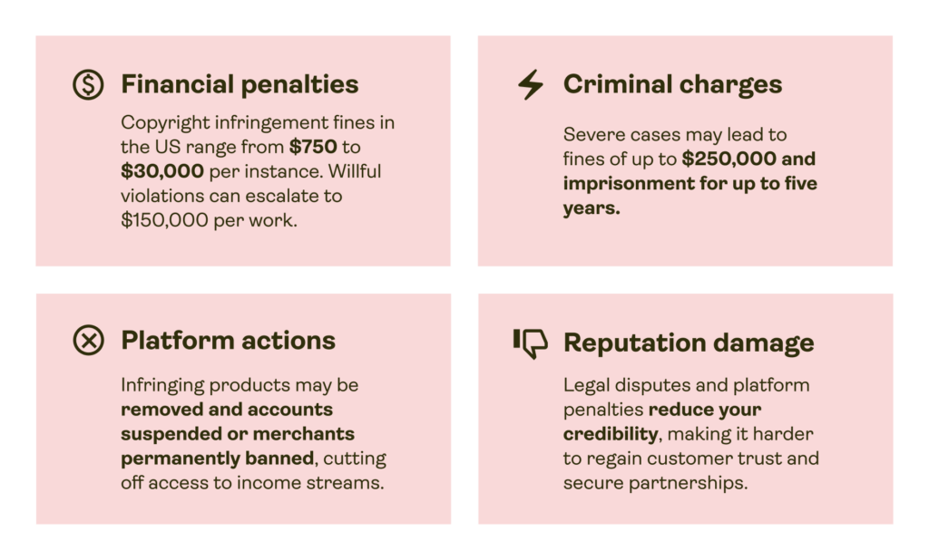
Consequences of violating intellectual property rights
Violating intellectual property rights can result in:
How Printify deals with IP-infringing designs
Printify prioritizes and values commitment to original creativity. We take immediate action to comply with legal obligations and protect all parties involved, respecting intellectual property rights while addressing any possible errors.
When we identify an issue, the product is blocked and marked with an IP-reported status, restricting actions such as publishing, order creation, duplication, and replacement. We also hide the infringing product listings on your sales channels.
How do you appeal design infringement on Printify?
Merchants who believe their product was mistakenly flagged can submit an appeal directly from the product details page by clicking Request appeal. Our team then reviews the case and communicates the outcome to the merchant.
How to comply with copyright laws in your design
Navigating intellectual property laws can feel a little intimidating, but following the right strategies really clarifies the process. This section gives actionable tips to help you steer clear of IP violations and create legally compliant, original designs for your print-on-demand business.
- Create original designs
Craft unique visuals by drawing inspiration from trends and themes, not specific works. Use tools like Adobe Illustrator or Canva for customization and explore AI-generated elements for new ideas. Be cautious of the AI system’s output source to avoid unintentional copyright disputes.
- Use licensed or public domain resources
Use assets explicitly licensed for commercial use or from public domain sources. Free platforms like Printify’s Shutterstock integration provide accessible, licensed elements.
Learn about licensing tiers, such as personal, commercial, or exclusive rights, to help distinguish what you can and can’t use for your designs or other business materials.
- Get permission from creators
If you want to use third-party material, contact the creator or rights holder for permission. Get licenses or written agreements that detail your usage rights. Keep these records to ensure your work is legally protected and avoid any disputes.
- Prepare a store IP policy
Document your creative process and develop guidelines for sourcing and creating designs, including verifying originality and checking licensing. Set limits on where assets can be sourced and ensure all contributors understand these standards. A solid IP policy prevents errors and streamlines your design process.
- Consult legal professionals
If you’re uncertain about using certain design elements, seek advice from an IP law expert. Their guidance clarifies complex rules and protects your business from unintentional violations or disputes.
How to protect your own brand
Trademarking is a proactive step in safeguarding your business. Use it to protect your name, logo, tagline, or other elements that distinguish you in the market. Trademarking requires time and financial investment, but the benefits highly outweigh the costs.
Depending on your needs, there are different levels of trademark protection:
- State: Protection within one state, ideal for local businesses.
- Federal: Nationwide protection through the USPTO, best for regional brands.
- International: Multi-country protection with global agreements.
- Common Law: Automatic but limited protection when a brand is used commercially without registration.
Each type has its costs and benefits. Federal registration through the United States Patent and Trademark Office offers the most comprehensive protection within the US.
How to apply for a trademark:
- Search existing trademarks
Use the USPTO database to ensure no conflicting trademarks already exist. - Set up a USPTO account
Create an account on USPTO.gov to access the trademark application system. - Choose an application type
- TEAS+: Lower cost but requires all details at submission.
- TEAS Standard: More flexible but with a higher filing fee.
- Submit your application
Complete the form with accurate descriptions of your goods or services and attach your trademark drawing or standard character mark. - Track application status
After submission, you’ll receive a serial number to monitor your application.
For more on how to apply for a trademark through the USPTO, design intellectual property submissions, and additional things to keep in mind, watch our video.
Disclaimer: Not professional advice
This content is for informational purposes only and does not count as professional advice. The content is based on our understanding as of the date of publishing. We encourage you to seek advice from qualified professionals for specific situations. Actions taken based on this information are at your own risk. Printify is not liable for any losses or damages.
