


Bring your design ideas to life
Are you looking to create a stunning website but need some inspiration? Wix is a go-to website builder thanks to its extensive variety and customization flexibility. It offers thousands of templates that cater to diverse needs and styles, ensuring you’ll find the right design for your brand.
In this article, we will explore 15 fantastic Wix website examples of real-life business owners showcasing exceptional web design, creative features, and engaging user experiences.
Whether you’re planning to build a personal website, an online store, or a digital art portfolio, these Wix websites will spark your creativity and guide you toward building a site that stands out.
1. Body by Simone

Body by Simone’s Wix website is a vibrant and energetic hub for fitness enthusiasts. The design is clean and modern, with pops of pink and bold typography that exude confidence and motivation.
Key Features and Design Elements
- Easy access to different sections.
- Clear and attractive thumbnails for different classes.
- Professional, motivational images of Simone and class participants.
- Prominent call-to-action (CTA) buttons to drive user engagement.
- Testimonials and media mentions.
- A seamless user experience on mobile phones and other devices.
This website example sets a high standard for fitness and wellness eCommerce sites with its clean layout, motivational imagery, and strategic CTA buttons.
2. Hors-D’oeuvre

Hors-D’oeuvre is a fashion lover’s dream, boasting a clean, modern design that exudes elegance. A minimalist black-and-white color scheme is accented with hints of color in product photos, conveying a luxurious feel that perfectly complements the brand’s sports-centered designs.
Key Features and Design Elements
- The homepage features a stylish full-screen video, engaging visitors.
- Intuitive navigation with a simple menu bar.
- High-quality videos and photos showcase the clothing beautifully.
- Well-placed buttons and prompts.
- Social media profiles linked.
- The website adapts seamlessly for a flawless shopping experience on any device.
This Wix website example might just be one of the best examples of how web design can convey a message so clearly while having a unique style and maintaining a cohesive user experience that seamlessly integrates with the brand’s identity.
3. Bonsie

Bonsie’s pastel paradise for new and expecting parents is one Wix website example that simply melts your heart the moment you enter. The soft color scheme creates a warm and inviting atmosphere, perfectly reflecting the brand’s focus on baby products.
Key Features and Design Elements
- The homepage is an excellent example of video use, instantly capturing the heartwarming essence of the brand.
- A simple menu bar guides us through the product categories, making it easy to find exactly what’s needed.
- The dedicated expert section helps build trust.
- A New Arrivals section on the Homepage. Consider incorporating it in your own site so people can easily find your latest projects and product launches.
- Strategically placed discount offers and promotions.
- Social media integration for even more cute baby content and product inspiration.
Overall, Bonsie’s website is a beautifully designed and informative resource for parents. It’s easy to navigate, visually appealing, and packed with helpful information and adorable items, making it a great website example for anyone else opening a baby-product store.
4. Festela

The Festela Store’s business website embodies the spirit of slow fashion with a vibrant color scheme and user-friendly design. High-quality photos of their handmade clothing dominate the homepage, showcasing unique prints and bold colors that grab attention immediately.
Key Features and Design Elements
- Reminiscent of a summer festival, this website’s palette instantly grabs attention and sets a playful tone.
- Handmade garments are showcased through bright, colorful photos that pop against the white background.
- A well-organized menu bar for easy navigation.
- The site proudly highlights their handmade process, emphasizing the care and artistry behind each garment.
Festela is one of those Wix website examples that instantly grabs your attention. They make it easy to find what you’re looking for and order online, creating a great shopping experience for web users on desktop and mobile.
5. Izzy Wheels

The Izzy Wheels website is a vibrant and engaging platform dedicated to its mission of turning wheelchairs into fashionable works of art through its product: stylish wheel covers.
Key Features and Design Elements
- Beautiful photos showcasing diverse designs.
- Strong CTAs.
- A bright, cheerful website color scheme and engaging visuals.
- The layout is intuitive, enhancing user experience.
- Each product page is well-organized, with detailed descriptions and multiple images of the wheel covers in use.
- Using bold colors and creative designs throughout the site reinforces brand identity and mission.
This Wix website delivers a user-friendly and visually appealing experience, combining functionality with style. The excellent navigation and vibrant design make it an outstanding example of eCommerce in the fashion and medical accessory niche.
6. Copper and Brass

The Copper and Brass Paper Goods website is a stunning example of vibrant web design, perfect for an online store centered around creative projects. The homepage greets visitors with high-quality photos of their unique stationery products, capturing the essence of their brand identity.
Key Features and Design Elements
- Easy navigation with clearly defined categories like Stickers, Full-Sized Notebooks, and Bundle Deals.
- Highlighted benefits include free shipping when spending at least $75, secure payment processing, and data privacy protection.
- Well-placed call-to-action buttons like “Shop Now,” encouraging visitors to explore different categories.
- Large, eye-catching images and a clean layout emphasizing products.
- The intuitive navigation bar and an overall modern aesthetic.
Copper and Brass Paper Goods showcases excellent use of visual elements, ensuring their website functions well and leaves a lasting impression on site visitors.
7. Babe Formula

Babe Formula’s website is a vibrant, visually engaging platform focused on hair care solutions. The site features a cohesive pink and pastel color scheme that exudes a fresh and youthful vibe, immediately drawing visitors in.
Key Features and Design Elements
- The homepage displays high-quality images and videos.
- The navigation bar at the top makes it easy for visitors to explore the site.
- Consistent use of colors and branding elements across the site helps reinforce the brand identity.
- User testimonials and social proof build trust and encourage new customers to connect with sales representatives.
- Strategically placed CTAs.
- The website is optimized for both desktop and mobile.
This website is an excellent example of an effective web design combining aesthetic appeal and functionality. The use of engaging visuals, straightforward navigation, and strong branding elements makes it a standout website in the hair care industry.
8. Sticky Lemon

Sticky Lemon’s Wix website is a vibrant wonderland for kids (and kids at heart!) with an eye for bold style. It’s a playful mix of quirky, colorful, and retro-inspired web designs that instantly transport you to a sunnier state of mind.
Key Features and Design Elements
- The homepage is a colorful explosion of product photos, playful animations, and catchy slogans that perfectly capture the brand’s spirit.
- The website is easy to navigate, with a clear menu bar and well-organized product categories.
- A handy filter on the side lets you quickly narrow down the search by product type, color, or pattern.
- The website is fully responsive and works nicely on any device.
- Sticky Lemon proudly showcases its commitment to sustainability, which echoes in the web design colors.
Sticky Lemon’s website celebrates childhood, where kids’ fashion is all about being bold, bright, and having fun. It’s a place where imaginations run wild, and every day feels like a sunny adventure.
9. The Boho Birdy

The Boho Birdy offers a unique shopping experience focused on bohemian-inspired fashion. The online fashion magazine features a mix of new arrivals in wedding dresses, fashion, and homewares, all presented with stunning visuals and easy navigation.
Key Features and Design Elements
- Clean and organized with prominent new arrivals and sale banners.
- Search bar for browsing the store.
- Instagram feed linked for social proof and product visuals.
- Fast loading times and mobile device optimization for seamless browsing.
- Easy access to promotions and sales information.
- Secure payment options and easy checkout process.
The Boho Birdy is a great example of how a well-designed Wix website can enhance brand identity, engage visitors to explore products, and drive sales. Beautiful images, clear navigation, and strategic CTAs create an engaging shopping experience.
10. Papier Patate

Papier Patate has a whimsical and easy-to-use eCommerce site designed for lovers of customized stickers and stationery – perfect for parents and kids. The website’s playful colors elements create an engaging and memorable user experience.
Key Features and Design Elements
- A clean, playful aesthetic with pastel colors and fluid shapes, instantly drawing attention to their custom stickers.
- Simple and engaging steps for customization guide users smoothly through the shopping experience.
- High-quality photos and videos show products in everyday use, adding authenticity and appeal.
- Prominent sections highlight the brand’s commitment to sustainability, using recycled materials, and donating profits.
- Customer photos and testimonials are displayed to enhance trust and community.
- Intuitive navigation with clear product categories.
Papier Patate’s website example blends creativity with functionality, making it easy for users to navigate, customize, and purchase their products. The playful web design and clear messaging encourage visitors to explore and engage.
11. Cherry and Mint

Cherry and Mint showcases a vivid collection of slow-fashion garments and accessories. Their website reflects the brand’s playful and colorful aesthetic, offering an engaging user experience through high-quality images and intuitive navigation.
Key Features and Design Elements
- Bright, colorful photos of dresses, skirts, and accessories grab attention.
- The simple and clean layout makes browsing effortless.
- Responsive web design that seamlessly adapts to mobile use.
- A mix of product shots and lifestyle images.
- Prominent “Shop Now” and “Custom Order” CTAs encourage conversions.
Cherry and Mint’s well-designed website effectively combines vibrant visuals with user-friendly features, ensuring a pleasant shopping experience on both desktop and mobile devices.
12. Mananalu

Mananalu is a fantastic example of a well-designed Wix site, showcasing the platform’s capabilities for creating visually striking and highly functional eCommerce experiences.
Key Features and Design Elements
- Responsive design with seamless transitions between sections.
- Custom hero section with overlaid text and background videos and images.
- Product gallery with high-quality images and hover effects.
- Integration of eCommerce features, including the “Shop Amazon” button.
The site demonstrates how Wix can be used to create a professional-grade web design that balances aesthetics with functionality. It effectively uses Wix’s drag-and-drop interface to arrange content in a visually appealing layout while also incorporating more advanced features like custom animations and third-party site integrations.
13. Something Good Studio

This website showcases a modern, visually striking design that effectively highlights their textile and design work. It is the best example of using a unique scrolling feature where images smoothly transition and change as the user scrolls, creating a dynamic and engaging browsing experience.
Key Features and Design Elements
- The dynamic hero section with an animated GIF logo immediately catches the visitor’s eye.
- Minimalist navigation menu with clean typography.
- Innovative scrolling bar and parallax image transitions keep visitors engaged as they browse.
- Grid layout alternating between full-width images and text blocks on pastel backgrounds.
- Consistent use of GIFs throughout the site, adding movement and visual interest.
- Subtle hover effects on clickable elements for improved interactivity.
Overall, this page exemplifies contemporary web design trends, balancing form and function to create an immersive showcase of their creative work. The clever use of animation, particularly in scrolling effects and GIFs, sets this site apart and likely increases visitor engagement and time spent exploring their portfolio.
14. Monk & Anna

Monk & Anna’s Wix website is a great place to start for even more inspiration if you’re into fashion. The website showcases a minimalist, elegant design focusing on showcasing products through high-quality imagery.
This website example features a clean layout with ample white space, muted earth tones, and a mix of product and lifestyle photography. The navigation is simple and straightforward, allowing users to browse different product categories easily.
Key Features and Design Elements
- Minimalist top navigation menu with logo centered.
- Large, full-width hero image featuring a model with the brand’s product.
- The product grid layout showcases items with titles and prices.
- Lifestyle photography highlighting products in use.
- A muted, earthy color palette complementing the brand aesthetic.
- The responsive design adapts to different screen sizes.
- Simple, sans-serif typography enhances readability.
The Monk & Anna website communicates the brand’s aesthetic through its clean, understated design. By focusing on quality visuals and a simple layout, the site creates an engaging shopping experience.
15. Ayelet Raziel

The Ayelet Raziel website features a vibrant, colorful design emphasizing visual elements and dynamic interactions. The site uses bold, contrasting colors to draw attention to various artistic works and designs. The layout is modern and playful, with sections dedicated to different aspects of the artist’s work.
Key Features and Design Elements
- Large, full-width header with animated background elements.
- Scroll-triggered animations that reveal content as the user navigates.
- The parallax effect creates depth and visual interest as users scroll.
- Grid layout showcasing various artworks and design projects.
- Minimalist navigation menu with simple, clear categories.
- Integration of eCommerce functionality.
This Wix website example successfully combines playful design elements with functional eCommerce capabilities, creating an immersive showcase for the artist’s work while providing a sales platform.
What makes a good Wix website?
Creating a standout Wix website is about crafting an experience that delights visitors and keeps them coming back – it’s more than just stunning visual content.
Whether showcasing your portfolio, selling products, or sharing your passion, web design elements like great call-to-action buttons, intuitive navigation, and engaging micro-interactions separate the good from the great.
Easy-to-use navigation
A well-designed navigation menu is intuitive, clearly labeled, and accessible from any page. Consider using dropdown menus for subcategories and ensuring your logo links back to the homepage. Remember, visitors are likely to bounce if they can’t find what they’re looking for quickly.
Correctly structured
A logical hierarchy helps both visitors and search engines understand your content. Use headings to organize information, create clear categories for your content, and maintain a consistent layout across pages. A well-structured site looks more professional and improves user experience and search engine optimization (SEO).
Optimized for search engines
SEO is crucial for getting your site noticed. Make your Wix website more visible by using relevant keywords in your content, meta descriptions, and image alt texts. Use Wix’s built-in SEO tools to give your customers the best chance of finding your website.
Check out our Wix SEO blog article for more tips and detailed info on how to gain more organic traffic to your website.
Responsive design
Your own website needs to look great on everything – smartphones, desktops, laptops, tablets, and so on. Wix’s responsive design ensures your site adapts seamlessly to different screen sizes.
Test your website on a few different devices to ensure all elements are accessible and visually appealing, regardless of how visitors view it.
Fast checkout process (for stores)
For eCommerce sites, a smooth, quick checkout process can make or break sales. Minimize the steps required to complete a purchase, offer guest checkout options, and provide multiple payment methods.
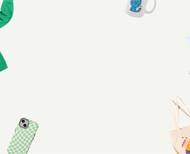
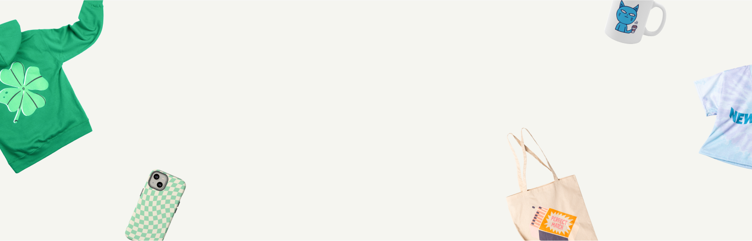
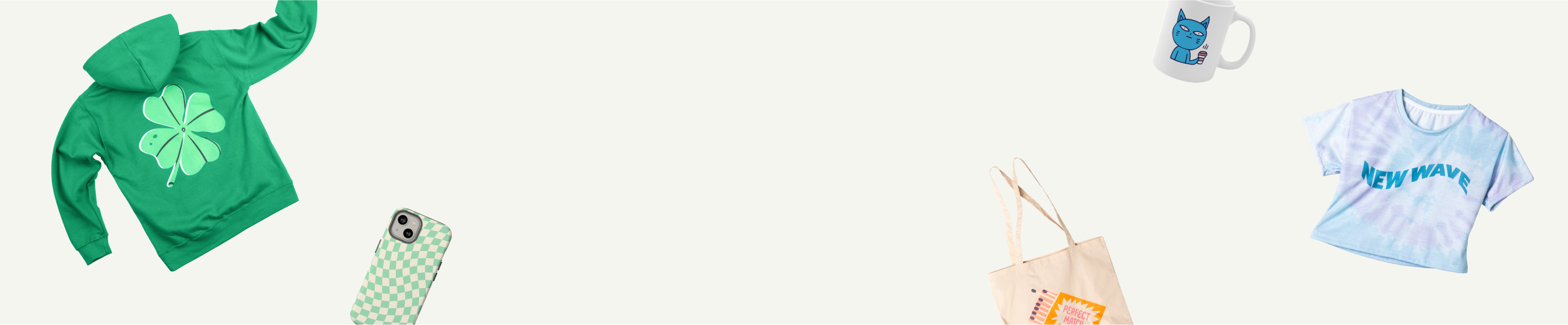
Start an eCommerce business with Wix and Printify
Turn your creative ideas into profit with our seamless Wix integration. Design your custom products, build a stunning online store, and let us handle the production and shipping!
Wrapping up
Exploring these well-designed websites showcases the potential of creating stunning and functional sites using Wix.
Whether you aim to build a personal brand, set up an eCommerce site, or simply create a visually appealing online presence, these web design examples highlight the importance of responsive design, intuitive navigation, and compelling CTAs.
Optimize your site for smartphones to capture the growing number of mobile users. With Wix, the possibilities for creating exceptional websites are endless, inspiring you to take the next step in your digital journey.