

Etsy thumbnails are the first (and sometimes only) shot you've got at convincing a buyer to click. Get it right, and your listing earns the visits, the favorites, and ultimately the sales. Get it wrong, and your product disappears into the scroll.
This guide breaks down exactly what makes a thumbnail click-worthy in 2026 – from sizing to styling to the mistakes that quietly tank shops.
What is an Etsy thumbnail?
An Etsy thumbnail is the small preview image that appears in search results, category grids, and shop pages – pulled automatically from the first listing photo you upload. It's the shopper's first impression of your product, and on a platform with around 7.5 million active sellers, it's the single biggest factor deciding whether a browsing customer clicks your listing or someone else's.
Why Etsy thumbnails matter for clicks and sales
Etsy thumbnails do more than just look pretty – they directly drive your click-through rate, which then feeds back into how Etsy ranks your listing. A higher CTR signals to the algorithm that shoppers actually like what you're selling, which lifts your listing across related searches. Lower CTR? Etsy buries you.
Three forces stack the importance even higher:
- Image quality drives purchase decisions. 67% of online shoppers say product image quality is the top factor influencing their purchase – above descriptions, reviews, and even price.
- Mobile-first shopping rules Etsy. Over 45% of Etsy sales come from mobile devices, where shoppers make split-second decisions on tiny screens. Your thumbnail images need to read clearly at the size of a postage stamp.
- Trust gets built in milliseconds. Polished, consistent thumbnails make your brand look professional. Blurry, cluttered ones make shoppers click "back" faster than you can say "handmade."
What size are Etsy thumbnail images?
Here's the tricky truth: Etsy doesn't show your thumbnail at one fixed size. The platform crops your first listing photo differently depending on where it appears – square in mobile search results, landscape thumbnails in desktop search, sometimes portrait on newer layouts. Etsy has been testing different thumbnail crops across the platform since late 2025, which means your image gets sliced into multiple shapes whether you like it or not.
The safest move: keep your product centered, leave breathing room around the edges, and avoid placing text near the edges (it gets chopped on at least one crop). Etsy provides a built-in placement tool when you upload, letting you preview how the image will appear across different views and perform fine-tuning adjustments before saving.
Recommended Etsy thumbnail sizes
Element | Recommended size |
|---|---|
Etsy listing image size | 2000 × 2000 px (square) or 2700 × 2025 px (4:3) |
Minimum upload size | 2000 px on the shortest side |
Recommended aspect ratio | 1:1 (square) – crops cleanly across all devices |
File type | JPG (best), PNG, GIF |
Resolution | 72 PPI (standard for web display) |
File size | Under 1 MB for fast upload; max 10 MB |
What makes a good Etsy thumbnail?

A great Etsy thumbnail communicates exactly what you're selling in a split second – no captions, no squinting, no guesswork. Five things separate the click-worthy from the scroll-past.
Use clean, high-contrast product photos
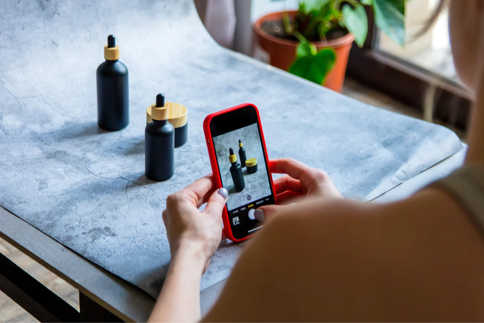
Lighting and contrast do the heavy lifting. Natural daylight near a window beats harsh overhead bulbs every time. Uncluttered backgrounds let your product breathe – a clean wooden surface, a neutral linen, or a soft pastel wall all work better than busy patterns.
Strong contrast between the product and its background helps shoppers spot the item instantly on a small screen. Steer clear of dark mockups on dark backgrounds – the product disappears, and the thumbnail loses its punch. Save important details for the close-up shots that come after the hero.
Make your product instantly recognizable
If a buyer has to study your thumbnail to figure out what you're selling, you've already lost them. The product should be the unmistakable star.
- Show the full item, not a weirdly zoomed-in corner.
- Make any personalization clear (a name on a mug, an initial on a tote).
- Match your styling to your niche – minimalist designs work for stationery, cozy props work for candles, edgy backdrops work for streetwear.
People should know exactly what your product is and what style of brand you're running before they even click.
Optimize thumbnails for mobile shoppers
Most of your traffic is shopping on a phone. Pull up your thumbnail on your own device and zoom out – if you can't tell what the product is at a glance, neither can your buyer.
Frame your product slightly larger than you think you need so it fills the cropped preview. Skip tiny text, intricate details, or anything that requires squinting. Bigger and bolder always wins on mobile.
Use lifestyle mockups instead of plain product shots
This one matters a lot for POD sellers. Plain product shots on a white background can look generic – fine for stock, but forgettable in a sea of Etsy listings. Lifestyle mockups show the product in use: a model wearing the tee, hands wrapped around the mug, a tote bag slung over a shoulder at a market.
They add emotional context, demonstrate scale, show real use cases, and lift the perceived quality of your product. Apparel, mugs, tote bags, and wall art all convert better with lifestyle shots than with sterile catalog photos.
- One key Etsy policy note: Etsy's official guidance says your first photo or video should show the actual physical item the buyer will receive, not just a rendering or stock mockup.
POD sellers using third-party digital mockups as the primary thumbnail have been flagged. The fix is simple: order a sample of your product first.
A real-life photo of your actual printed tee or mug as the hero image keeps you on the right side of Etsy's rules, lets you double-check print quality and fulfillment, and gives you content for social media all in one shot. Lifestyle mockups still work brilliantly – just use them in slots.
Add subtle branding without overcrowding
A consistent visual identity across your Etsy shop makes you memorable. Use the same color palette, the same prop styling, the same background tones, the same lighting across every thumbnail.
Skip the loud logo overlays, busy graphic elements, and template-looking text boxes – they make your shop look like every other generic seller.
Subtle branding wins: a recognizable backdrop, a signature prop, a consistent crop. When buyers see your second listing, the goal is for them to recognize it as yours before they read the Etsy shop name.
Best Etsy thumbnail styles by product category
Different products demand different thumbnail strategies. Here's what works for the categories Printify sellers love most.
Apparel thumbnails

Tees, sweatshirts, and custom hoodies live or die on how the design looks on the body. Flat lays work for bold graphic prints, but front-facing model shots almost always outperform them for click-through.
What works best:
- Front-facing model shots showing the design clearly across the chest or back.
- Neutral backgrounds – plain walls, brick, soft studios – so the garment pops.
- Visible design placement – chest, sleeve, back panel, whatever the hero detail is.
- Consistent crop across all your apparel listing images so your shop looks intentional.
Skip dim lighting, weird angles, and crowded backdrops. The shirt should be the obvious main character.
Jewelry thumbnails

Engraved jewelry sells on craftsmanship, and tiny details disappear fast in a small thumbnail frame. Macro shots are your best friend here.
The winning formula:
- Close-up macro photos that show texture, finish, and stone quality.
- Skin-tone or warm-wood contrast to make metals and gems pop.
- Minimalist styling – one piece, one prop, zero clutter.
- Centered composition, so nothing critical lands in the cropped edges.
Necklaces, rings, and earrings all benefit from being shown both on a clean surface and worn – but the hero thumbnail should make the piece itself unmistakable, even at the size of a postage stamp.
Printable and digital product thumbnails
Digital products are trickier – the buyer can't hold the item, so your Etsy listing photos have to do all the convincing.
Format options that convert:
- Framed mockups showing posters on walls, planners on desks, art prints above couches.
- Stacked preview layouts that hint at multiple pages, designs, or variations included.
- "What's included" graphics in a clean grid so buyers see exactly what they're getting.
- High-resolution PNG files when transparency matters, otherwise, JPG keeps file sizes low.
Skip moody lighting and arty crops here – clarity beats vibe for digital downloads every time.

Home decor thumbnails
Home decor needs context. A pillow floating in white space doesn't sell – a pillow on a styled couch does.
Build thumbnails that:
- Place the product in a real room – living room, bedroom, kitchen, whatever fits.
- Show scale next to recognizable objects like a sofa, a bed, a lamp, or a coffee cup.
- Use lifestyle scenes that match the buyer's aspiration for their own space.
- Play with image orientation. Mix landscape images and square crops depending on the product (wall art reads best in landscape; candles in square).
Room context tells buyers exactly how the piece will land in their home, which solves the number-one decor hesitation: will this actually look good in my space?
How to make an Etsy thumbnail image
You don't need pro gear or design school – just a workflow that turns photos into click-worthy thumbnails. For a step-by-step listing setup, check out our article on how to post on Etsy.
Use Printify’s mockups for POD products

Printify’s Product Creator stores free mockups for every product in the Catalog – apparel previews, lifestyle photography, and clean studio shots, all auto-generated the moment you upload your design.
The benefits of the Printify-Etsy collab stack up fast:
- Speed: Generate dozens of original pictures in minutes, no photographer required.
- Variety: Apparel previews, flat lays, lifestyle scenes, all in one place.
- Consistency: Every product gets the same polish across your shop.
- Customizable backgrounds: Those can work like mini shop banners or branding elements. You can also adjust them based on seasons and promotions.
- Faster listing creation: Launch multiple designs without setting up a photoshoot.
Pair the mockups with a real sample shot as your hero image to stay on the right side of Etsy's first-photo policy. Ordering a sample also lets you double-check print quality and fulfillment timing, and gives you photo and video content for Instagram, TikTok, and Pinterest in one go.
Create thumbnails with Canva
Canva is the go-to free tool for Etsy sellers who want polished thumbnails without editing on Photoshop. The platform has hundreds of templates meant for your Etsy shop, sorted by style, niche, and product type, plus a drag-and-drop editor that resizes images and handles text overlays, and mockup imports in minutes.
Start with a square canvas (1080 × 1080 px or larger), drop in your product photo or Printify mockup, adjust the composition until your product sits centered in the frame, and download as a JPG or PNG.
Keep text minimal – just personalization names or "what's included" lists for digital products – and skip the heavy graphic overlays that make thumbnail images look like every other generic shop.
Photoshop works for advanced editing and bigger image files, but Canva delivers professional results free for nearly every Etsy listing you'll ever post.
Edit thumbnails for consistency
Before publishing, run every thumbnail through one final pass to make sure your Etsy shop reads as one brand instead of a patchwork of random photos.
Match brightness levels so your shop feed looks cohesive. Use the same crop ratio for great listing images (square works safest across devices). Center your product in the frame to survive Etsy's auto-cropping. Match your color palette across thumbnail images – same backgrounds, same prop tones, same lighting temperature.
Preview all your thumbnails side by side on your phone before publishing, and test small changes one at a time to spot which moves lift your click-through rate. A storefront that looks deliberately styled wins more clicks than one that feels like a content dump.
Common Etsy thumbnail mistakes to avoid

Even great products lose clicks when their thumbnails fall into common traps. Here are the worst offenders, why they kill your CTR, and tips for fixing them fast.
- Cluttered backgrounds. Busy props and competing patterns pull attention off the product.
Fix: shoot against a clean wall, neutral surface, or soft fabric backdrop and let the product be the obvious star.
- Tiny products in oceans of white space. Buyers can't see what you're selling when the item floats in a sea of nothing.
Fix: zoom in so the product fills at least 80% of the frame.
- Unreadable text crammed into corners. Etsy crops thumbnail images differently across mobile, desktop, and the app – edge text gets sliced off.
Fix: skip text overlays on your first photo, or keep it short and dead-centered.
- Too many props. Trendy styling dates your listings the moment a trend shifts.
Fix: choose one or two timeless props that match your niche and stick with them across your shop.
- Inconsistent branding. Different fonts, colors, and lighting across listings make your shop look amateur.
Fix: build a simple style guide (colors, backdrops, props) and apply it to every listing.
- Low-resolution image files. Anything under 2000 px gets upscaled and looks pixelated.
Fix: shoot or generate mockups at 3000 × 3000 px and resize down only if you need to.
- Overedited filters. Heavy filters distort the actual product colors and trigger refund requests when the item arrives looking different.
Fix: edit lightly – brightness, contrast, sharpness, and that's it.
- Dark thumbnails. Moody black-on-black photos vanish in the search grid.
Fix: lift exposure and add light contrast so your product is visible at a glance.
- Misleading mockups. Using third-party mockups that overpromise versus the real product is an Etsy policy violation.
Fix: order a sample, photograph the real item, and use it as your hero image.
- Wrong image orientation. Vertical images get cropped harder than landscape or square ones.
Fix: shoot horizontally or square for your first photo so Etsy's auto-cropper has more to work with.
A messy first impression is the only impression a buyer takes away – fix the fundamentals before testing fancy tricks.
Etsy thumbnail examples that attract clicks
The best examples live right on Etsy itself – and they change with every trend cycle.
- Open Etsy.
- Search a few keywords in your niche (try minimalist tee, custom mug, printable wall art, or personalized gift).
- Study the first row of results.
The shops ranking at the top of the search page didn't get there by accident – their first photo earned the click. Save a screenshot of any thumbnail image that stops your own scroll and build a swipe file you can reverse-engineer for your own listing images.
Four formats consistently outperform across categories:
1. Minimalist apparel mockups

Clean tee on a soft-neutral background, design front and center, zero distractions. Search graphic t-shirt on Etsy and look at the top sellers' shop pages for living examples – the winners use cohesive lifestyle shots, square crops, and signature color palettes.
2. Before/after thumbnail upgrades
Swap dim lighting for bright daylight, crop tighter, fix the angle, and the click-through rate climbs. Many top sellers refresh their first photo every few months and document the change on YouTube and TikTok – search Etsy thumbnail makeover for real examples with metrics attached.
3. Seasonal Etsy listing photos

Holiday-themed props, autumn color palettes, Valentine's reds. Browse Etsy's curated holiday gift guides (linked from the homepage during each season) to see which seasonal listing images Etsy itself is featuring.
4. Personalized gift listings

Show the customization clearly (a name, a date, a monogram). Search personalized necklace or custom mug, and the top results almost always lead with a thumbnail showing the personalization in action.
The pattern in all four: the product is the hero, the styling tells a story, and the composition reads instantly even at thumbnail size – whether shoppers see it in a square crop on mobile, as an enlarged image on desktop, or sandwiched between carousel banners and shop icons on a store page.
FAQ
Create Etsy thumbnails that shoppers actually click
Etsy thumbnails are the smallest part of your listing with the biggest impact on whether you get the click. Nail the recommended size, keep your composition clean, lean into lifestyle shots for context and image rotation, and order samples so your first photo is the real deal. Build a consistent brand style across your Etsy listing photos, and your shop will start to feel like a real brand, not a random product dump.
Ready to start designing? Browse Printify's Etsy integration, price your products smart with the Etsy calculator, and turn your next listing into the one buyers actually click.