Sell custom products with Printify
Learn how to take product photos that build trust, enhance your brand image, and drive conversions. Whether you’re a print-on-demand seller or managing an eCommerce business, good product photography can make all the difference.
We’ll show you how to shoot product photos with natural and artificial light, adjust camera settings, and edit like a pro – no studio or professional photographer needed.
From improving image quality to optimizing for SEO and load speed, learn how to create product photos that don’t just look good – but help your store perform better.
This post may contain affiliate links, which means we may earn a commission if you make a purchase through those links. This comes at no additional cost to you.
What tools do you need to take good product pictures from home?
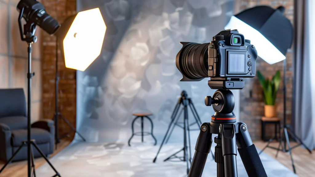
Good product photography is about knowing how to use what you’ve got. A solid setup with the right lighting, backdrops, and digital camera or smartphone settings will take your product photos from average to pro without spending a fortune.
You don’t need a professional photographer, expensive gear, or a fancy studio. A few DIY hacks and free photo editing software can get the job done.
Camera
Don’t have a top-tier DSLR for professional photography? No problem.
A smartphone camera or a simple point-and-shoot will work just fine. That said, if you’re looking to up your game, a DSLR or mirrorless camera gives you:
- Sharper details for those crisp, zoomed-in close-up shots.
- Better control over depth of field and lighting.
- Multiple lens options (wide-angle lenses work great for some products).
But remember, gear won’t save a bad product photography setup. Your lighting, background, and angles matter just as much.
Tripod
Want sharp, professional-looking product photography? Stop holding the camera.
A tripod keeps your shots steady, maintains consistency across multiple images, and lets you adjust angles without shaky hands ruining your shot. Even a cheap $30 tripod from Amazon will do the trick.
Lighting
Lighting plays a crucial role in your product photos. Too dark? Details disappear. Too bright? Colors get washed out. The key is finding the right balance to make your product shine.
You have two main options – natural light (free but unpredictable) and artificial light (controlled but requires setup). Both have pros and cons, and the best choice depends on your product, camera, setting, and budget.
Natural lighting
Natural light is free and universally flattering, making it perfect for lifestyle shots, clothing, and accessories. It creates a warm, inviting look that connects with customers.
Here’s where natural light shines:
- Soft ambient light shots – Perfect for capturing details and textures, requiring minimal edits.
- Outdoor shots with scenic backgrounds – Ideal for eco-friendly products or nature-inspired designs for an authentic feel.
- Photos with a person wearing or holding the product – Adds relatability and context.
- Thematic photos that tell a brand story – Think cozy coffee cups by a window or a tote bag on a city street.
How to get the best natural light for product photography?
- Time it right – Midday often casts harsh shadows, so aim for early morning or golden hour in the late afternoon.
- Use indirect sunlight – Direct sun can create glare. Position your setup in the shade or indoors near a large window.
- DIY light diffusion – If the sunlight is too strong, tape thin white sheets, parchment paper, or a sheer curtain over your window for a softer glow.
- Consider a white backdrop – A white wall, large sheet of paper, or poster board can help reflect light evenly back onto your product.
Artificial lighting
If you can’t rely on daylight or need consistent lighting for multiple shoots, artificial lighting is the way to go. It works anytime, anywhere, and eliminates color inconsistencies caused by shifting natural light.
Here are the best artificial lighting options for product photography:
- Softbox light kits – These mimic daylight, create soft shadows, and prevent glare. Softboxes on each side of your product will provide even lighting.
- LED panel lights – Adjustable brightness and color temperatures let you match the lighting to your brand’s aesthetic.
- Ring lights – Best for small products, jewelry, or beauty items, providing a clean, even glow without intense shadows.
- White foam boards – Bounce light back onto the product to reduce harsh shadows and keep details sharp.
- Clip-on desk lamps with daylight bulbs – A budget-friendly hack for smaller product shoots.
How to set up artificial lighting for product photography?
- Position your key light – This is your main light source, typically placed 45 degrees to the left or right of the product.
- Add a fill light or reflector – This helps soften shadows. If you don’t have a second light, use a foam board or white poster board to bounce the light back.
- Use a light tent – Also known as a lightbox, this encases the product in soft, even light. You can buy one or DIY it with a plastic storage bin lined with white fabric.
Worksurface
A wobbly table equals blurry photos. You need a stable, spacious surface that keeps your products steady and gives you room to experiment with angles.
No fancy setup? No problem. Here are some alternatives:
- Folding table – Affordable, portable, and easy to adjust.
- Desk or countertop – Works if it’s clean, flat, and sturdy.
- DIY fix – Push a chair against a wall and cover it with a sheet for a quick, makeshift setup.
- Photo shooting table – If you’re serious about successful product photography, a dedicated photo table with a built-in backdrop is worth considering.
White backdrop
A crisp, white background eliminates distractions, enhances product focus, and simplifies editing. A plain wall might seem like a shortcut, but even the best-painted surfaces show shadows, uneven tones, and textures that can ruin your shots.
Best backdrop options:
- Seamless white paper roll – The gold standard for clean, pro-level shots. It’s cheap, smooth, and easy to replace.
- Vinyl backdrops – Durable and wipeable, they’re great for food, cosmetics, or anything messy.
- DIY poster board or craft paper – Budget-friendly but flimsy. Expect creases and wear and tear.
- Photography lightbox – An all-in-one setup that handles lighting and background in one go.
- Product photo stand – If you want stability without the hassle, this is a go-to.
Whatever method you choose, a distraction-free background makes your product pop and gives your store a polished look.
How to take good product photos in 8 steps
Now that you’ve got the vision and tools – let’s get down to business.
Successful product photography requires more than just a camera and a subject. From settings to angles, here’s how to create high-quality shots that showcase your products in the best light.
1. Set up a product
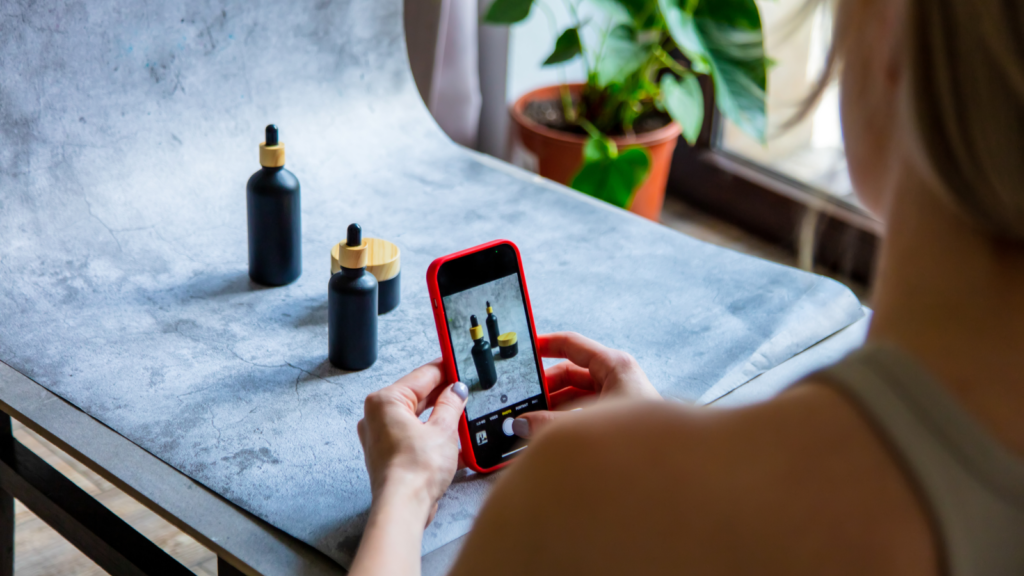
Think about the types of product photography you need. Different product shots serve different purposes, so set up accordingly:
- White background product shots – Clean and professional, these make your product stand out and are essential for product listings.
- Lifestyle shots – Show the product in real life to help customers imagine using it. Add models, props, or staged environments.
- Close-up shots – Focus on textures, materials, or intricate design details to highlight key features.
- Group shots – Ideal for product images that include bundles, variations, or collections.
- Packaging shots – Customers want to see what they’re getting, so showcase the final product, including branded packaging.
- Reference shots – Place your product next to familiar objects to provide a sense of scale.
If you’re shooting print-on-demand apparel, make sure it looks crisp and polished:
- Steam or iron shirts before photographing to eliminate wrinkles.
- Stuff fabric with thin cardboard or tissue for a structured look.
- Use mannequins, hangers, or flat lays to give shape.
For white background photos, position your product in the center, leaving enough space around it for cropping and shooting different angles. Even with a minimalist backdrop, you can use subtle props or textures to create a premium look.
2. Set up a background
Your product photography setup plays a huge role in the final look of your product images. Get this right, and you’ll instantly improve the quality without needing much editing.
Use natural light strategically – Position your work surface near a large window to take advantage of soft ambient light. Use a thin curtain or sheer fabric to diffuse or add more natural light.
Stabilize your backdrop – If you’re using a white background, secure it properly:
- Clamp a paper roll to the backrest of a chair for a quick DIY setup.
- Tape it against a wall, making sure the edges are straight and level.
- Use a photo studio backdrop stand for a more professional setup.
Optimize your light tent setup – If using this approach, line the back wall with white material and trim the backdrop to fit perfectly, preventing visible seams.
3. Adjust the lightning
A well-lit setup makes all the difference in product photography, resulting in high-quality photos that accurately showcase your items.
Whether you’re doing a lifestyle photo or a white background product shot, here’s how to optimize your lighting setup for a stunning final result.
Natural lighting
- Experiment with angles (45-90 degrees from the window) to soften shadows and improve image quality.
- Turn off house lights to prevent mixed-color contamination that could distort your product images.
- Watch for ambient changes. Shifting sunlight, electronic screens, or streetlights can impact your final shot.
- For outdoor shots, find an open space without obstructions. Shoot before midday for the best clarity and softer light, but be mindful of unpredictable weather.
Artificial lighting
- Use two light sources – one as the primary light source, the other as fill lighting to minimize dark areas.
- Add white foam boards or a reflector card to diffuse light evenly across the product.
- If using a light tent, adjust thelight intensity to prevent overexposure and maintain color accuracy.
- Record your setup for reference. Getting the perfect angles and light balance takes trial and error, but a consistent setup will speed up future shoots.
4. Use a tripod and adjust the camera
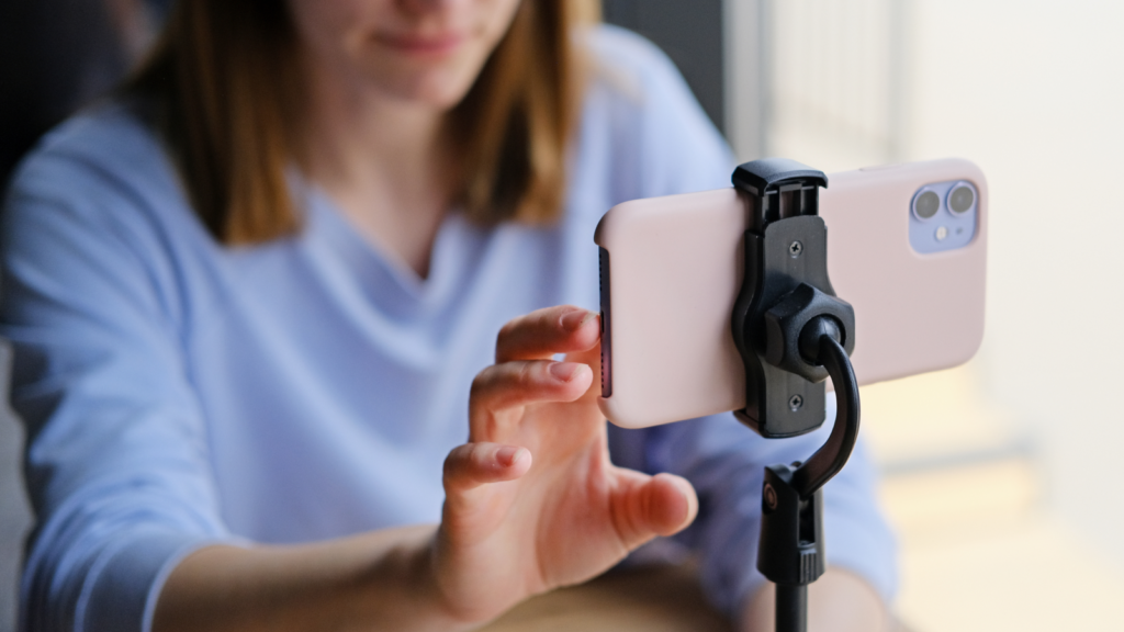
A solid camera setup separates amateur shots from professional-looking product photos. A shaky hand can ruin the sharpness of your product images, so let’s eliminate the guesswork.
Set it and forget it
- Place your tripod directly in front of the product, adjusting the height and distance until the entire frame looks balanced.
- Attach your camera or smartphone securely – you don’t want a sudden tilt ruining your perfect composition.
- Make sure the legs are level – a lopsided shot can throw off the whole visual perspective.
Frame it like a pro
- Leave some space around the product for easy cropping during editing.
- Play with different camera angles to highlight the product’s best features. A simple shift can make an item look sleek, cheap, or high-end.
Angles that sell
- Eye-level shots – A straight-on, direct view that works for almost anything.
- Low-angle shots – Looking up to add dominance and presence to the product.
- High-angle shots – Facing down for a compact, stylish aesthetic.
- Bird’s-eye shots – Great for flat-lay photography.
Take it up a notch and try a 360-degree product shot by slightly rotating the item and capturing it from multiple angles. This creates a seamless effect that makes your online store stand out.
5. Choose the right settings
If you want high-quality product photos, your camera settings need to be on point.
Whether you’re using a DSLR, mirrorless camera, or smartphone, tweaking a few settings will sharpen your images, reduce noise, and enhance colors.
Here’s what you should be looking out for:
- Optimize your storage space – Nothing’s worse than running out of memory mid-shoot. Leave enough space for plenty of high-resolution images.
- Enable scene view grid lines – These help you frame the product properly and keep it centered and aligned.
- Turn off flash and color filter settings – Your lighting setup will do the work. Artificial flash can create shadows and overexposure.
- Use the highest-quality image setting – Shoot in RAW or your camera’s highest JPG setting to capture maximum detail.
- Set white balance to auto – This works well when using a white background, but you can tweak it manually for dynamic lifestyle shots.
- Keep ISO as low as possible – This limits grain for a clean, sharp image.
- Use optical zoom – Digital zoom can distort quality, while optical zoom keeps the clarity intact.
- Use manual exposure – It lets you control the brightness and contrast better than auto settings. If you’re unsure, use Aperture Priority mode to adjust the depth of field.
After taking a few test shots, display them on a larger screen to check details, sharpness, and color accuracy. The small camera preview might miss unwanted grain, uneven lighting, or white balance issues that need adjusting.
6. Take multiple images of your product
Don’t settle for just one photo. Capture various angles and compositions to give customers a complete view of your product.
- Start with a clean, well-lit still shot, then experiment with close-ups, overhead shots, and side perspectives.
- Fine-tune your lighting and focus as you shoot to highlight key features and avoid harsh shadows.
- Check composition and framing to maintain straight, balanced shots with no awkward cropping.
- Upload images to a computer for a proper quality check – small camera screens won’t reveal imperfections.
7. Edit the pictures
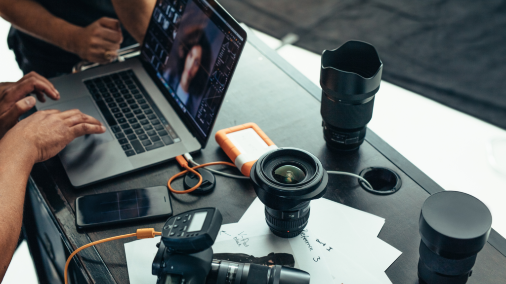
A great photo can become a stunning product image with the right edits.
Since first impressions are everything in eCommerce, now’s the time to refine, enhance, and perfect.
- Upload your pictures – Choose your preferred photo editing software, like Lightroom or Adobe Photoshop.
- Fix white balance – Your backdrop should be crisp and clean, but not artificially stark. Keep some subtle shadows to add depth.
- Tweak brightness, contrast, and sharpness – Be careful not to overdo it. Customers expect real-life accuracy, not over-processed perfection.
- Remove distractions – Dust spots, stray fibers, or uneven edges can make your product photo look unprofessional.
Want to outsource editing? Professional retouching services like Pixelz or Fiverr freelancers can handle it for a few dollars per image – letting you focus on growing your store.
8. Optimize pictures for your online store
Beyond high-quality product photography, make sure your images are ready for web use. The goal of image optimization is to maintain quality while reducing the file size.
One of the biggest factors is loading speed. Large images slow down websites, hurting both the user experience and SEO rankings.
Find the right image dimensions
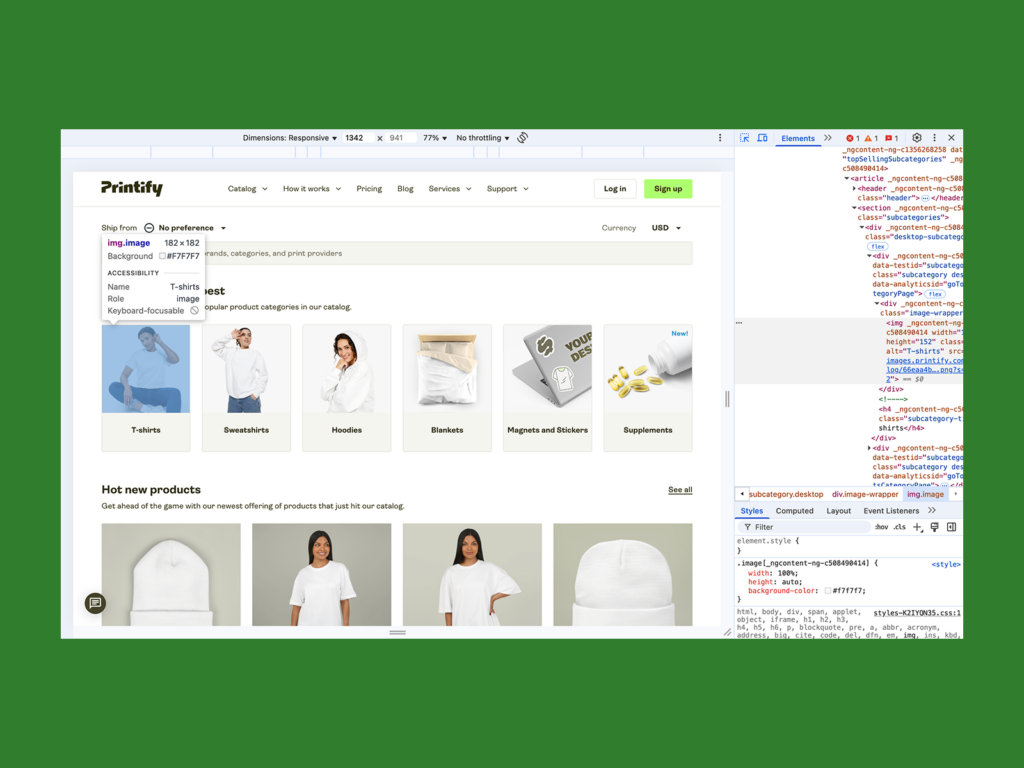
Before resizing, determine the exact image container size your website uses:
- Inspect the web page – Right-click anywhere on your site and select Inspect to open the HTML source code.
- Locate the container – In the layout tab, hover over image elements until the pixel dimensions appear.
- Take note of the size – This helps your images fit perfectly without distortion or unnecessary cropping.
Resize and compress your images
To match your container size:
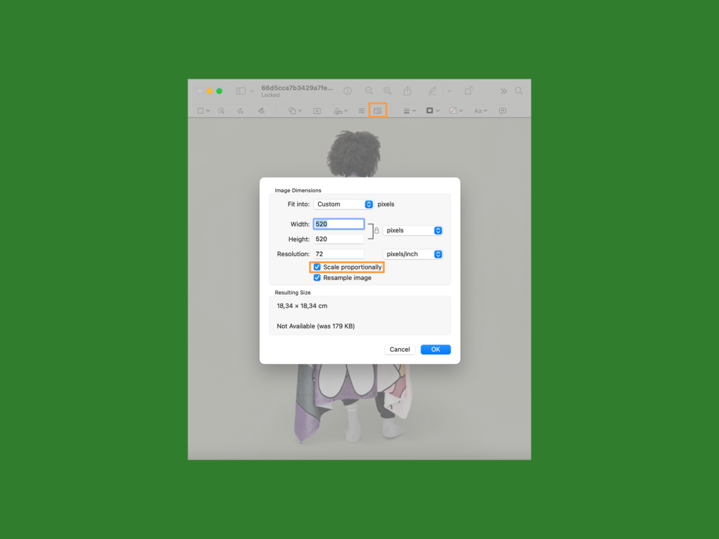
- Use built-in tools like Mac Preview or Windows Photos, or opt for online image editing software.
- Choose pixels for the dimensions.
- Enable scale proportionally to maintain the aspect ratio.
Here’s how it looks in Mac Preview:
You can stick with the precise size or take the pixel ratio up to 1.5 for a sharper display on high-resolution screens. Save the image as a JPEG at 100% quality.
After resizing, compress your images to reduce the file size without sacrificing image quality. Photoshop and online tools like TinyPNG or Squoosh can help.
Final check
Resize each product imageindividually to avoid distortions and cropping issues, even if they feature the same product. Then, review these points before publishing:
- Preview the image on your website.
- Adjust if necessary and make sure all key elements and features are visible.
- Test load speed to confirm your website’s user-friendliness.
With these strategies, your eCommerce store will deliver fast, high-quality product images that drive customer engagement and conversions.
See our guides on optimal Shopify image sizes and Etsy listing photo sizes.
How to take product photos with your phone: Pro tips

Phone cameras have come a long way – some even rival professional gear, making them perfect for capturing high-quality product photos without an expensive setup.
The average smartphone today boasts around 50 megapixels, meaning you can achieve crisp, detailed product shots with the right settings and lighting.
Follow these steps to capture high-quality images on your phone:
- Use the back camera – It offers a higher resolution and better image processing than the selfie camera.
- Choose the right aspect ratio – A 3:4 aspect ratio is ideal for online stores and maintaining photo quality during editing.
- Turn off flash – Built-in phone flashes create harsh shadows and uneven lighting, making products look unprofessional.
- Adjust white balance – If your phone allows it, change this setting to match the lighting conditions.
- Optimize exposure – Tap on the product to focus the camera and adjust the brightness accordingly.
- Lock focus – Press and hold on your product to get sharp details and prevent blurring.
- Keep your lens clean – Not even the best camera is safe from blurry, low-quality images due to smudging.
With these tips, you can achieve professional-looking product photos anytime, anywhere.
3 Best apps for editing product images
Your smartphone is all you need to edit product images like a pro.
Whether you’re enhancing brightness, adjusting contrast, or fine-tuning colors, here are three top-rated editing apps – all free and available on both Android and iOS.
1. Adobe Express
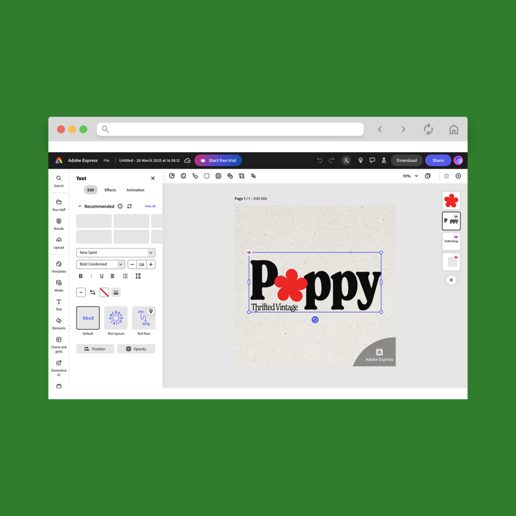
Formerly known as Photoshop Express, this app brings powerful editing tools to your fingertips. Adjust brightness, contrast, exposure, and hue, remove unwanted objects, and apply professional-looking filters without sacrificing quality.
It’s perfect for quick edits that make your product photos pop and ready for an online store.
2. Lightroom
If you’re serious about product photography, Adobe Lightroom is the gold standard. This photo editing powerhouse lets you fine-tune colors, balance lighting, and apply custom presets.
Its AI-powered tools help with automatic adjustments, making it ideal for achieving high-quality product photos. Plus, it syncs seamlessly with Lightroom’s desktop version for consistent brand visuals across all platforms.
3. VSCO
Best known for its trendy filters, VSCO is great for enhancing product images with subtle edits. It offers precise controls for color grading, sharpness, and texture, helping you achieve a polished, aesthetic look.
If you’re selling on social media or an online store, VSCO is a popular and beginner-friendly option to help your product photography stand out.
Use a combination of these photo editing apps to get the best results – Lightroom for deep color correction, Adobe Express for quick edits, and VSCO for finishing touches.
How can good product pictures increase conversions?

Shoppers want to see exactly what they’re getting before they buy.
Clear, appealing photos build trust, set accurate expectations, and make your brand look more professional. Great images don’t just show products – they help sell them.
Enhance your store’s reach and traffic
Great product photography isn’t just for your website – it improves SEO and engagement on social media, ads, and marketplaces.
A/B tests show that larger, high-quality photos lead to higher click-through rates and more sales. Search engines also favor original product images, increasing your store’s visibility.
Provide a better shopping experience
Customers want a 360-degree view before committing to a purchase. Including different angles, close-ups, and lifestyle shots helps highlight key product features to convert buyers.
Different types of eCommerce photography like studio shots, white background images, and in-context lifestyle photos create a more immersive shopping experience.
Improve brand perception and professionalism
Your brand image relies on consistent, well-styled product photos. A sleek backdrop, good lighting, and high-quality editing help establish credibility and differentiate you from competitors.
Using a mix of signature lifestyle shots and standard product images builds a recognizable brand identity.
Encourage faster decision-making
People process visuals faster than text, and compelling images hold attention longer. The first few seconds are critical – if your images don’t immediately engage potential buyers, they’ll bounce off the page.
Strong product photography hooks visitors, while detailed product descriptions reinforce the purchase decision.
Using different types of product photography strategically – with optimized images, different angles, and clear product details – improves customer trust and ultimately drives more conversions.
Examples of creative product photography
Creative product photography tells a story. With smart framing and thoughtful props, you can highlight your brand’s personality and connect with shoppers on a deeper level.
You don’t need to be a professional photographer to get creative. AI-powered tools like Adobe Sensei, Canva’s Magic Resize, or smartphone-based AI features can help balance framing, adjust lighting, and suggest creative angles in real time.
Need some inspiration? Try these techniques:
- Dynamic poses or angles – Skip the standard eye-level shots. Play with depth, framing, and perspective to add energy.
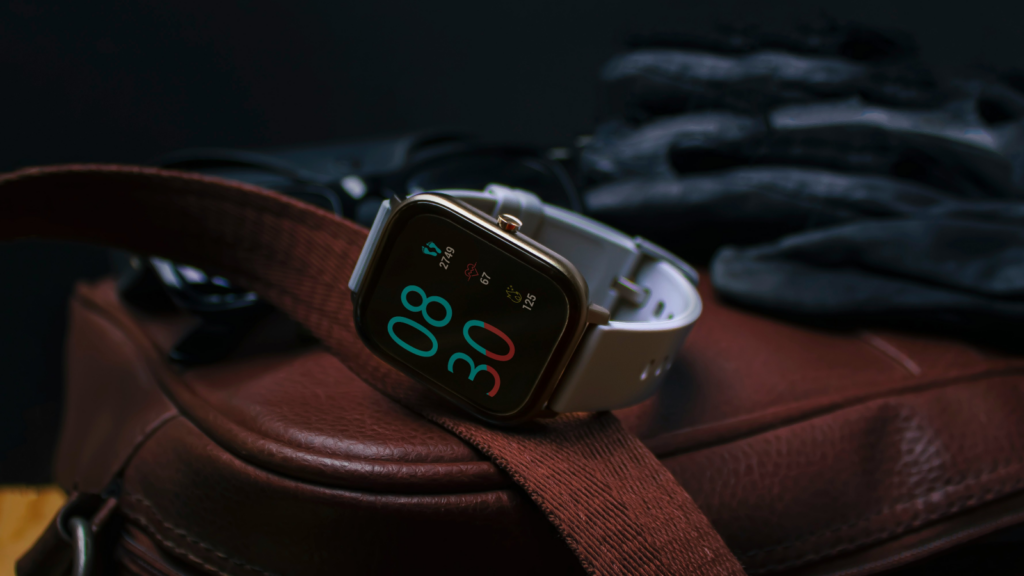
- Macro shots – Zoom in on textures and details for bold, high-impact visuals.
- Styled setups – Use props, color themes, or AI-generated backgrounds to build scenes that reflect your brand.
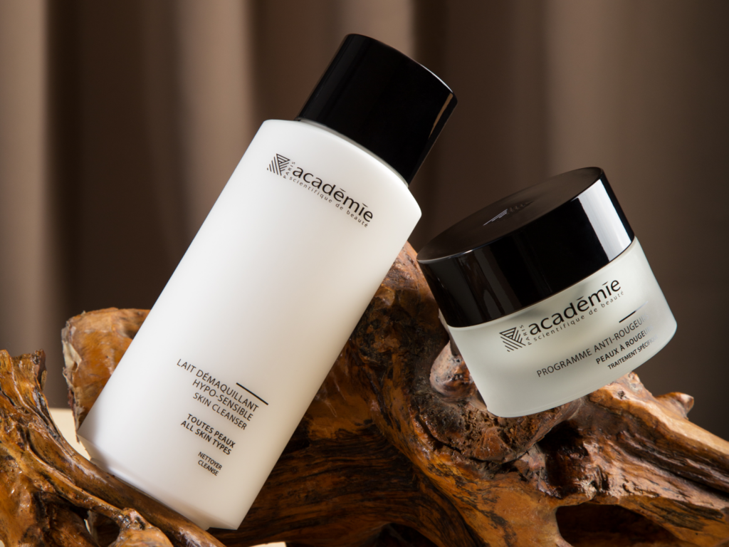
- Hanging shots – Capture your product mid-air for a cinematic, in-motion feel.
AI isn’t just about automation – it’s a creativity amplifier. Whether you’re a beginner or a seasoned pro, AI can take your product photography to the next level, giving your online storefront an instant upgrade.
FAQ
For DIY product photos, all you need is a smartphone camera, a tripod, and a well-lit surface near a large window.
Start taking photos by placing your product in front of a white backdrop and adjusting your lighting to reduce intense shadows. Set your camera to the highest quality with a high focal ratio, white balance, and low shutter speed.
Take multiple photos and upload them to editing software. Adjust the contrast, hue, and saturation until you’re satisfied with the final result.
For catalog photos, use a white backdrop for a polished, distraction-free look. Clean, high-quality images that highlight specific product features are crucial for driving purchases.
While you can use natural or artificial light, we recommend shooting near a window for a soft, diffused glow. For artificial lighting, use reflective boards or a softbox to reduce glare and harsh shadows.
After editing, resize your photos to fit the website layout. Match the dimensions of your store’s image containers, and compress the image file sizes to improve your shop’s loading speed.
Start with a goodsmartphone or camera, a tripod for stability, and a basic lighting kit – like two softboxes and foam boards or a light tent. Create a seamless white background using a cloth sheet, paper, or poster board.
Set up your photo studio, adjust the camera settings, and take multiple photos from different angles highlighting key product features. Then, edit the contrast, hue, and saturation using image editing apps like Lightroom or Photoshop.
Your iPhone camera can rival professional product photography – if you know how to use it right. Here’s how to get the most out of it:
- If your iPhone version supports it, shoot in ProRAW for greater control over color, exposure, and detail in post-production.
- For small products, Portrait Mode creates a soft background blur, making your item stand out.
- Avoid camera shake by using a Bluetooth shutter button or your Apple Watch to snap photos hands-free.
- Experiment with Live Photos and Burst Mode. Capture subtle variations and pick the sharpest frame. This is great for action shots in lifestyle photography.
- Experiment with exposure control. In your camera app, tap and slide up or down to manually adjust the brightness.
- If your iPhone has multiple lenses, use ultra-wide for dynamic angles, telephoto for detailed close-ups, and the standard lens for balanced, distortion-free shots.
These tricks turn your iPhone camera into a fast and flexible product photography tool.
Snap, edit, and profit from amazing product photos
In a world where visuals rule, standout product photos aren’t optional – they’re essential. Great images build trust and drive sales.
Let’s recap the steps on how to take the best product photos:
- Set up a product
- Prepare a clean background
- Adjust the lighting
- Use a tripod
- Choose the right settings
- Take multiple product images
- Start the editing process
- Optimize pictures for your online store
Product photos are as much a visual aid as a branding opportunity. With the right setup and a little creativity, your home can become a pro-level studio. Lights on, camera ready – let the sales begin.


