Sell custom products with Printify
Flags can represent a movement, commemorate an event, or become the symbol of a group.
Whether you’re designing something fun for personal use or creating flags to sell online, this guide covers a wide range of cool flag design ideas.
You’ll find practical design tips, inspiration across different styles, and a straightforward way to bring your designs to life with Printify.
Flag design ideas
Great flag design starts with simplicity. The best flags use basic elements – lines, colors, and symbols – but combine them in ways that feel meaningful and memorable. Here are five flag design categories to inspire your next creation.
1. Minimalist geometry
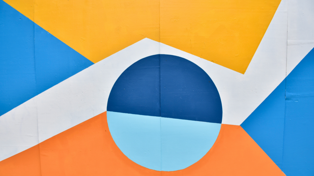
Bold shapes. High contrast. Instant recognition.
Minimalist flags work because they strip everything down to what matters most. A single circle, a clean stripe, or two intersecting blocks of color can make a powerful statement, especially when seen from a distance or in motion.
Japan’s red circle on white is a perfect example. So is Greenland’s curved horizon in red and blue. Neither design is complicated, but both are recognizable anywhere in the world.
Design considerations:
- Limit your colors: Stick to 2-3 bold, contrasting colors. Too many shades blur together from far away. Simplicity makes your flag easy to identify in seconds.
- Choose simple shapes: Circles suggest unity, triangles imply change, and bars convey stability. Basic geometry carries meaning and stays legible even when the flag is moving.
- Test for readability: View your design at a small size and in grayscale. A strong flag should work as a pin, patch, or simple sketch.
Minimalist geometry works well for modern brands, digital communities, and personal identity flags where clarity is everything.
When in doubt, simplify. If your design still communicates your intended meaning after removing a color or line, you’ve found its strongest form.
2. Symbol and stripe combo
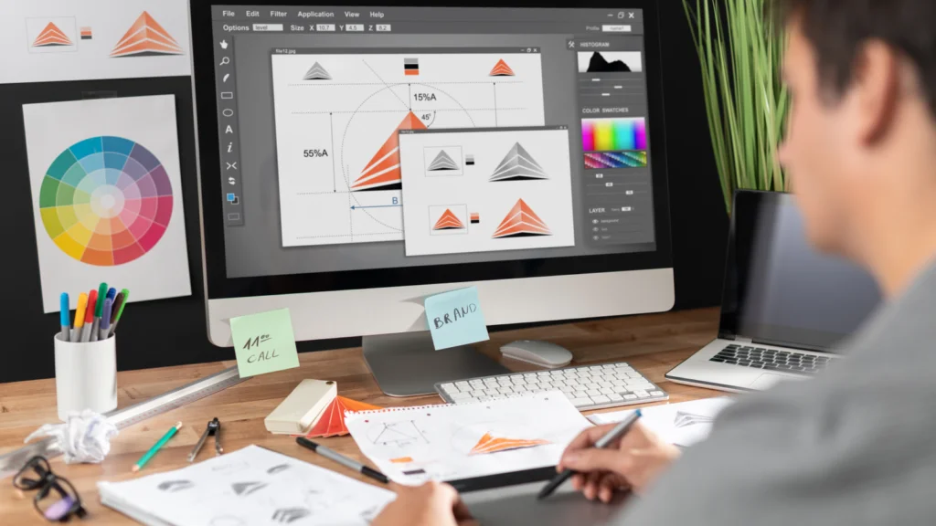
This is one of the most versatile approaches to flag design. Stripes create visual order and rhythm, while a symbol adds identity. You’ll see this format everywhere, from state flags to sports teams and grassroots movements.
The United States flag uses stripes and stars. Greece combines blue-and-white stripes with a cross. The structure is familiar, which makes these designs instantly recognizable and easy to adapt.
Design considerations:
- Keep stripes balanced: Use 2-3 horizontal or vertical bands. Stripes guide the eye and create harmony, but too many can make the design feel cluttered.
- Simplify your symbol: Choose something bold and easy to reproduce – a star, flame, compass, or leaf. Remember, flags aren’t posters. Fine details disappear when viewed from a distance.
- Think about placement: A centered symbol feels traditional and formal. An offset placement creates a more modern, dynamic look.
This approach works well for community flags, team flag ideas, and social causes that want to feel accessible yet distinct. It’s also great for groups within fandoms or gaming worlds where a clear structure makes the flag immediately readable.
Make sure your symbol has purpose. It should represent something specific, rather than just filling space.
3. Nature-inspired

Nature adds a timeless quality to flag design. A wave rolling across a sandy field, a rising sun made of layered circles, or a green triangle suggesting a mountain – these elements feel connected to something real.
The Navajo Nation flag does this beautifully with earthy tan fields, corn plants, and outlines of sacred land. Every element ties back to place and meaning.
On the other hand, Portland’s city flag condenses rivers, forests, and fields into bold green, yellow, and blue bands – a modern, abstract representation of natural landscapes.
Design considerations:
- Use a natural palette: Terracotta, forest green, sky blue, and sunburst yellow connect your design to the natural world without being too literal.
- Work with organic shapes: Waves, spirals, and leaves break up rigid grids, making flags feel more alive and approachable.
- Balance asymmetry: Nature isn’t perfectly symmetrical, but design should be intentional. Balance irregular forms so your flag looks deliberate, not messy.
Nature-inspired designs work for environmental organizations, heritage events, and wellness movements. They’re also perfect for fictional cultures tied to land and tradition.
These designs carry quiet strength and signal harmony. When drawing from nature, remember to simplify – let the symbol suggest rather than illustrate every detail.
4. Abstract energy
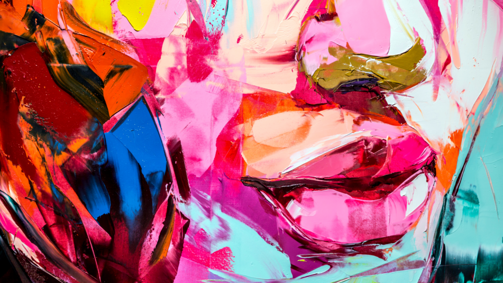
Abstract flags don’t spell things out – they create a mood. Instead of literal symbols or traditional layouts, they use motion, color, and visual rhythm to make an impression.
The Progress Pride flag is a great example. Its chevrons and bold color fields create a sense of forward movement and layered meaning without relying on literal imagery.
Similarly, Amsterdam’s city flag uses stark crosses on red and black. It’s less about depicting something specific and more about creating rhythm and impact.
Design considerations:
- Add dynamic lines: Use diagonals, arcs, and broken fields. Angles create tension, while curves suggest flow and continuity.
- Choose colors for emotion: Think about how colors make people feel, not just what they traditionally symbolize. Clashing tones feel rebellious, while blended gradients suggest harmony or transformation.
- Give it some logic: Even abstract designs need structure. Repeat elements, mirror edges, or use one stable anchor to keep the design intentional.
Abstract energy works for art collectives, speculative worldbuilding, and countercultural movements – any group that resists easy definitions. These flags linger in people’s memories because they feel alive.
5. Heritage-inspired
Flags rooted in heritage carry weight that pure aesthetics can’t match. They borrow colors, symbols, or patterns from the past and reinterpret them for the present.
New Mexico’s state flag is a standout example – the red Zia sun symbol centered on a gold background. It’s simple, powerful, and deeply rooted in the region’s Indigenous heritage.
Another great example is the Welsh flag. It features a red dragon (Y Ddraig Goch) on a white and green background, which originates from an ancient Welsh legend and has been a symbol for centuries.
Design considerations:
- Use colors with historical significance: Culturally relevant tones connect modern designs to history.
- Incorporate cultural motifs: Symbols from textiles, architecture, or emblems can reflect identity, but handle them with respect and research their significance.
- Add a modern twist: Simplify complex motifs into clean, bold forms. This keeps heritage alive while ensuring the flag remains versatile and easy to reproduce.
Heritage-inspired designs work well for diaspora communities, revived city or county flags, and history projects.
Done thoughtfully, they give people something meaningful to rally around.
Practical tips for creating your flag

Designing a flag isn’t just about what looks good on screen – it’s about creating something that works in the real world.
The best flags follow a few reliable principles that have been proven effective throughout history. Here’s how to ensure your design stands out wherever it’s displayed.
Test visibility at different scales
A flag should be recognizable from across a stadium and still work as a tiny icon on a phone. Scale your design up and down to see if the shapes and colors hold their impact.
Try your design on:
- Large-scale displays: Stadium banners, outdoor rallies, building drapes.
- Medium-scale displays: Handheld flags, car flags, wall hangings.
- Digital assets: Social media avatars, website icons, email headers.
- Print materials: Flyers, posters, low-resolution grayscale printouts.
- Small-scale items: Pins, patches, stickers, phone backgrounds.
If your design works across all these formats – or even as a custom t-shirt design or cup design ideas – you’ve got something strong. If it doesn’t, strip back the details until it does.
Check color contrast in black and white
Flags often appear in less-than-ideal conditions – at dusk, under streetlights, or printed on a basic office printer. A good flag should still work in grayscale. High contrast between light and dark areas makes designs pop, no matter the medium.
Convert your design to grayscale in any image editor (Canva and Photopea are free options) or use an online contrast checker. If shapes blend together, your contrast needs work.
You can also squint at your design until details blur, or print it on a home printer. The bold forms should still stand apart.
Keep proportions standard (2:3 or 1:2)
A flag’s shape matters as much as its colors or symbols. Most flags use a 2:3 or 1:2 ratio (height to width). These proportions look balanced, fly well, and are easy to reproduce across manufacturers. If you go too tall or too wide, the flag can look awkward next to others.
How to apply it:
- Pick a common ratio: 2:3 is most common worldwide; 1:2 is widely used (like the UK flag). 3:5 appears on some regional and civic flags.
- Design to the ratio from the start: Set up your canvas at 2:3 or 1:2 so shapes, stripe widths, and symbol sizes stay proportional.
- Stay consistent: Use the same ratio for mockups, print files, and production so your flag always looks right.
Think about emotional resonance
Will people want to wave it? A flag should spark a reaction quickly. Color and shape do most of the heavy lifting. Aim for simple, bold, and memorable, whether that’s a single color or a rainbow that signals belonging.
Quick checks:
- Five-second test: Show your design to someone briefly. What sticks – colors, shape, or nothing? If nothing registers, simplify.
- One-line story: Describe what your flag stands for in one sentence. If you can’t, the concept isn’t clear yet.
- Add one distinctive touch: Include a unique angle, stripe, or symbol that makes the design feel original without adding clutter.
Design with longevity in mind. If you feel hesitant about any element, consider cutting a color, sharpening a line, and testing again. The goal is a design that inspires action.
How to create a custom flag with Printify
Print on Demand makes flag creation super quick and easy. You design, we print and ship. No inventory required, minimal risk, and fast turnaround.
Here’s how to start designing flags and bring them to life with Printify:
- Sign up: Create a free account in under a minute.
- Choose your flag: Browse custom flags in the Catalog. Pick your size and ratio to create your own flags.
- Add your design: Open the Product Creator and upload your art. Align it and preview it on a mockup to see how it looks – no graphic design experience needed.
- Order a sample or start selling: Order a sample to see your design in person, or click Publish and start selling through any of our eCommerce integrations.
- We handle the rest: We print and ship each order. You focus on creating more designs or promoting your flags.
FAQ
- Keep it simple.
- Use meaningful symbols.
- Limit colors (2-3) with strong contrast.
- No text – flag is a visual sign.
- Be distinctive (or clearly related to a group).
Start by writing one sentence about what your flag represents. Think about the meaning behind it and the emotion you want to convey. Sketch big shapes and create symbols that communicate that meaning.
Looking for team flag ideas for game day? Go bold with high contrast. Working on a creative flag design? Let one shape carry the story. Exploring made-up flag ideas for worldbuilding? Let the world’s values guide your choices.
Pick a category that fits your concept – geometric minimalism, heritage-inspired, or abstract energy – and follow its design principles. Sketch ideas and test them from a distance.
Here are some prompts to get started:
- Simple flag ideas: One symbol on a solid background.
- Cool flag design ideas: Diagonals, off-center symbols, or a bright stripe.
- Made up flag ideas for worldbuilding: Define core values first, then pick colors and shapes that reflect them.
- Feather flag design ideas: Tall, narrow designs with bold vertical elements work best.
This usually refers to the 13-star layout on early US flags, often linked to Francis Hopkinson. The pattern uses five rows of stars: 3, 2, 3, 2, 3. Stars are evenly spaced, and the 2-star rows are centered between the 3-star rows.
Some designers also use 3-2-3-2-3 as a five-stripe thickness pattern, but that’s less common.
Conclusion
Flags are visual stories. Design them to read quickly and feel authentic—whether they’re flying on streets across America or representing worlds you’ve imagined. Test your design at small sizes, order a sample, and refine until it feels right.
Ready to get started? Create a free account today and read our guide on how to start a print-on-demand business.
