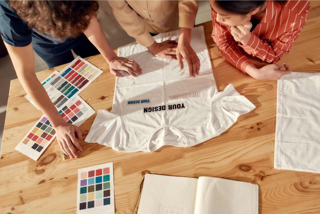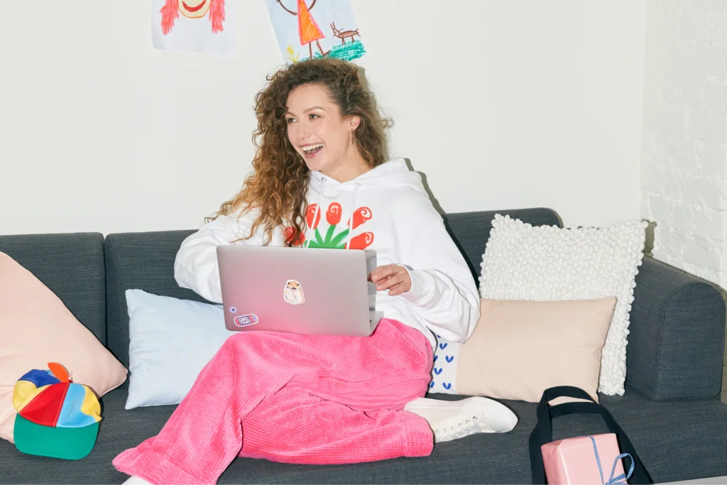


Make your own shirt today
T-shirts are a profitable product to sell, and designing them can be super fun. But choosing between all the different t-shirt and ink color combinations can get overwhelming.
This article will go over choosing the perfect color combinations, so you’ll end up with beautiful, eye-catching t-shirts every time.
Whether you want a more traditional look or to try something with bright colors to grab customers’ attention, we’ve got you covered.
Basics of color theory
Before diving into shirt color combinations, let’s go over a few theoretical aspects of color mixing in visual arts and design.

The color wheel has three primary colors (blue, red, and yellow), three secondary colors (orange, purple, and green), and six tertiary colors (vermillion, amber, chartreuse, teal, indigo, and magenta).
Combinations from different points on the wheel create different color schemes.
For example:
- Complementary colors – These are opposite each other on the wheel (e.g., blue and orange) and create strong contrast that makes designs stand out.
- Analogous colors – These sit next to each other on the wheel and create a more harmonious look.
- Triadic color schemes – Three colors evenly spaced on the wheel, often used for vibrant, lively designs.
High-contrast shirt and ink color combinations make t-shirt designs pop, while neutral colors offer a more timeless aesthetic. Understanding contrast and visibility is key when designing custom apparel.
When creating t-shirt designs, it’s essential to understand color modes – RGB is used for digital displays, while CMYK is the standard for printing. Since t-shirt printing relies on CMYK, what you see on screen might look slightly different in real life.
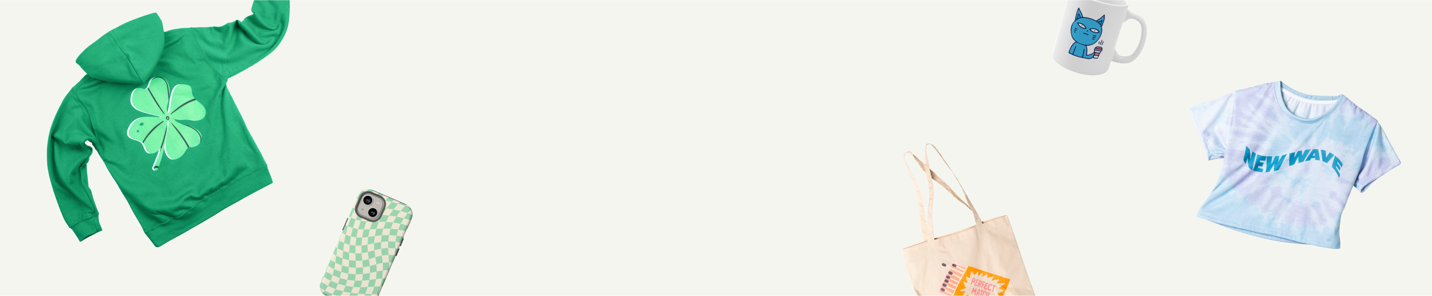
10 T-shirt and ink color combinations that work
You’ll find a huge range of t-shirt colors in the Printify Product Catalog. Some shirts have up to sixty colors to choose from. We all love variety, but not every shirt and ink color pairing will be a bestseller.
To get you started on the right track, here are 10 t-shirt color combinations that will look fantastic.
Read our guide on how to choose a t-shirt style that’ll be a fan favorite in your store.
Black and yellow

The black and yellow shirt combo is a staple in sportswear, branding, and custom t-shirt design. From athletic apparel to streetwear brands to rap songs, this high-contrast pairing is both striking and versatile.
- Black t-shirts create a sleek base, making yellow ink pop with vibrant energy.
- Yellow t-shirts with black ink deliver bold contrast, ensuring t-shirt designs remain eye-catching and legible.
- Black and yellow are a great t-shirt color combo when starting a clothing brand, thanks to their contrast and clarity in custom ink prints.
Use black and yellow designs for high-impact, statement-making t-shirt color combinations that attract attention and drive sales for your t-shirt business.
Red and white

A red t-shirt and white ink (or the inverse) create a high-contrast look that turns heads.
- Red is a primary colorand naturally grabs attention, so it’s commonly used on warning signs and high-visibility branding.
- White ink on a red t-shirt offers strong contrast, ensuring that intricate designs and thin lines stand out.
- This combination is perfect for custom t-shirts, hoodies, and bold statement pieces.
Orange and blue

Combining the complementary colors blue and orange is a powerful way to create a high-contrast t-shirt design that stands out.
- Bright orange and royal blue are popular for gym wear, team uniforms, and sports jerseys.
- Consider a lighter orange t-shirt with navy blue ink to balance vibrancy with wearability.
- This t-shirt design pairing works well for bold branding, high-energy designs, and eye-catching custom ink prints.
Although contrasting colors create a strong visual impact, avoid overly bright tones that might be too overwhelming – unless that’s what your customers want.
Blue and gold

Blue and gold give a sophisticated, luxurious, and confident vibe. Blue is one of the most popular t-shirt colors because it looks good on everyone. Add gold ink, and you have a design that feels timeless, bold, and effortlessly stylish.
- This is a pairing for high-end custom clothing, uniforms, or statement pieces that need to stand out.
- The color combo is exceptionally good for t-shirt designs with vinyl prints, bold graphics, and intricate linework.
For the best shirt and ink color combination, go for a rich navy blue t-shirt with metallic gold ink – it looks premium without trying too hard.
Black and white

The black and white combo is classic. Black ink on a white t-shirt is sharp and modern, while white ink on a black t-shirt is sleek and timeless. No matter which way you flip it, this high-contrast pairing makes every design pop.
- Perfect for any aesthetic – minimalist, vintage, or edgy streetwear.
- Works exceptionally well for detailed graphics, thin lines, or high-contrast typography.
- A safe bet for any custom apparel business because black and white look good on everyone.
When in doubt, go black and white – these shirt colors are a foolproof choice that never goes out of style.
Blue and white

If you’re after a versatile and timeless choice, blue and white is one of the best t-shirt color combinations you can try.
- Experiment with different shades of blue. Medium to darker shades usually look best in this combo since white lettering would quickly get lost on a light blue t-shirt.
- White ink on a blue shirt provides a nice contrast, making even thin lines and intricate details stand out.
- Flip the script with a white t-shirt and blue ink – a fresh, summer-ready combo perfect for beach-inspired designs.
Olive and gold

This isn’t your average t-shirt color combination, but that’s why it works. While most people stick to safe, conventional color choices, this duo screams bold, stylish, and unexpected – perfect for a brand looking to stand out.
- Olive is an underrated neutral – earthy, warm, and versatile. It lets gold designs shine without overpowering them.
- Go big or go home with your designs. Gold ink looks best in bold letters, clean graphics, and statement prints.
Maroon and white

Maroon and white areclassic, bold, and effortlessly stylish t-shirt colors. If you’re looking for t-shirt color combinations that pop in dark colors, this is the one.
- Maroon t-shirts are often linked to fall fashion, school pride, and vintage aesthetics, making them a go-to for uniforms and streetwear.
- White ink on marooncreates a strong contrast, making designs crisp and highly visible. This combination is perfect for bold logos, typography, and intricate details.
- Flip the script with a white t-shirt and maroon ink to give your shirt design a fresher look with a blank base.
Whether you’re designing for sports fans, college merch, or trendy streetwear, this color pairing is a proven winner.
Red, blue, and yellow

Bold, energetic, and impossible to ignore, red, blue, and yellow bring primary colors to life in a way that demands attention.
- Try starting with a blue shirt as your base – navy or royal blue works best for contrast.
- Use red and yellow ink to create a design that pops without overwhelming the eye.
- Adjust the tones – deep blue with muted red and golden yellow makes for a balanced yet dynamic look.
This perfect combination of bright colors is excellent for bold graphics, retro aesthetics, and team apparel.
Green and gray

Green and gray are unexpected but seriously underrated on our list of t-shirt color combinations. Whether you go for forest green, mint green, lime green, or kelly green, each shade can create a unique effect when paired with a gray base.
- Dark gray with kelly green ink is great for bold graphics, sports logos, or a nature-inspired t-shirt design.
- Light gray with deep forest green is a classic, earthy combo that works well for minimalist designs or eco-friendly brands.
- Heather gray with mint or neon green is a fresh, trendy look for summer collections or casual wear.
Want to make the t-shirt pop? Add white or black outlines to increase contrast and bring attention to details. Whether you’re aiming for vintage athletic styles or modern streetwear, this combo delivers.
How to choose the right t-shirt color combination
Nailing the perfect t-shirt color combinations is about making your design pop while staying true to your print-on-demand business.
Here’s how to get it right:
- Include the classics. Just about every niche appreciates a black t-shirt with white ink or vice versa. Offer this timeless combo to cover your bases with more minimalist customers.
- Think about your audience. What do they like? Loud, vibrant combos or more muted ones?
- Use the color wheel. Colors opposite each other (like blue and orange) pack a punch, while analogous colors create a nice monochromatic look.
- Contrast is king. Light ink on dark shirts (or vice versa) makes your design impossible to miss.
- Find inspiration. Check out trending t-shirt design ideas on Etsy, Instagram, and TikTok to see what sells.
Start a t-shirt store with Printify

Want to start your own t-shirt business? With Printify, launching a store is quick, hassle-free, and requires zero upfront costs.
- Sign up for free. No hidden fees or purchasing inventory.
- Choose your t-shirts. Browse our massive selection of styles and colors.
- Upload your designs. Use our beginner-friendly Product Creator to customize your shirts.
- Publish to your store. Seamlessly integrate with top eCommerce platforms for easy listing and order management.
- Let us handle the rest. Our Print Providers take care of printing, packing, and shipping straight to your customers.
Depending on the Print Provider, your designs may be created using several printing methods:
–DTG (Direct-to-Garment). Best for detailed, full-color prints
–DTF (Direct-to-Film). Offers better durability on various fabrics.
–Sublimationor all-over printing. Infuses ink directly into polyester fabrics, creating vibrant, long-lasting designs that won’t fade, crack, or peel over time.
FAQ
The best ink colors for t-shirts depend on the shirt’s background color, but in general, high-contrast and bold hues stand out the most.
Most digital designs are created using the RGB (red, green, blue) color model because it’s the standard for screens. However, t-shirt printing typically uses CMYK (cyan, magenta, yellow, and clack) inks. This difference can cause some color shifts during the printing process, so always preview your design in CMYK if possible to get a more accurate idea of how the final print will look.
Read our guide on RGB vs CMYK to ensure your files are in the correct format for crisp, colorful designs.
The best t-shirt and ink color combinations depend on personal preference, design style, and printing method.
- DTG printing works best on 100% cotton shirts with dark ink on light fabric or white designs on darker colors.
- DTF printing creates vibrant colors on all shirt colors, including tricky fabrics like polyester blends.
- Sublimation printing thrives on light polyester shirts, making bright, full-color designs stand out. Because there is no white ink in sublimation, the base shirt should be white.
- Screen printing is ideal for bold, high-contrast designs, like black ink on a white shirt or yellow ink on a navy blue or black t-shirt for a striking look.
The best three-color t-shirt combos often follow color wheel principles:
- Red, blue, and yellow are primary colors that add vibrancy.
- Black, white, and gray make up a neutral color palette for sleek, modern designs.
- Navy, gold, and white create a classic blend often used in sportswear and branding.
When creating a t-shirt design, the base can make or break the shirt’s success in your store.
Black ink works well with light-colored shirts for maximum readability. A white t-shirt is a go-to option for high contrast, but light gray, pastels, and earth tones also work beautifully.
Opt for muted shades like beige, light blue, or heather gray if you want shirt colors that create a softer effect.
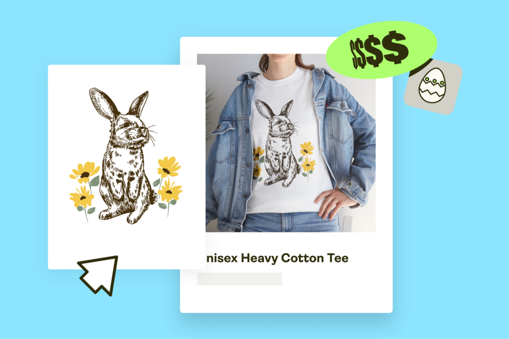
Ready to start making that green?
Now that you have these t-shirt color combinations to choose from, it’s time to start designing.
Our Catalog offers hundreds of t-shirt options for people of all different age groups, and our free design tools make it easy to create the perfect t-shirt design for yourself, your friends, or your online store.
Sign up, create your new favorite t-shirt with the perfect color combination, and start selling custom apparel online!