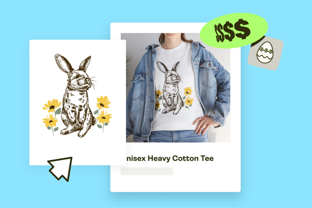


Create what’s trending. Sell what’s hot
The official Pantone Color of the Year 2026 drops this December, but the color marketing battle is already fierce. Experts like WGSN are pushing Transformative Teal green, while Sherwin-Williams favors the neutral hues of Universal Khaki green.
For print-on-demand (POD) entrepreneurs and graphic designers, knowing these trends is crucial for planning best-selling products. Keep reading to discover the global signals influencing Pantone’s 2026 decision and the green shade predictions that’ll define style in the coming year.
What is Pantone’s ‘Color of the Year’?
The Pantone Color of the Year program started in 1999 as a way to link culture and color. Every year, the Pantone Color Institute’s experts study global trends across the fashion world, art, and social shifts to identify one defining hue that captures the world’s collective mood. They announce the final shade in December.
The chosen color acts as a global design forecast, influencing home design, product style, and color marketing. More than just a visual trend, it represents a psychological snapshot of society’s mood and aspirations – a reason why brands and creators pay close attention to Pantone’s choice.
For example, the 2025 Pantone’s pick, Mocha Mousse, was a sophisticated, warm brown shade. Experts chose this subtle and classic color because it evokes a sense of stability and cozy warmth, perfect for minimalist lovers.
Understanding these annual trends helps POD creators keep their products relevant and, more importantly, appealing. A crucial step in connecting with customers and staying ahead of competitors.
Predictions for 2026 – What will be the Color of the Year?

For 2026, the leading themes are simple: a search for stability and a return to the natural world. After a lot of change, people want healing and sustainable living. This focus gives us 2 main color trends for the coming year – deep nature tones and simple, neutral hues.
The first major trend centers on the nature-inspired green shade. WGSN picked Transformative Teal for 2026, describing it as a beautiful mix of blue and aquatic green. Other paint colors in this family – like the hidden gem of Smoky Jade and the muted sage Warm Eucalyptus – carry the same restful yet modern, sophisticated effect.
This vibrant yet grounded shade of Transformative Teal introduces a refreshing and trustworthy look to your creative services, making your products instantly feel relevant, mindful, and high-quality.
The second major trend points to comfortable, grounding colors. They’re versatile and easily pair with a wide range of shades, acting as a stable backdrop for modern design.
Sue Kim, Valspar’s Director of Color Marketing, defends Warm Eucalyptus as a strong neutral: “Going beyond the classified color term, neutral refers to colors that set a grounding and inviting mood with the warmth that calms our senses.”
Major paint brands have made their choices. Sherwin-Williams, for example, chose Universal Khaki for its ability to create balanced, peaceful spaces.
Benjamin Moore picked Silhouette, a rich, dark blend of espresso and charcoal from the browns family. Offering a classic and dramatic look, this shade brings high-end sophistication to any room.
Meanwhile, Glidden favored Warm Mahogany as its color of the year. The deep red-brown shade adds richness and a cozy feel to interiors, including kitchen cabinets. Its warmth is perfect for creating inviting spaces.
The final Pantone reveal is still coming. However, these paint colors are guaranteed to set global trends and influence both home decor and the fashion world.
The 2026 color battle and your next bestseller

The official Pantone Color of the Year 2026 announcement typically drops in early December.
Monitor Pantone’s official channels and major design publications to be an early adopter.
That said, the announcement is just the start – adoption dictates the real trends. Throughout the coming year, observe how major fashion weeks, interior design shows, and fresh tech or gadget launches embrace the chosen colors.
You’ll know the color marketing works if it appears consistently across various industries.
Consumer reaction is also key. Does the color quickly become flashy and oversaturated, leading to a short trend life? Or, is it adopted more subtly, suggesting a classic, timeless evolution? For POD sellers, watching for these signals helps you adjust your offerings.
It’s never too early to look ahead to 2027 and 2028. We know from past trends that colors rarely disappear completely – they evolve.
For example, the deep green shade of Transformative Teal might lighten into a muted sage or minty hue in a future palette. We may see a shift in palette saturation, or the shades may appear in new finishes with a tactile element, like iridescent trims in fashion or textured ceramics.
These subtle shifts give you a two-year head start. This foresight provides the necessary depth and fresh tones for your future art and home decor collections, whether that’s on wall prints or custom acrylic signs.
If you’re interested in more than just paint colors, our articles on design trends explore topics like gift trends, creative sticker design ideas, or the best white-label products to sell.
When designing apparel using popular blanks like Printify’s Gildan POD products, study the Gildan color chart to ensure your predicted shades are available and pair well with core apparel tones.
FAQ
The Pantone Color of the Year 2027 hasn’t been announced yet. Pantone reveals its new annual color in December. However, color trend forecasting authorities like WGSN and International Colour Authority (ICA) usually release early predictions a few months before, helping designers and brands plan their products and marketing strategies for the year ahead.
The Pantone Color Institute’s team of color experts spends the year researching global trends. They look at the fashion world, new technology, social media, and world events. The final hue reflects the world’s emotional tone, serving as both a color marketing tool and a forecast for future design trends.
While the Pantone Color of the Year 2026 hasn’t been announced yet, strong global trends suggest two popular directions: calming green shades and versatile neutral hues. Trend forecaster WGSN named Transformative Teal, while the paint brand Sherwin-Williams picked grounding tones like Universal Khaki. This shows the world wants simple, timeless design embodying nature, regeneration, and sustainability.
The official Pantone Color of the Year for 2025 isMocha Mousse (PANTONE 17-1230). This warm, comforting brown shade reflects a global desire for simplicity, stability, and connection to the natural world. This tone has influenced mindful design trends across fashion, interiors, and home decor.
Pantone usually announces the new Color of the Year in early December. For the Pantone Color of the Year 2026, the official announcement should happen in December 2025.
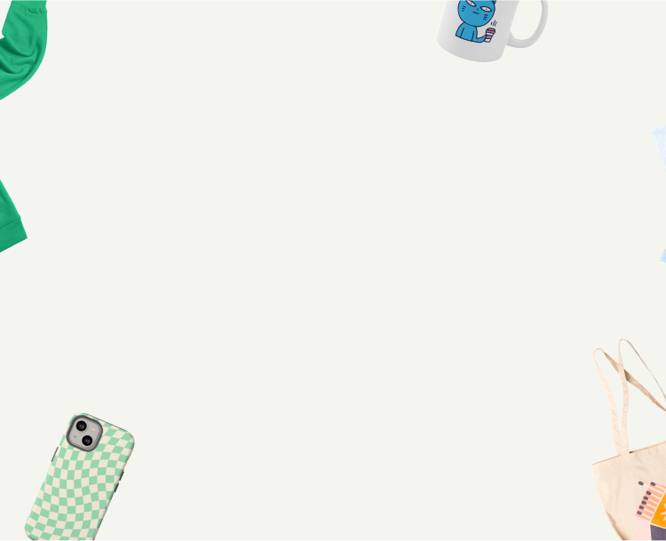
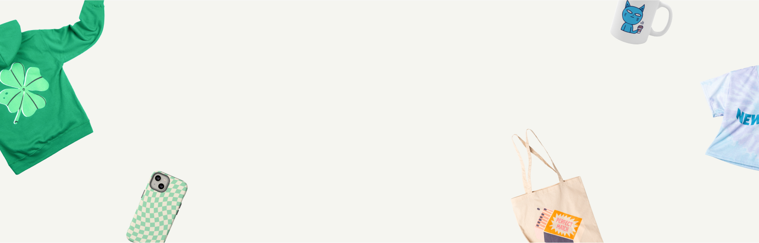
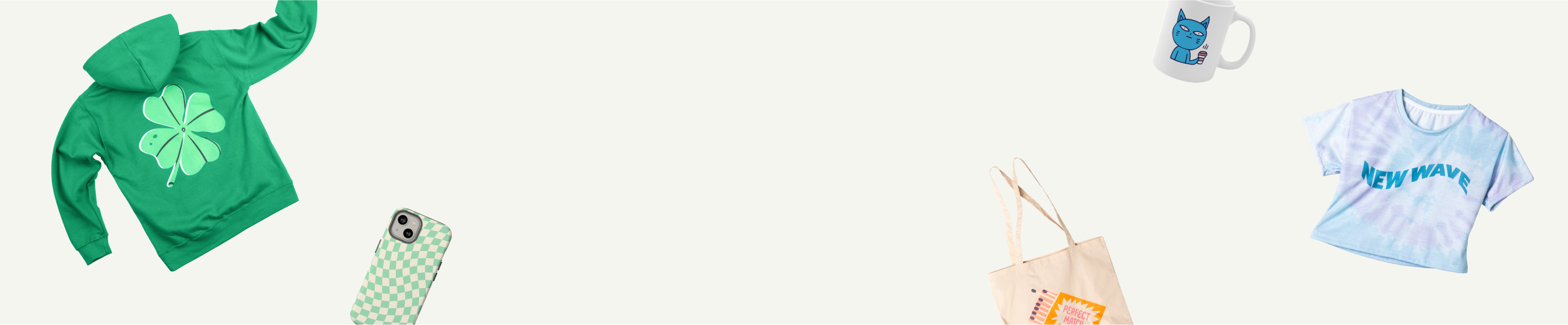
Use Transformative Teal and its complementary neutrals – Universal Khaki or Warm Eucalyptus – in your next mockups or product designs.
If you’re designing with Printify, apply these green shades to hoodies, tote bags, or wall art to test customer response. Track what sells, then scale the winners into full collections.
To summarize
The Pantone Color of the Year 2026 discourse features two main trends: neutral hues and green shades. For POD entrepreneurs, anticipating these palettes early lets you plan cohesive product collections, optimize store visuals, and launch trend-aligned designs ahead of competitors.
Use this foresight to position your brand as a trend-savvy leader and increase sales as people look for the next big trend in 2026. Whether you create apparel, wall art, or home decor, integrating Transformative Teal and its complementary neutrals helps your store connect with current consumer moods and boost seasonal sales.
And when you’re ready to bring your designs to life, Printify makes it easy to create and publish new products fast, helping you capitalize on emerging color trends as soon as Pantone makes its official announcement. Starting your print-on-demand business couldn’t get easier.