


Struggling to make AI art stand out? Unlock best-seller status with typography secrets.
As a Printify partner, you know “good enough” AI designs often lead to razor-thin margins and costly returns. You’ve embraced AI to scale your creative output, but how do you truly stand out and achieve best-seller status without your unique retro posters getting flagged for “low effort” content? The secret isn’t more AI – it’s precise, post-production typography that acts as your quality assurance. In 2026, retro aesthetics demand “intentional friction”—pairing heavy and expressive display fonts with clean and modernist sans-serifs to ground the fluidity of AI art. This transforms your designs into premium Printify best-sellers and safeguards your profits. This guide provides a proven framework to elevate your AI art to print-ready perfection.
The problem with AI text
Marcus’s dilemma: Differentiating AI products
You’ve got the vision and the AI tools, but you’re struggling to make your high-volume AI retro posters truly stand out in a saturated market. This isn’t just about competition; it’s about the silent killer of print on demand profits: low-quality content flags and costly returns, especially with AI-generated designs. You’re wasting precious time and resources on designs that never quite reach best-seller status. The illusion of “free” AI design often comes with a hidden cost – relying solely on AI for text elements costs you in returns and missed premium opportunities.
Typography as quality assurance
AI is powerful, but text is its Achilles’ Heel. Why? AI-generated text often results in blurry, inconsistent, or non-vector output, even on seemingly high-res images. This isn’t just a minor flaw; it’s a glaring “low-effort” flag. Poor, unrefined text signals amateur work to discerning customers, leading to lower perceived value and lower shop scores.
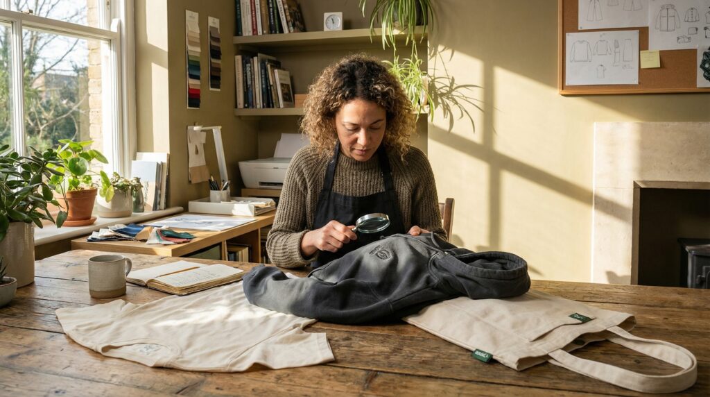
This is where your opportunity for financial freedom lies. Manually adding high-resolution, vector-based fonts in post-production isn’t just a design tweak; it’s a critical quality assurance step. As Marcus, a top Printify seller, puts it: “This is what separates my best-seller shop from the 8,477 other sellers using basic AI without a profit-first QA process.” This deliberate manual step directly impacts your conversion rates and profit margins, ensuring your shop stands out.
Intentional friction: A typography playbook
Understanding intentional friction
2026 retro aesthetics demand “intentional friction”—pairing heavy and expressive display fonts with clean and modernist sans-serifs to ground the fluidity of AI art. This strategic contrast isn’t accidental; it’s a deliberate choice that creates visual interest, enhances readability, and elevates a design from “generic AI” to a premium, sought-after product.
Why does it work for profit? Because “intentional friction” captures attention immediately. It signals a meticulous design choice, elevating the perceived value of your AI art. This allows you to justify higher price points, leading to better profit margins and more autonomy over your time and money.
3 Printify best-seller pairings
These aren’t just pretty fonts; they are proven frameworks for specific retro niches, engineered to maximize appeal and conversion for Printify partners. Each pairing is designed for intentional contrast, driving higher perceived value and best-seller status.
- Pairing one: Groovy psychedelic
- Display font: Nectarine (heavy, expressive, and free-flowing)
- Sub-text font: Inter (clean and modernist sans-serif)
- Aesthetic and profit angle: Ideal for vibrant and whimsical AI art. The "friction" of a solid and modernist sans-serif against a free-flowing display adds professional grounding, making it irresistible to customers seeking unique, high-quality statement pieces.
- Display font: Mirador (bold, structured, and editorial)
- Sub-text font: Roboto Mono (functional and clean monospace)
- Aesthetic and profit angle: Perfect for sophisticated, vintage-magazine style AI posters. The monospace sub-text adds a retro-futuristic edge, appealing to buyers looking for intellectual yet stylish art that commands a higher price.
- Display font: Helvetica Compressed (edgy, condensed, and impactful)
- Sub-text font: Handwritten Serif (organic, personal, and grounding)
- Aesthetic and profit angle: For raw and rebellious AI art. The organic, handwritten element softens the grunge, creating an approachable yet authentic vibe that taps into nostalgic demand for unique, artistic expressions.
Transform AI art into premium products
Stop leaving money on the table. Discover how strategic typography elevates your designs, captivates customers, and drives higher profit margins.
Implementing your quality assurance checklist
The post-production power-up
For best-seller quality and consistent profits, manual intervention in post-production for text elements is non-negotiable. Here’s why: high-resolution vector fonts maintain razor-sharp edges at any size, preventing the “blurry text” returns that tank new shop scores, especially on large format prints. AI-generated text is often rasterized, degrading quality significantly when scaled.
This manual step is precisely what separates your high-margin, “best-seller” shop from the 8,477 other sellers using basic AI without a profit-first QA process. This isn’t just design; it’s a strategic move that protects your shop’s reputation and your bottom line.
Using high-quality Printify posters
You’ve chosen Printify for a reason – our commitment to quality. Use our high-quality poster options (e.g., Premium Matte Posters, Canvas) by ensuring your design matches our print standards. After carefully adding your chosen “intentional friction” font pairings, you must export your final designs as PDF-Print at 300 DPI. This format ensures that the vector font edges remain razor-sharp on physical products. This precise export strategy is your safeguard against the dreaded “blurry text” returns that actively damage your shop’s reputation, ranking, and your profit margins.
7 steps for razor-sharp text
- Generate your core AI retro image in your preferred tool.
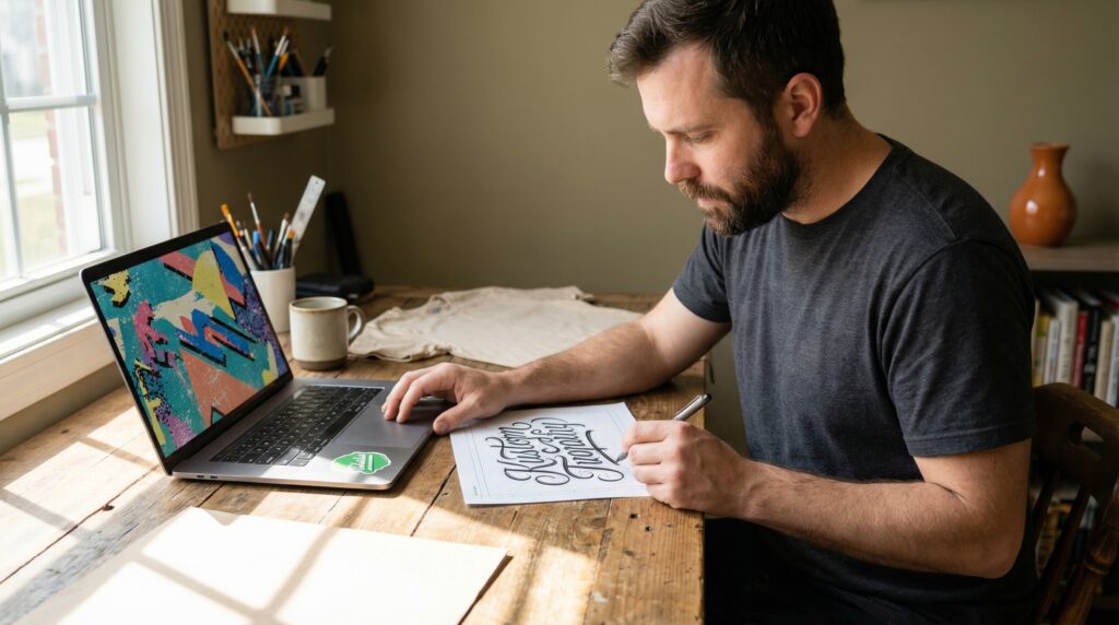
- Import the image into a professional design software (e.g., Adobe Illustrator, Photoshop, Affinity Designer, or even Canva Pro for its robust text tools).
- Apply your chosen “intentional friction” font pairing for headlines and any crucial sub-text, ensuring fonts are converted to outlines or embedded correctly.
- Review text for kerning, leading, and legibility at various scales.
- Export the final design as PDF-Print at 300 DPI.
- Upload to the Product Creator in the Printify Catalog, selecting our Premium Matte Posters or Canvas.
- Click Publish to launch your design, confident in its best-seller potential and reduced return risk.
Sustaining your best-seller status
The value of differentiation
“Intentional friction” typography is more than an aesthetic choice; it’s a shrewd business strategy. It builds trust with your customers, fosters brand loyalty, and significantly reduces customer complaints. This leads to glowing positive reviews, repeat business, and a direct impact on your profit velocity, paving the way for more autonomy and financial freedom.
Scaling smart across your portfolio
Don’t stop with one design. Apply this quality assurance checklist to all future AI-generated retro poster designs. Experiment with new “intentional friction” pairings within this framework, always with an eye on market appeal and margin optimization. Your creativity, combined with this strategic approach, is your ticket to consistent best-seller status and unlocking the financial freedom you deserve.
Ready to stop leaving money on the table? Apply these “intentional friction” pairings as your go-to quality assurance checklist for every AI retro poster. Dive into Printify’s premium poster options with confidence, knowing your typography is razor-sharp, your designs are differentiated, and your profit margins are optimized. Start converting those AI concepts into consistent best-sellers today.
Unlock your best-seller potential
Apply these proven typography strategies to all your AI designs. Elevate quality, reduce returns, and build a thriving Printify business.