

Color Schemes
What is a color scheme?
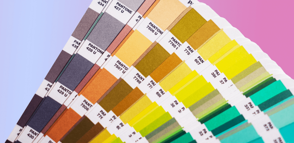
A color scheme comprises a mix of colors used in a range of design disciplines, from fine art to graphic design. You can create endless color schemes by pairing two or more colors. Every color scheme has one or more of the twelve main colors present on the color wheel. Different colors evoke different emotions by using color theory or color psychology.
How to pick a color scheme?
Creating a color scheme for your ecommerce site can be overwhelming and time-consuming. The good news is that you do not have to sit around for hours trying to make a color combination that works. You can start with tried-and-tested color schemes to increase the aesthetic appeal of your store.
Main color schemes
Read all about the most common color schemes below, with tips on making the most out of every color scheme:
Monochromatic color scheme
Monochromatic color schemes concentrate on a single color and also use variations of the same hue with the help of tints, tones, and shades. By incorporating different shades, the single color expands into a complete palette with different amounts of value. Hence, you can make a flat color palette interesting by incorporating shades, tones, and highlights.
Monochromatic color schemes are so versatile and easily applicable to any project. Using lots of colors in a design often creates a clash and obstructs the real message. In contrast, adding hues from only one color enhances a design and simplifies it without making it look too flat. The dark and light hues add visual interest and still keep the overall design look minimal.
Monochromatic color schemes are also rising in popularity due to the increasing demand for minimalism. From interior design to packaging and website design, all aspects of design are now focusing more on minimalism. Also, monochromatic color schemes provide ample room to convey important information without making colors clash.
Choosing a monochromatic color palette does not mean you have to sacrifice your creativity. Remember, the color choice only needs to get along with the context of the brand message. One rule of thumb for working with the monochromatic palette is to read up on color psychology and how it may impact the design. As there’s only one hue to work with, it’s crucial to let contrasting elements guide the way. Creating a design with hues of the same value will add no interest to your work and make it look one-dimensional.
Complementary color scheme
Complementary colors reside on the opposite sides of the color wheel. You have to pick one color as a primary color and the other as a secondary color. Common complementary colors are usually blue and orange, red and green, and purple and yellow. Colors that reside on the opposite ends of each other on the color wheel usually provide high contrast together.
If you increase the saturation, complementary colors can become too intense for the viewer. Fortunately, you can tone down the intensity of complementary tones by using tones, tints, and shades that extend the palette.
When done well, a complementary color aesthetic can make a huge impact on your design. The pair of warm and cool colors bring a rich contrast to any project. Although using complementary color schemes can be overwhelming at first, you will achieve harmony of colors with some trial and experimentation.
For instance, you can use lighter and darker versions of the same color to make it soothing to the eyes. Ask for feedback from people around you to see if the colors look harmonious together.
Analogous color scheme
The word ‘analogous’ means closely related. Analogous colors are a set of three colors that border with each other on the color wheel. The color scheme starts with a base hue and extends with the help of two neighboring hues. The combination of these hues looks harmonious, just like a monochromatic color scheme.
Analogous color schemes look pleasing to the eye, so if you are unsure about a color scheme to use in a project, the analogous palette will not disappoint you. You can keep this color scheme grounded by choosing cool or warm colors together.
If you look around for inspiration, you will find the analogous color group in nature.
From forests to bird feathers, sunsets and oceans, all have beautiful hues that fit so well. With this inspiration, you can guide the color scheme of your next project, branding guide, or even apparel designs.
Triadic color scheme
A set of three things or people is called a triad. The triad color scheme is based on three colors on the color wheel, equidistant and forming a triangle when joined together. Triadic color schemes offer a lot of combinations from primary, secondary, and tertiary colors. Common triad colors are blue, yellow, and red, and violet, green, and orange.
Most triadic colors are very vibrant and difficult to balance. We recommend assigning a base hue and then using the remaining hues as accent colors. If you use the colors in a triadic scheme equally, it will seem like every color is fighting for the limelight. You can establish a color hierarchy within the composition to prevent the clashing of colors.
Neutral color scheme
Neutral color palettes recently became very popular in all design disciplines. This color scheme consists of mostly achromatic shades (black, grey, and white) and near neutrals (tan, beige, brown hues). All neutral colors will have one thing in common: they are desaturated using tints, shades, and tones.
The neutral aesthetic quickly found its place in various applications, be it brand guides, interior decorations, or custom stationery. Just like a monochromatic palette, neutral colors evoke feelings of calmness and peace. You can not go wrong with neutrals, as it is hard to go overboard with these hues. But, as a rule of thumb, you must stick to four colors or less.
The desaturated tones are timeless and look easy on the eye in any setting.
Conclusion
Choosing a color scheme for your website is no easy feat. You have to analyze the cultural and psychological implications of various website palettes and how they shape people’s perceptions. Luckily, you don’t need an arts or designs degree to do this. Using the information and tips above, you should be able to identify the best color pattern for your website.


