

Tired of your viral TikTok Shop designs falling flat when they hit print? You are burning time, profits, and customer trust. This is not about complex design theory; it is about smart hacks to make your print-on-demand colors pop on screen and in real life, turning scrolls into sales, and preventing those profit-eating returns. Let's get your next trend live and profitable in under 24 hours.
The core color problem
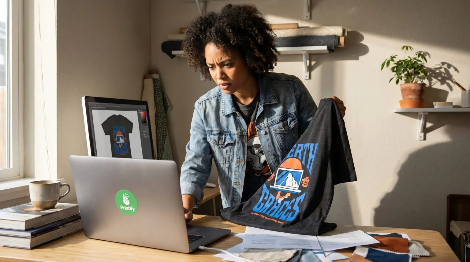
You have designed a killer graphic, it looks incredible on your screen, but when it arrives, your electric blue looks muted. This common frustration kills customer satisfaction, and drains your profits with returns. A true hustler understands this is not a flaw in printing; it is a fundamental difference in how screens and printers create color.
RGB vs CMYK showdown
Computer screens use RGB (Red, Green, Blue) to create millions of vibrant colors by mixing light. Printers use CMYK (Cyan, Magenta, Yellow, Key/Black) to mix ink, which has a much smaller color range, also known as its gamut. This is why neons, electric blues, and super-saturated hues that look amazing on screen will always appear flatter on cotton than on your glass display. This is not a printer flaw; it is physics. The hustler understands this distinction instantly to avoid costly errors, and ensure consistent quality.
3 Hacks for vibrant colors
Stop guessing, and start dominating. These rapid-fire strategies empower you to take control of your designs, ensuring they look stunning, and drive sales.
1: Catch saturation red flags
Are you an artist pouring creativity into AI-generated art, or trending designs, only to be disappointed by dull prints? You are burning time and money on reprints, losing valuable momentum on TikTok. The solution is to identify saturation red flags before you send anything to print.
Action steps:
- Use the gamut warning tool: In Photoshop or Affinity Photo, learn to use the Gamut Warning feature. You do not need to be a color theory expert; this is a quick visual cue.
- Spot the red flag: If your AI-generated art, trending design, or custom graphic turns grey in the preview, it is a saturation red flag. This means the printer simply cannot replicate that specific frequency of light with CMYK inks.
- Save hours of rework: Spotting these issues in seconds saves you hours of rework, and prevents costly errors.
2: The contrast cheat code
You want your designs to pop and grab attention, but trying to make muted CMYK inks brighter is a losing battle. This struggle leads to disappointment, and impacts your profitability. The solution is to trick the human eye using strategic contrast.
Action steps:
- Embrace dark garments: Instead of attempting to make a pink brighter (which is difficult with CMYK), use a deep charcoal, or black garment.
- Use psychological impact: High contrast makes the muted ink appear neon and vibrant to the human eye, even if the ink itself is not glowing.
- Boost perceived vibrancy: By using contrast, you boost perceived vibrancy, prevent disappointment, and keep your profit margins intact without expensive specialty inks. Explore various custom clothing options to find the perfect dark canvas for your designs.
3: Calibrate colors for profit
As a business owner, you need reliable, scalable solutions to eliminate returns, and ensure consistent quality across all your print-on-demand products. Guessing your colors leads to wasted inventory, and damaged brand reputation. The solution lies in direct, actionable calibration steps with Printify's powerful tools.
Action steps:
- Convert to sRGB: Before uploading your files, convert them to sRGB. This is often the widest color space that printers can accurately interpret from RGB data, giving your designs the best chance at accurate color reproduction.
- Use the Product Creator: After uploading your design to the Product Creator, always click Preview to check the CMYK rendering. This gives you the most accurate screen representation of how your design will look when printed, helping you visualize the final product.
- Order a color swatch shirt: For the 12,203 business owners ready to scale and truly eliminate returns, order a color swatch shirt from your favorite Printify Print Provider. This allows you to see exactly how your electric blue or any other critical color renders on a real product from the Printify Catalog, like a Gildan 5000 custom T-shirts. This physical proof is the ultimate safeguard against disappointment, and profit-eating returns.
Boost your TikTok Shop sales
In the fast-paced world of eCommerce and TikTok Shop, your visual appeal is everything. Off-color prints lead to customer disappointment, bad reviews, and costly returns. By implementing these quick, actionable color hacks, you safeguard your brand, ensure customer satisfaction, and build a foundation for scalable, profitable trends that launch in under 24 hours. Stop wasting time, eliminate tech barriers, and start seeing your designs pop on screen and in your bank account.
Ready to stop guessing and start profiting? Master Print on demand and launch your next viral trend with confidence. Visit Printify.com to explore products, order your first color swatch shirt, and see your designs pop!


